Tag: metal

Material Flows and Value Streams in Mining

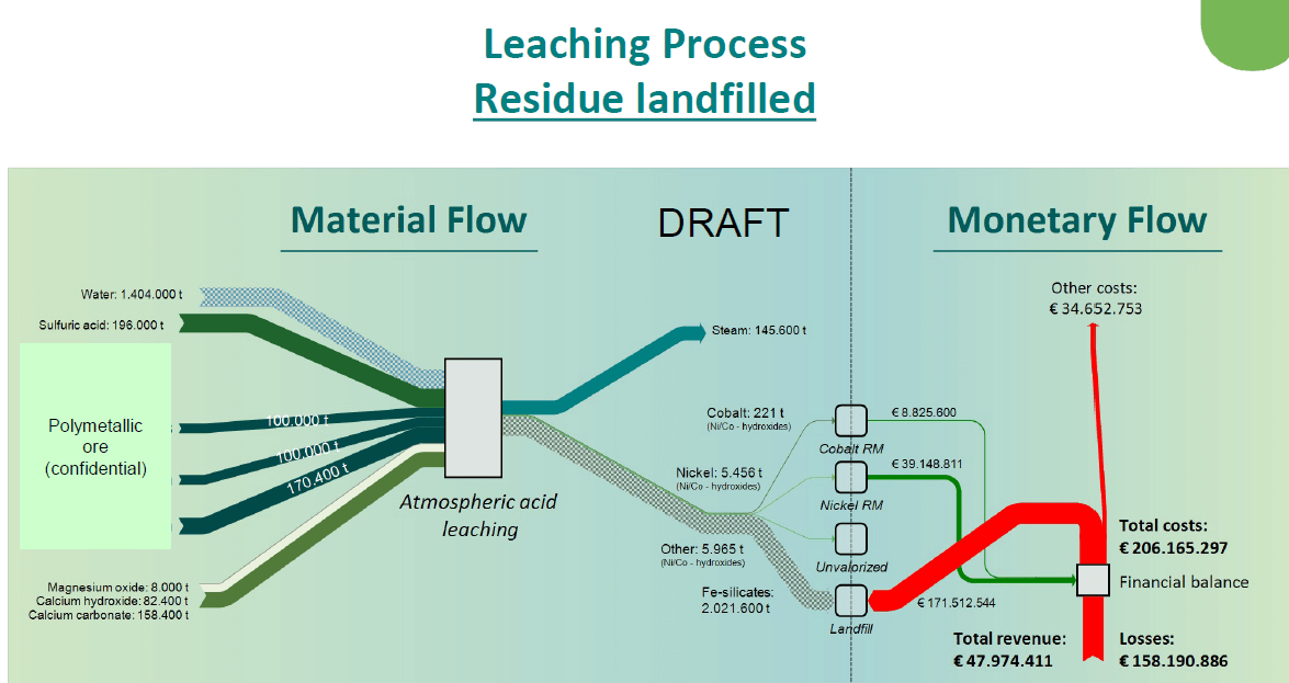
A news item reporting on a 2019 workshop on sustainability assessment by Liesbeth Horckmans (VITO) also makes mention of findings in the European research project METGROW+. What caught my eye were two Sankey diagrams from the field of mining and metals production.


(Source METGROW+ Project via Crocodile project news page)

The Sankey diagram is interesting in two ways. First, these are actually two Sankey diagrams, touching each other at the nodes along the dotted ‘cut here’ line. The left part shows material flows in mining and metals production. From the tailings that typically end up on a landfill, nickel and cobalt are recovered. The right part visualizes the value streams linked to metal recovery and and costs associated with the landfill. These “monetary flows” are shown in red (if it is an expense) and in green (if it is a revenue). They run in opposite directions and are connected at the “Financial Balance”.

A second Sankey diagram (not shown here) compares this to a situation, where the Fe silicates typically sent to landfill can actually be “valorised” and fed back into the material cycle. In this case the financial balance can actually show a profit.

The second interesting aspect of this Sankey diagram is the way they handle flows that are out of scale (an issue I am particularly wary about, as some of you might have noticed).
In the mining and metal production process the water quantity being used is threefold the materials quantity, so the water flow would normally be three times the width of all the other flows in the Sankey diagram, if they were to scale. Here, the authors opted instead to mark the flow with a pattern and also use a pastel color to signal that this flow is not to scale.
The same on the output side, where we see the tailings stream (2 million tonnes) that is much much larger than the green recovered metals flows. If you were to draw these flows to scale, the arrow to ‘Landfill’ would be many times wider, and most likely spoil the whole diagram. Instead they opted to draw it in light grey with a moiree pattern. …
Circular Zinc Flows

While some were indulging in an extended spring cleaning (this year labeled ‘quarantine cleaning’) I decided to take on some of the hard disks sitting on my desk.

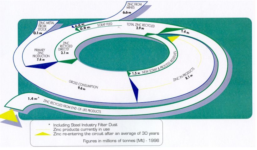
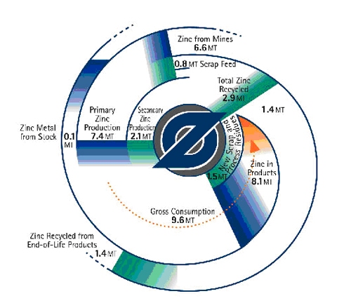
These circular zinc flow diagrams from 2011 survived the cleaning and are getting a new life here on the blog. They are more or less two versions of the same diagram, apparently with a Sankey diagram in mind.

The first is a top view and shows zinc flows in the economy (U.S. or world? … sorry, but I don’t have the accompanying text any more). Flows are in millions of tonnes (Mt) in 1996. The second one has the same numbers, but adds a 3D perspective…

Some tricky issues here: The ‘zinc in products’ stream of 8.1 Mt narrows down to zero, as the zinc sits in products, from where it later might be released into the cycle again. This does not help the attempt to draw them in a circle (to associate circularity of zinc flows). As a consequence the streams are not to scale (compare, for example the 0,8 Mt scrap feed flow right next to the 6,6 Mt flow for zinc from mines). The 3D perspective and the shadow effect don’t help in any way here…

Check out some more Sankey diagrams with the tag ‘circular’ and this post on radial Sankey diagrams.

Non-Ferrous Metal Waste Paths

Another spectacular Sankey diagram from the final report of the project “Resource conservation through material flow-oriented secondary raw materials management” published by German Environment Protection Agency (Umweltbundesamt, UBA). This one is on non-ferrous metals in waste and recycling paths Germany. Flows are in mio. t for the year 2013.


I had presented another Sankey diagam from this report (on paper and cardboard streams) here on the blog back in January. You can access the full report here.

European Copper Streams 2012

After all these colorful Sankey diagrams, here is something soothing for your eyes.

This b/w Sankey diagram shows European copper streams in 2012. It is taken from the 2017 dissertation by Simon Gloser-Chahoud of Technical University Clausthal in Germany with the woooh title ‘Quantitative Analyse der Kritikalität mineralischer und metallischer Rohstoffe unter Verwendung eines systemdynamischen Modell-Ansatzes’ (‘Quantitative analysis of the criticality of mineral and metallic raw materials using a system-dynamic model approach’ …thanks Google Translate!).

Flows are in kt. The dotted line references the geographical boundary of the EU-27 states. We can see that 1.100 kt copper concentrate was imported and 830 kt came from mines in Europe. Import and export of finished products containing copper is almost balanced. The overall addition of copper to the European stock (estimated at 90.000 kt) was at 3.200 kt. Copper in waste streams leaving this stock amounted to 2.500 kt, of which 1.750 kt were fed back into the copper production.

Precious Metals and Critical Raw Materials

The EU funded PROSUM research project looks at ‘Prospecting Secondary raw materials in the Urban mine and Mining wastes’. The more than 15 institutions participating in the project have recently published their findings in a final report.

The report has some interesting Sankey diagrams on market input, stocks, waste generation and waste flows for product groups such as vehicles, batteries, precious materials and selected critical raw materials (CRMs) contained in batteries, electrical and electronic equipment (EEE) and vehicles.

Here is the diagram for vehicles in the EU28+2 (=EU28 plus Switzerland and Norway) market. Data relates to the year 2015.

Flows are in tons and ktons, blending two scales in one diagram. This merits its own post, I think. (read it here)

The electric vehicles currently driving on the roads are shown as “Stock”, meaning that the materials are in use and that they could eventually be recovered at the end of the life of the vehicle. This is the large stackd bar between “POM” (placed on market) and “De-reg Vehicles”. Again this stacked bar uses two different scales (tons and ktons).

Official report citation: Jaco Huisman, Pascal Leroy, François Tertre, Maria Ljunggren Söderman, Perrine Chancerel, Daniel Cassard, Amund N. Løvik, Patrick Wäger, Duncan Kushnir, Vera Susanne Rotter, Paul Mählitz, Lucía Herreras, Johanna Emmerich, Anders Hallberg, Hina Habib, Michelle Wagner, Sarah Downes. Prospecting Secondary Raw Materials in the Urban Mine and mining wastes (ProSUM) – Final Report, ISBN: 978-92-808-9060-0 (print), 978-92-808-9061-7 (electronic), December 21, 2017, Brussels, Belgium

EU Raw Material System Analysis

A study on key raw materials and their flows “through the EU economy, as raw materials or as parts of basic materials, components or products” has been produced by BIO Intelligence Service for the European Commission, DG GROW (BIO by Deloitte (2015) Study on Data for a Raw Material System Analysis: Roadmap and Test of the Fully Operational MSA for Raw Materials. Prepared for the European Commission, DG GROW).

It contains Sankey diagrams for 28 materials considered critical or important to European economy, such as cobalt, lithium, or tungsten.

The flows of these materials into the EU-28 geographical area (imports) as well as out of the EU-28 (exports) are displayed for all substances in the same way. Recycling of the substance within Europe is represented as a loop, leading to a kind of see-saw-ish diagram. Additions to in-use (e.g. the substance being part of a product in use) and a certain amount of the substance being disposed off (e.g. as waste) are also shown as arrows to the right. Below is the diagram for cobalt. Flows are in tonnes for the year 2012 (t/y).

All Sankey diagrams are color-coded the same-way, providing additional information whether the material (in the case above: cobalt) is imported as raw material or as part of a product, and whether it is exported as processed material, waste, or also as part of a product.

The study can be downloaded from this page or directly here (PDF, 6 MB)

Misc Sankey Diagrams Uncommented 14

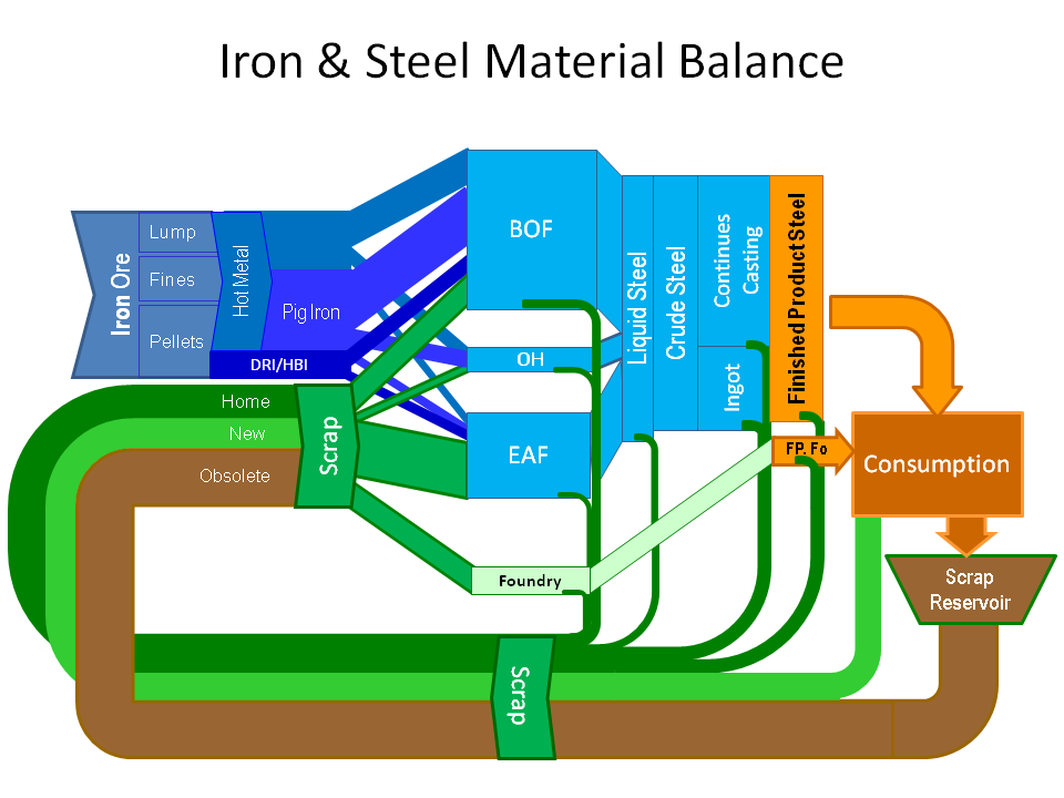
Digging through some long untouched folders on my hard disk, I found this schematic Sankey diagram of iron and steel flows.


Schematic? Well, no quantities or units given, no time reference, no source of data. And no idea as to who the author is. Just take it as another miscellaneous Sankey diagram.

Material Scarcity Visualized

This presentation from 2015 by Alicia Valero of the Spanish Research Centre for Energy Resources and Consumption (CIRCE, Zaragoza) is on critical materials, minerals scarcity, recycling and a “thermodynamic cradle-to-cradle approach”.

It features two Sankey-style diagrams depicting the mineral balance of the European Union (UE).

This first one is a Sankey diagram for the mineral balance without fossil fuels (‘Diagrama de Sankey para el balance mineral de la UE sin combustibles fósiles’).

Data is for the year 2011, Flows are shown in tons. Iron and limestone dominate the picture with 77% of the input. Limestone is produced (extracted) mainly within Europe, while iron is mostly imported.

The second Sankey diagram is a scarcity diagram (‘Diagrama de rareza para el balance mineral de la UE sin combustibles fósiles’) and takes into account thermodynamic exergy to obtain (mine) the minerals. Although it depicts aluminium, gold, ion, nickel and the likes, flows are shown in an en(x)ergy unit (Mtoe).

Iron and limestone which seemed to be the most important mass-wise only constitute some 10% of the input. Aluminium and potash seem to be much more difficult to produce. Rare earth elements (REE) are not included in this diagram.

The author points out that it is important to not only look at materials from a mass perspective. Looking at materials availability taking into account thermodynamic exergy paints a different picture of the real cost and scarcity.

For those interested, please check out the presentation (in Spanish) here.