Tag: circular

Circular Economy Roadmap Australia

CSIRO, Australia’s national science research agency, recently released a report “Circular economy roadmap for plastics, glass, paper and tyres. Pathways for unlocking future growth opportunities for Australia”. It looks at “a circular economy, with an objective of reducing total waste generated in Australia by 10 per cent per person by 2030”.

For each of the consumer products mentioned in the title it presents the current situation, and a 2030 circularity scenario as a Sankey diagram. Here is the one for plastics in Australia 2018 and 2030.

Flows are in million tonnes. In 2018 only 4% of plastics were recycled. This is projected to increase to 50% in a circular economy scenario, even with a slight overall increase in annual plastic use from 3.41 Mt to 3.76 Mt.

Read more here and download the summary report.

Loopbacks in Sankey Diagrams

My previous post on circular links got a number of responses. Indeed it seems as if drawing loopbacks (as I prefer to call them) is one of the tougher challenges in Sankey diagrams.

  • Loops back to the same node are typically not required in relationship diagrams (bands depicting relationship between categories, see here), but they may be necessary if you want depict actual physical flows (e.g. recycling of material)
  • Direct loops back, where the output of a process leads directly back to the same node, are not very common (one example can be seen here, called “functional recycling”). There could be in reality a node along the way back (e.g. a pump that pumps cooling water cycling the process). If you have a node in the loopback, then the input and output side are flipped.
  • Loops can “go back via several nodes, they may even branch on the way back” like in the example below


If you take a left-to-right column oriented approach when setting up the diagram working with tabulated data as the source (sth like “source”: “process3”, “target”: “process8”, “value”: 20) then you have to consider the column depth to identify whether you have a back loop. All sorts of routing issues for the arrow come up and you need to create room to not produce overlaps. Drawing the Sankey diagram manually (like I did i the figure above) rather than programmatically gives more freedom in that respect.

Sankeys with circular links

Guus, a reader of this blog, DMed me to ask whether I “knew of any (open source) JavaScript libraries that can generate circular Sankey diagrams”?

Many of the Sankey diagrams I see on the web are created using d3.js by Mike Bostock. Typically these diagrams are left-to right oriented and have a column structure. What is less common are feedback loops or circular Sankey arrows, like the pink ones in the figure below.

The place to look for is Tom Shanley’s Block.

Here you can find many samples for:

Guus, I hope you can find what you are after there. Enjoy!

Basque Country Circular Economy 2030

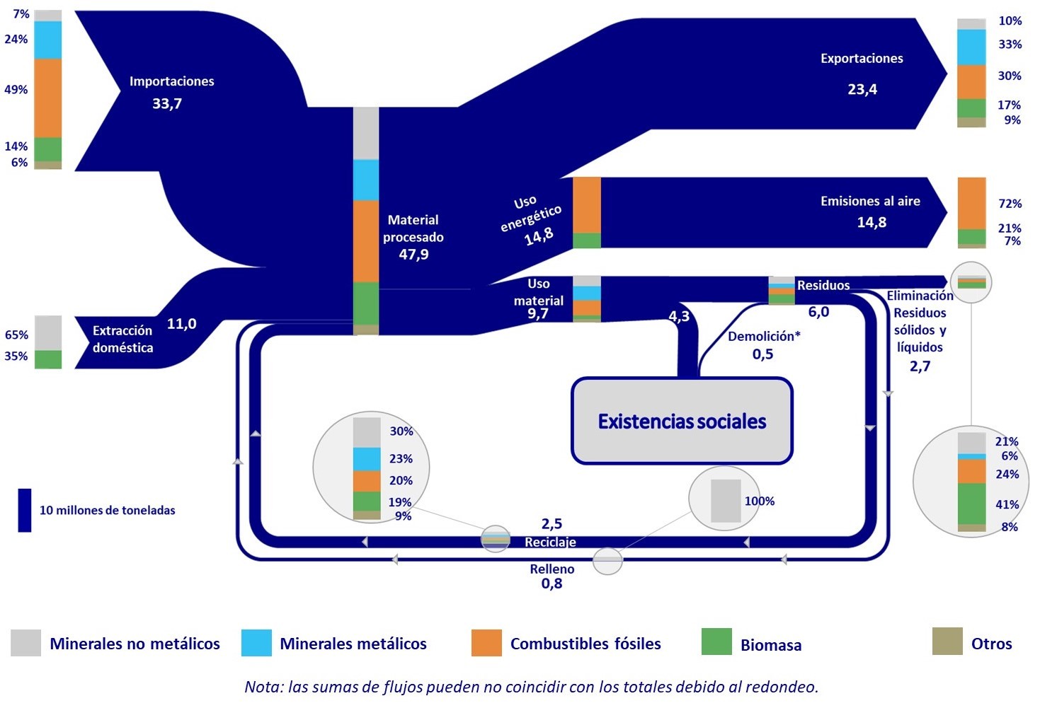
A post on the ‘Low Carbon Future’ blog by IDOM caught my attention as it featured the below Sankey diagram. The post is a summary of an event held back in 2019 on the elaboration of a Circular Economy Strategy for the Basque Country” (“Foro de participación para la elaboración de la Estrategia de Economía Circular del País Vasco 2030”).

The diagram shows mass flows in mega tonnes (Mt) for the year 2016 within the autonomous community in the North of Spain. While the arrows are unicolored, stacked bars on the streams reveal their composition with contributions from metallic minerals, non-metallic minerals, fossil fuels, biomass and others.

Somehow I couldn’t get rid of the feeling that I had seen something similar before. And indeed a similar Sankey diagram for global flows is featured in this post from 2015 and – even more so – one for EU material flows in this followup post from 2018. They seem to have served as a template for the creation of a regional Basque version.

Circular Zinc Flows

While some were indulging in an extended spring cleaning (this year labeled ‘quarantine cleaning’) I decided to take on some of the hard disks sitting on my desk.

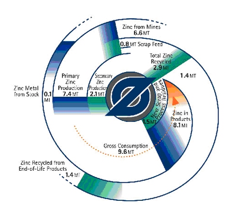
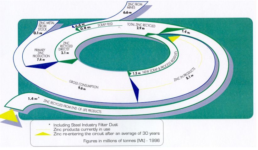
These circular zinc flow diagrams from 2011 survived the cleaning and are getting a new life here on the blog. They are more or less two versions of the same diagram, apparently with a Sankey diagram in mind.

The first is a top view and shows zinc flows in the economy (U.S. or world? … sorry, but I don’t have the accompanying text any more). Flows are in millions of tonnes (Mt) in 1996. The second one has the same numbers, but adds a 3D perspective…

Some tricky issues here: The ‘zinc in products’ stream of 8.1 Mt narrows down to zero, as the zinc sits in products, from where it later might be released into the cycle again. This does not help the attempt to draw them in a circle (to associate circularity of zinc flows). As a consequence the streams are not to scale (compare, for example the 0,8 Mt scrap feed flow right next to the 6,6 Mt flow for zinc from mines). The 3D perspective and the shadow effect don’t help in any way here…

Check out some more Sankey diagrams with the tag ‘circular’ and this post on radial Sankey diagrams.

European Copper Streams 2012

After all these colorful Sankey diagrams, here is something soothing for your eyes.

This b/w Sankey diagram shows European copper streams in 2012. It is taken from the 2017 dissertation by Simon Gloser-Chahoud of Technical University Clausthal in Germany with the woooh title ‘Quantitative Analyse der Kritikalität mineralischer und metallischer Rohstoffe unter Verwendung eines systemdynamischen Modell-Ansatzes’ (‘Quantitative analysis of the criticality of mineral and metallic raw materials using a system-dynamic model approach’ …thanks Google Translate!).

Flows are in kt. The dotted line references the geographical boundary of the EU-27 states. We can see that 1.100 kt copper concentrate was imported and 830 kt came from mines in Europe. Import and export of finished products containing copper is almost balanced. The overall addition of copper to the European stock (estimated at 90.000 kt) was at 3.200 kt. Copper in waste streams leaving this stock amounted to 2.500 kt, of which 1.750 kt were fed back into the copper production.

Europe JRC Critical Materials Report

Europe’s Joint Research Centre (JRC) has published a new report on ‘Critical Raw Materials and the Circular Economy’ in December 2017.

The report also builds on findings from a 2015 study by BIO by Deloitte, where a Raw Material System Analysis (MSA) Framework had been introduced that “investigates the flows and stocks of 28 raw materials from ‘cradle-to-grave’, that is, across the entire material life cycle from resource extraction to materials processing to manufacturing and fabrication to use and then to collection, processing, and disposal/recycling”. I had posted about this here.

Like in the 2015 study the authors present MSAs for a number of critical materials (CRMs) within the EU-28 boundaries and are depicting them as Sankey diagrams. The authors then expand into how scarcity and price may impact certain industrial sectors or products (Automative, Electronics, Batteries, etc.). Best practices are suggested for recovering critical materials.

Here is the MSA Sankey diagram for Germanium (from page 41 of the report):


All flows are in kilograms per the reference year 2012. We can see that roughly 80.000 kg of Germanium entered the EU in the year 2012, and 15.800 kg were made available on the secondary material market within the EU.

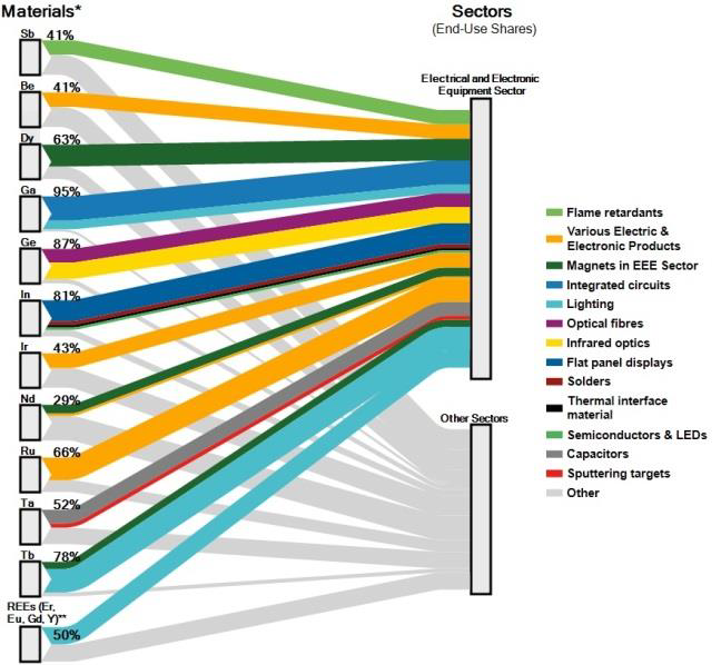
For the individual industrial sectors, another type of figure is presented. This breakdown of how much of the CRMs is used in a specific sector gives a better understanding of the dependency on certain CRMs.

This Sankey diagram (from page 39 of the report) for the Electrical and Electronical Equipment sector shows, for example, that 87% of the Germanium (ge) entering the EU are used in the EEE sector, making it the largest consuming sector of Germanium. The remaining 13% are used in other sectors:

Crossing the information from the MSA Sankey diagams that show availability of a CRM, and the information from the Sankey diagram showing demands per sector gives a good understanding on why some materials are considered critical for industries, and measures for recovering more of them from tailings or waste are meaningful.

Source: Mathieux, F., Ardente, F., Bobba, S., Nuss, P., Blengini, G., Alves Dias, P., Blagoeva, D., Torres De Matos, C., Wittmer, D., Pavel, C., Hamor, T., Saveyn, H., Gawlik, B., Orveillon, G., Huygens, D., Garbarino, E., Tzimas, E., Bouraoui, F. and Solar, S., Critical Raw Materials and the Circular Economy – Background report. JRC Science-for-policy report, EUR 28832 EN, Publications Office of the European Union, Luxembourg, 2017, ISBN 978-92-79-74282-8 doi:10.2760/378123 JRC108710.

Access JRC report here (PDF).
Global Plastics, Ellen MacArthur Foundation

This week the global plastics flows topic made the news and social media with the publication of the EU Plastics Strategy and Chancellor Philip Hammond presenting the United Kingdom’s plan for tackling plastic waste.

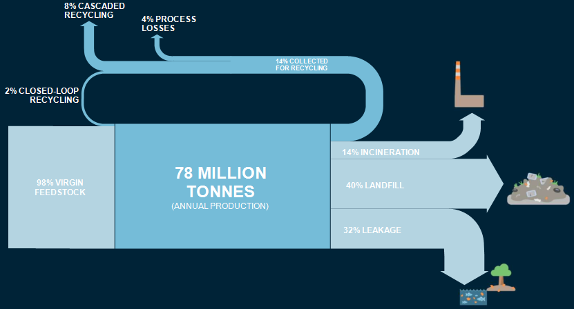
Ellen MacArthur Foundation has long been active in research and awareness building in this field. It aims at supporting a transition to a circular economy. The foundation tweeting under @circulareconomy contributed this Sankey diagram. It is from a 2016 report they produced together with the World Economic Forum and McKinsey.

The Sankey diagram shows indeed, that “today, plastic packaging material flows are largely linear”. This beautifully crafted diagram had already caught my attention back in 2016 when I first saw it.

However, I had this subtle feeling that something was wrong here. Not regarding the content or the data … but rather that something wasn’t OK in the Sankey diagram, Just my gut feeling. Now, seeing the Sankey diagram again in the above tweet this week, I finally sat to quickly do a remake of this Sankey diagram. Here it is:

I stuck to the original layout and design as closely as possible, using the same color codes and even the white all caps font. While transfering the numbers (all percentage values, so no issue there), it immediately became clear to me what caused my irritation. Can you identify it yourself by comparing the two pics?

Won’t give it away now and wait for your comments. Will post the answers to this small ‘spot-the-difference contest’ here next week.

[Edit 24 Jan] Blog reader ‘First!’ was the first to comment and point out that the 2% recycling flow does not seem to be to scale (i.e too wide / overemphasized) in the Sankey diagram published by Ellen MacArthur Foundation, and possibly the same issue with the two arrows representing 14% each.