Tag: MFA

Material Flow Analysis for Almaty

Almaty is the largest city in Kazakhstan. It is also the first city in Central Asia that did a circular economy opportunities analysis. Numerous ideas were proposed during a project with local stakeholders.
The project is described on the Shifting Paradigms blog, and the full report ‘Metabolic analysis and circular economy strategies for Almaty, Kazakhstan’ describing the project can be downloaded there.

Visuals turned out to be crucial in this project for communicating information and to be able to oversee the amount of data. “Mapping out the metabolic system of a city, helps understand how a city uses material resources to deliver valuable services to its inhabitants, like nutrition, shelter and mobility, and identify opportunities for improvement.”

This is the Sankey diagram depicting the material flows for Almaty, Kazakhstan covering minerals, metals, biomass, fossil fuels, energy and water used in Almaty’s industry. It is shown on pages 36/37 of the report. Flows are in kT (per one year ?) with imports/exports across the city’s boundaries.

Blended into this material flow analysis (MFA) diagram are greenhouse gas emissions (GHGs). “The red flows at the lower section of the graph show the embedded gas emissions in imported goods and materials.” These could be considered hidden quantities associated with the production of products or the import of fuels, “piggybacking” on the actual physical material flows that enter and leave the industrial sector in the city.

Note that it seems as if flows are not always to scale or parts are hidden behind other flows (see, for example, the yellow stream representing 968 kT of fuel being turned into 2,975 kT GHGs, a flow that is not three times as wide). Also the recycling flow width seems to overblown, probably to point out that recycled materials can loop back through the system multiple times, and to focus the circular economy perspective.

There are two other Sankey diagrams in the report, so make sure you have a look at it.
Basque Country Circular Economy 2030

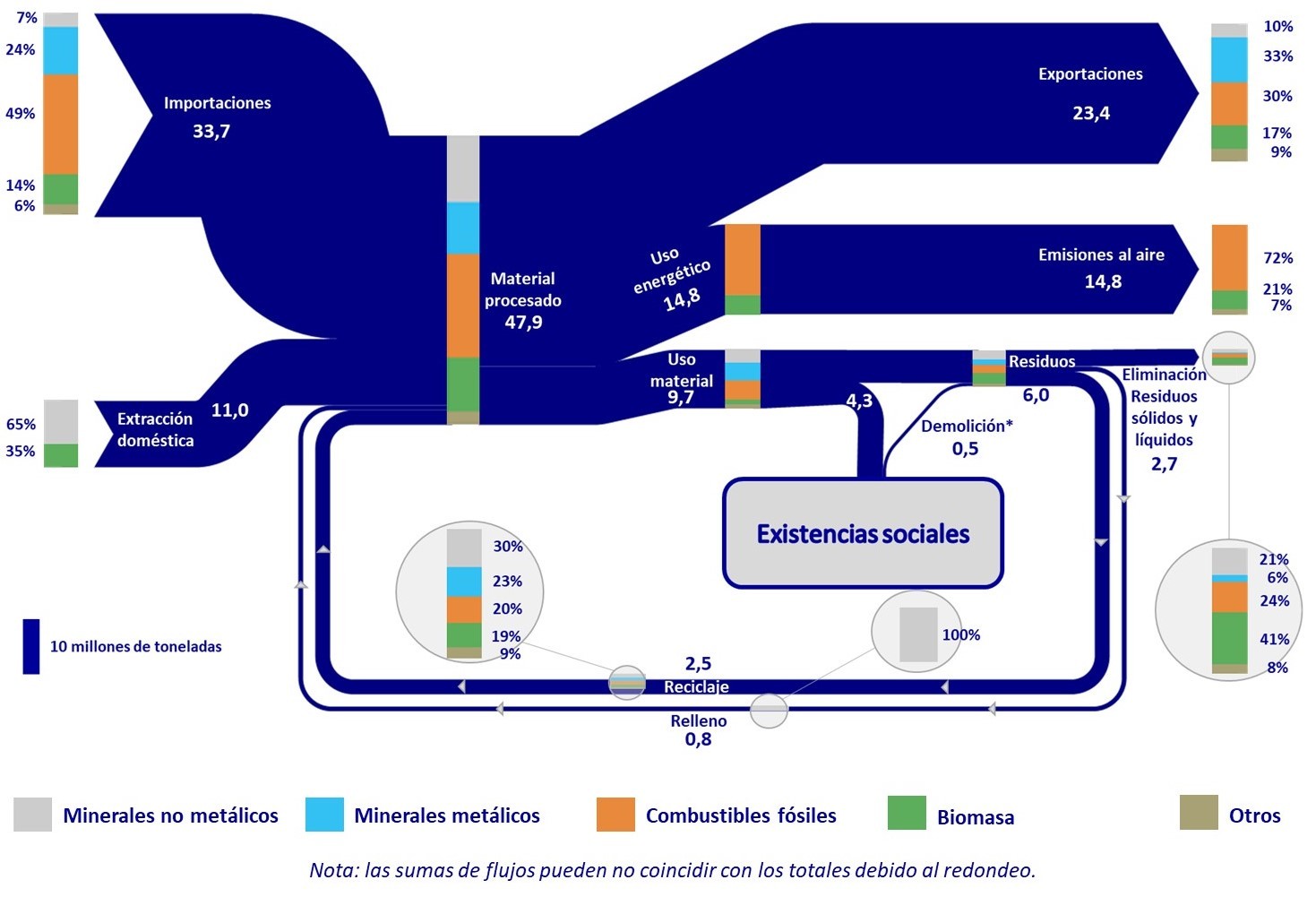
A post on the ‘Low Carbon Future’ blog by IDOM caught my attention as it featured the below Sankey diagram. The post is a summary of an event held back in 2019 on the elaboration of a Circular Economy Strategy for the Basque Country” (“Foro de participación para la elaboración de la Estrategia de Economía Circular del País Vasco 2030”).

The diagram shows mass flows in mega tonnes (Mt) for the year 2016 within the autonomous community in the North of Spain. While the arrows are unicolored, stacked bars on the streams reveal their composition with contributions from metallic minerals, non-metallic minerals, fossil fuels, biomass and others.

Somehow I couldn’t get rid of the feeling that I had seen something similar before. And indeed a similar Sankey diagram for global flows is featured in this post from 2015 and – even more so – one for EU material flows in this followup post from 2018. They seem to have served as a template for the creation of a regional Basque version.

Hong Kong Water Flows

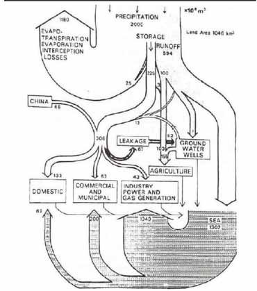
Sometimes I get a little nostalgic… Here is a Sankey diagram of water flows in Hong Kong. My guess is that it pre-dates 1997, so this would be the former British colony Hong Kong. Originally published in Worldbank’s Eco2 Cities book (Hiroaki Suzuki, Arish Dastur, Sebastian Moffatt, Nanae Yabuki and Hinako Maruyama. Eco2 Cities: Ecological Cities as Economic Cities. 2010), it is pictured in this guide(link currently broken) on page 41.


Flows of water are shown in 1.000.000 m³ of water (difficult to see, but I read this as 10 to the power of 6). Obviously hand drawn, so flows are not fully to scale.

Hongkong receives an average 2.000 Mm³ of precipitation (per year?) on a land area of 1.046 km² (interesting: todays area is 1.108 km²). Most of the water directly evaporates, and a large chunk goes into the sea.

This is considered an early example of a material flow analysis (MFA) visualization, and also of an urban metabolism study.

UK Resource Flow 2014

This Sankey diagrams for the resource flows in the UK in 2014 can be found in the Digest of Waste and Resource Statistics – 2018 Edition. The report is published annually by UK’s Department for Environment, Food & Rural Affairs (DEFRA). This is for all mass flows nationwide, but excluding fossil fuels and energy carriers. Unit of flows is megatonnes (mt) per year.

That figure didn’t quite convince me. Apart from the the pixelated arrow segment borders where arrows don’t run vertically (see red arrow), I found that some flow quantities were missing. Further, I didn’t like that the blue recycling back flow was exaggerated (read: not to scale) and the 91 mt arrow as wide as the green 143 mt biomass flow (at least in some segments). To be fair, the footnote for the diagram warns “that the ‘pipes’ are not all to scale”, but my impression was that this effect was mainly used to emphasize the thinner arrows.

I did a quick redo of this resource flow diagram only to find out that it was impossible to determine some of the missing flow quantities. I could find some of them in the report, but was unsuccessful for others. So I had to estimate them (which is indicated with an asterisk in my version).


Warning: Some values based on estimates, please do not use the data from this figure.

As you can see the recycling stream is less wide in my remake. Didn’t fully hit the right color codes, but tried to stick to the original layout as much as possible.

European Copper Streams 2012

After all these colorful Sankey diagrams, here is something soothing for your eyes.

This b/w Sankey diagram shows European copper streams in 2012. It is taken from the 2017 dissertation by Simon Gloser-Chahoud of Technical University Clausthal in Germany with the woooh title ‘Quantitative Analyse der Kritikalität mineralischer und metallischer Rohstoffe unter Verwendung eines systemdynamischen Modell-Ansatzes’ (‘Quantitative analysis of the criticality of mineral and metallic raw materials using a system-dynamic model approach’ …thanks Google Translate!).

Flows are in kt. The dotted line references the geographical boundary of the EU-27 states. We can see that 1.100 kt copper concentrate was imported and 830 kt came from mines in Europe. Import and export of finished products containing copper is almost balanced. The overall addition of copper to the European stock (estimated at 90.000 kt) was at 3.200 kt. Copper in waste streams leaving this stock amounted to 2.500 kt, of which 1.750 kt were fed back into the copper production.

Material Flows in the EU economy

Up on the EUR-Lex, the European Union’s database on laws, regulations, publications and reports is a staff working paper ‘Measuring progress towards circular economy in the European Union – Key indicators for a monitoring framework’ meant as accompanying background text for a ‘Communication from the Commission to the European Parliament, the Council, the European Economic and Social Committee and the Committee of the Regions on a monitoring framework for the circular economy’.

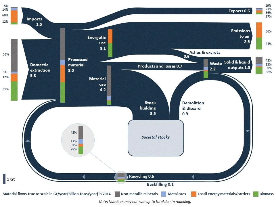
And it shows this beautiful Sankey diagram on material flows in the EU economy (2014).

Beautifully crafted, this diagram shows that “8 billion tonnes of raw materials were processed during 2014 in the EU: of this 1.5 billion (i.e. around 20%) are imported, which indicates the EU dependency on imports of materials. Out of the 8 billion tonnes of processed materials, 3.1 billion tonnes are directed to energetic use, 4.2 to material use and 0.6 are not used in the EU but exported.”

Flows are in Gt/yr (billion tons per year. The composition of the flows is presented at certain points in the diagram as bar charts on top of the dark blue bands: metal ores, non-metallic minerals, fossil energy materials/carriers and biomass. For each of those four groups individual Sankey diagrams can also be found in the working paper.

The EU never stops to surprise me! In this case in a positive way, as Sankey diagrams seem to have arrived at the top echelons of European policy making (or at least with their staff).

Minerals Exergy Replacement Costs

Another example for a Sankey diagram on a map from an article ‘Exergoecology Assessment of Mineral Exports from Latin America: Beyond a Tonnage Perspective’ by Jose-Luis Palacios (Escuela Politécnica Nacional, Quito, Ecuador) et al. published in Sustainability 2018, 10(3), 723 as open access article distributed under Creative Commons Attribution (CC BY) license.

I had not heard of the term ‘exergoecology’ before:

Exergoecology is the application of the exergy analysis in the evaluation of natural fluxes and resources on earth. The consumption of natural resources implies destruction of organized systems and dispersion, which is in fact generation of entropy or exergy destruction. This is why the exergy analysis can describe perfectly the degradation of natural capital.
The thermodynamic value of a natural resource could be defined as the minimum work (exergy) needed to produce it with a specific composition and concentration…
(Source: Exergoecology Portal)

The authors of the article argue that the Material Flow Analysis (MFA) approach should be combined with a measure for the thermodynamic quality of minerals, “especially when dealing with non-fuel minerals”. They propose to use the indicator exergy replacement costs (ERC) from exergoecology because it “considers the scarcity degree of the commodities in the crust and the energy required to extract them. When a mineral is scarcer and its extraction and beneficiation processes are more difficult, its ERC value becomes higher”.

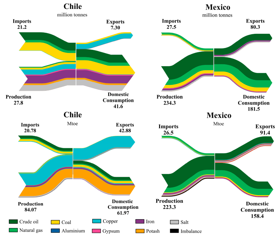
These two sets of Sankey diagrams visualize this approach:

The two Sankey diagrams on the left are for Chile, the two on the right for Mexico.

The figure at the top is a common mass-based figure, showing minerals production, imports, domestic consumption and exports for certain minerals. The unit of measure is million tonnes per year (in 2013).

The one at the bottom shows exergy replacement costs (ERC) measured in million tonnes of oil equivalent (Mtoe). For each mineral an energy indicator in GJ per tonne of element has been applied, representing the work (energy) to extract the mineral.

In the case of Chile we can see for example that iron, copper and salt are the minerals mined in largest quantities (mass-wise). However, iron and salt only make up a small fraction of ERC, while copper and potash dominate the picture. In other words: Potash has a high exergy replacement cost to produce given the work effort required to mine it and in face of its scarcity. Copper comes in second.

For Mexico the figure a the top and below look pretty similar in regard to the proportions of each of the colored flows. One could say that the minerals are similarly difficult or expensive to extract. Coal (yellow band) is comparatively wider in the mass flow diagram than in the exergy replacement costs diagram, so it is “cheaper” in regard to exergy cost to be mined.

Many more interesting details to discover and the article is well worth reading. In my oponion a fascinating blend of two approaches and a great use for Sankey diagrams.

Europe JRC Critical Materials Report

Europe’s Joint Research Centre (JRC) has published a new report on ‘Critical Raw Materials and the Circular Economy’ in December 2017.

The report also builds on findings from a 2015 study by BIO by Deloitte, where a Raw Material System Analysis (MSA) Framework had been introduced that “investigates the flows and stocks of 28 raw materials from ‘cradle-to-grave’, that is, across the entire material life cycle from resource extraction to materials processing to manufacturing and fabrication to use and then to collection, processing, and disposal/recycling”. I had posted about this here.

Like in the 2015 study the authors present MSAs for a number of critical materials (CRMs) within the EU-28 boundaries and are depicting them as Sankey diagrams. The authors then expand into how scarcity and price may impact certain industrial sectors or products (Automative, Electronics, Batteries, etc.). Best practices are suggested for recovering critical materials.

Here is the MSA Sankey diagram for Germanium (from page 41 of the report):


All flows are in kilograms per the reference year 2012. We can see that roughly 80.000 kg of Germanium entered the EU in the year 2012, and 15.800 kg were made available on the secondary material market within the EU.

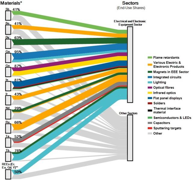
For the individual industrial sectors, another type of figure is presented. This breakdown of how much of the CRMs is used in a specific sector gives a better understanding of the dependency on certain CRMs.

This Sankey diagram (from page 39 of the report) for the Electrical and Electronical Equipment sector shows, for example, that 87% of the Germanium (ge) entering the EU are used in the EEE sector, making it the largest consuming sector of Germanium. The remaining 13% are used in other sectors:

Crossing the information from the MSA Sankey diagams that show availability of a CRM, and the information from the Sankey diagram showing demands per sector gives a good understanding on why some materials are considered critical for industries, and measures for recovering more of them from tailings or waste are meaningful.

Source: Mathieux, F., Ardente, F., Bobba, S., Nuss, P., Blengini, G., Alves Dias, P., Blagoeva, D., Torres De Matos, C., Wittmer, D., Pavel, C., Hamor, T., Saveyn, H., Gawlik, B., Orveillon, G., Huygens, D., Garbarino, E., Tzimas, E., Bouraoui, F. and Solar, S., Critical Raw Materials and the Circular Economy – Background report. JRC Science-for-policy report, EUR 28832 EN, Publications Office of the European Union, Luxembourg, 2017, ISBN 978-92-79-74282-8 doi:10.2760/378123 JRC108710.

Access JRC report here (PDF).