Tag: MFA

EU Raw Material System Analysis

A study on key raw materials and their flows “through the EU economy, as raw materials or as parts of basic materials, components or products” has been produced by BIO Intelligence Service for the European Commission, DG GROW (BIO by Deloitte (2015) Study on Data for a Raw Material System Analysis: Roadmap and Test of the Fully Operational MSA for Raw Materials. Prepared for the European Commission, DG GROW).

It contains Sankey diagrams for 28 materials considered critical or important to European economy, such as cobalt, lithium, or tungsten.

The flows of these materials into the EU-28 geographical area (imports) as well as out of the EU-28 (exports) are displayed for all substances in the same way. Recycling of the substance within Europe is represented as a loop, leading to a kind of see-saw-ish diagram. Additions to in-use (e.g. the substance being part of a product in use) and a certain amount of the substance being disposed off (e.g. as waste) are also shown as arrows to the right. Below is the diagram for cobalt. Flows are in tonnes for the year 2012 (t/y).

All Sankey diagrams are color-coded the same-way, providing additional information whether the material (in the case above: cobalt) is imported as raw material or as part of a product, and whether it is exported as processed material, waste, or also as part of a product.

The study can be downloaded from this page or directly here (PDF, 6 MB)
How Circular is the Global Economy?

I had previously reported on Sankey diagrams being used in articles on circular economy (earlier this year in January and back in 2013). Researchers in the field of MFA, circular economy and urban mining apparently love to use them…

Here is another one from an article by Willi Haas et.al. published a few weeks ago (How Circular is the Global Economy?: An Assessment of Material Flows, Waste Production, and Recycling in the European Union and the World in 2005; DOI: 10.1111/jiec.12244).


Open Access @ Journal of Industrial Ecology, via Green Manufacturing blog

The answer to the question raised in the title is answered visually: Not very circular!

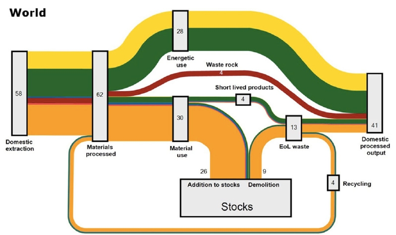
The above Sankey diagram is for “all societal material flows globally”, world mass flows moved by mankind. 62 gigatonnes (Gt) of material processed, out of which 58 Gt are newly extracted, and only 4 Gt recycled. “From such a system-wide metabolic perspective, the degree of circularity of the global economy measured as the share of actually recycled materials in total processed materials appears to be very low, at 6%.”

Fossil fuels (yellow) are converted to energy, most biomass (green) ends up as gaseous emissions or solid waste. Construction materials are in orange and metals in blue and these add to stocks of buildings, infrastructures, and other goods with a lifetime longer than a year. The two red arrows are for industrial minerals and “waste rock” (would that be tailings from mining?). Note: The legend is cut off in the screengrab above (please check the original article, page 6).

Interesting article, make sure you read it (open access). It also features a second similar Sankey diagram for Europe (EU-27). Beautiful and intelligent use of a Sankey diagram.

Japan Material Flow 2003

Another wild like-to-be Sankey diagram. Found this on a resources and links list related to ‘material flow’ hosted at Hiroshima University.

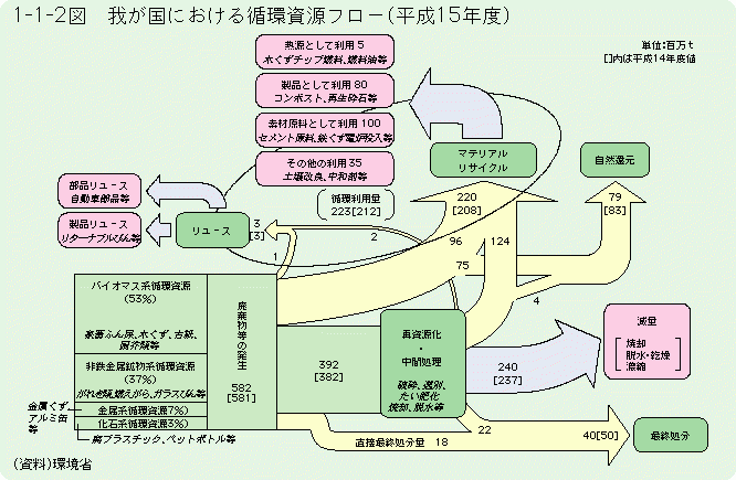
The diagram is from a white paper on a ‘Recycling Society’ published 2006 by the Japanese Environment Ministry (HTML version). Data is for the year Heisei 15 (=2003), the book was published in 2006.

The title 平成15年度における我が国の循環資源フロー can be translated as ‘The resource flow cycle in Japan in 2003’ (any other suggestion from a native Japanese speaker out there?).

Flows are in million tons (百万t) per year as indicated in the top right. Values in square brackets relate to the previous year (2002). Flows are not to scale and their width seems to be chosen almost deliberately.

The diagram itself is a very interesting depiction of national material flows. Starting out from the 582 million tons of material (green box lower left), a large portion (220 million tons) is recycled, either directly as rejects from production (96 million tons) or after product use (124 million tons). 3 million tons are reused.

Still trying to figure out some more translations… three more thoughts:
(1) Could this general diagram setup serve as a role model to visualize reuse and recycling in a country. What are the common standards in national MFA accounts for this?
(2) Can I do this more nicely with a modern Sankey diagram software? Would be a nice challenge (mostly for the Kanji characters!)
(3) What would be the picture for Japan in 2015 in comparison to 2003?

Lead Flows with Regional Scope

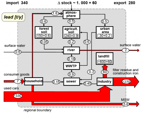
Material Flow Analysis (MFA) looks at substances or materials, often with a regional or national scope. MFA also has a stronger emphasis on stocks and stock changes. From the MFA blog (see blogroll on the right) comes the below diagram on lead flows.

The grey area delimits a region. Lead flow quantities are in tonnes per year. ‘Imports’ (to be understood as contamination or ingression here) to the region are from the left, ‘exports’ to the right. There is a net increase of lead ‘stocks’ in the region (accumulation in landfill).

Flows are on the same scale only for smaller quantities. The two large flows would have to be drawn much wider if they were on the same scale. Instead they have an upper cut-off indicated by the labels “240” and “330”.…

Circular Economy Sankey Diagrams

Yesterday it became known that the European Commission would shelve their circular economy package of waste, recycling and incineration laws for now, in favour of an even more ambitious legislation to be presented by end-2015 (read here or here).

That led me to browse tweets using the hashtag #circulareconomy, and I ended up unearthing two nice Sankey diagrams…

The first one is by WRAP UK, showing the EU-27 material flows estimated in 2020. This is not for a specific type of material, but all material.

Flows are in million tonnes, with the 2020 values in blue, and the current (2010) figures in brackets below for comparison. There are three nodes: ‘Direct Material Input’, ‘Domestic Material Consumption’ and ‘Waste’. Unfortunately the size of the node icons is too large, and the flows are difficult to see. But still, this is a nice idea!

The main message is that in comparison to 2010, Europe could have 350 million tonnes of recycled material in 2020. Check out these Sankey diagrams by WRAP UK that basically convey the same messsage, but are less infographic.

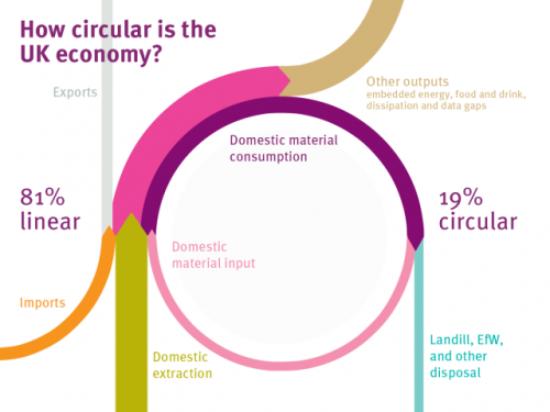
Another Sankey diagram I found when browsing through the tweets was this one below. The title of the diagram is “How circular is th UK?”.

I found it in a blog post ‘Designing Out Waste Consortium’ by Ramon Arratia on Interface’s Cut The Fluff blog on sustainability, but it is originally from this Green Alliance blog post by Julie Hill.

No values shown along the flows in this Sankey diagram, but neatly shaped circular flows. The question raised in the title is answered prominently with the message that 19% of the material in the UK is led in a loop (pink flow).

EU Steel Flows, from MFA Diagram

Browsing through the blogs on data visualization and infographics (check my blogroll) I often find inspiration in Nels’ MFA diagrams. From time to time I like to beef up the skinny MFA diagram skeletons a bit by converting them into Sankey diagrams. At the same time, by translating the numbers into Sankey arrows one gets a better idea what the main (mass) flows are.

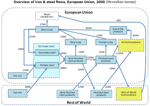
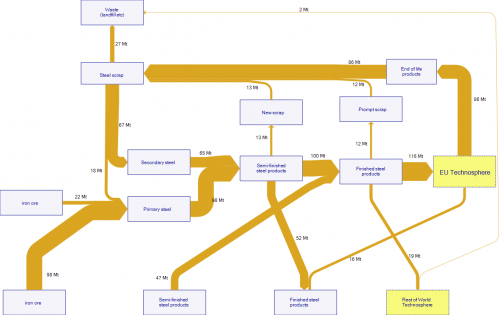
This is a MFA diagram on Iron and Steel Flows in the European Union in 2000 as found in this post. Original data is from a 2008 OECD study, flows in Mt.

The description of the diagram says: “A study of iron and steel flows in 2000 in the European Union showed that an input of about 120 Mt of iron ore (of which 98 Mt was imported) yielded 98 Mt of primary crude steel (i.e. produced directly from iron ore and coke). A further 65 Mt, representing 40% of total crude steel production, were produced as secondary crude steel, produced from scrap steel.”

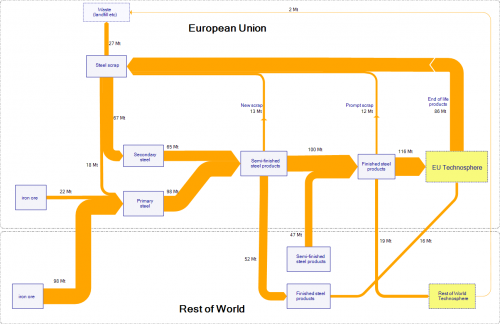
I did a first quick version of the flows as Sankey diagram, trying to stick very much to the layout of the original diagram. All nodes are the same size and more or less located at the position of the master. It already shows that the main steel flows: iron ore imported into the European Union, and steel scrap being recycled within the EU. Export of semi-finished steel products from the EU to the Rest of World (52 Mt) almost balanced with 47 Mt of semi-finished steel products imported into the EU.

I tried to improve the diagram by removing the three nodes ‘New Scrap’, ‘Prompt Scrap’ and ‘End of Life products’ since there is no transformation of these flows at the nodes (also no change in quantity). Further I reduced the size of some boxes and dragged the ‘Semi-finished Products’ (Rest of World) box closer to the ‘Finished Steel Products’ (European Union) box to avoid crossing streams. Wherever possible I try to avoid diagonal arrows.

The final result also has the Rest of World and European Union grouping. I am not to happy with the colors though.

Your thoughts?

Show it with Sankey Diagrams

Phosporus in the natural environment and the food chain has been a topic of several posts on my blog. So it didn’t come as a surprise to find yet another diagram on phoshphorus flows over at Nels’s MFA Diagram blog (one of the blogs I follow closely, see blogroll).

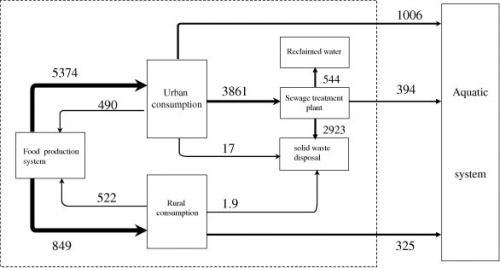
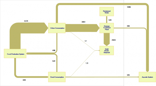
MFA diagrams have their focus on the nodes and the build-up of stocks. Sometimes they get a touch of Sankey diagram with the arrows having different magnitudes. The MFA diagram below is for phosphorous flows in China 2008 (original source: Min Qiao, Yuan-Ming Zheng, Yong-Guan Zhu, 2011. Material flow analysis of phosphorus through food consumption in two megacities in northern China). Values are in tonnes.


(click image to enlarge)

We can detect arrows with three different brush widths (my guess is 1px, 2px and 4 px), each standing for a value range into which the actual flow quantity falls. This may, however, bes somewhat misleading when having a quick glance at the diagram.

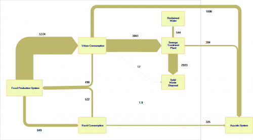
I quickly “translated” the above diagram to a Sankey diagram with flow values being actually to scale.


(click image to enlarge)

Here it is quite clear where the major phosphorus flows are located (from food production via urban consumption to sewage treatment plant and solid waste disposal: 2923 out of 5374 tons end up here). The other flows are comparatively small, with the phoshporous flow going directly to the aquatic system worth a mention. Two small flows in the center of the diagram are negligible, they are in fact so tiny in comparison to the major flows that they even don’t show up (or just as a hairline) here.

I have therefore added a minimum width of 1 px for small flows so that the annual 17 tons from urban consumption and the 1.9 tons from rural consumption to the solid waste disposal are at least visible (albeit not to scale with the other flows any more).


(click image to enlarge)

Final phosphorous sinks are solid waste disposal (landfill?) and the aquatic system.

3D circular Sankey ugliness

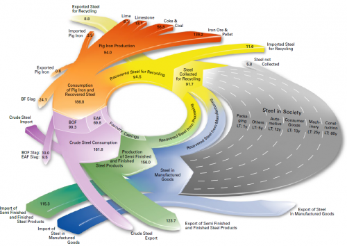
You might remember the radial Sankey diagrams “invented” by Visio guy (here). This 3-D version below left me speechless… I hope the guys at junkcharts dedicate a critical evaluation to it….


(view the original diagram here)

This is from EUROFER (The European Confederation of of Iron and Steel Industries) and shows steel flows in fifteen European countries (EUR-15) in million metric tons. Values are for 2004. The grey area is supposed to represent steel accumulated in capital goods (machinery, buildings, …) over a certain life time.

Whooo woah, that’s a merry go round, I feel dizzy already!