Tag: video

Sankey Diagrams in Excel

Mark over at the Excel Off The Grid blog has a great new post on how to ‘Create a Sankey diagrams in Excel’.

Mark shows how to build a simple 2 category relationship diagram by using stacked area charts and reversed stacked bar charts. By layering the individual charts with mostly transparent colors (except the actual arrow), he manages to get a very neat diagram. It even allows changing the spacing between the start and end nodes, as well as the segment length of the horizontal first and and last arrow segment.

That is ‘big ass’-Excel usage!! Check out this video to see how the source data is prepared (some SUMIFs involved here) and the Sankey diagram is made. It is well worth watching all 18 minutes, in my opinion.

And if you want to try it out, you can download the template and start building from there. Read Mark’s post here.
Living Sankey Diagrams

A reader of the blog, Olov, has produced the following video. He calls this a “Living Sankey Diagram”. The background can be found on the Sweco Blog (in Swedish). Basically he suggests to take energy declarations for buildings (‘Energideklarationen’) one step further and have visual energy monitoring for building using realtime data.

Energy consumption of a house is shown over a period of a year with up to 3 or 4 datasets per day. We can see heat (red) and electricity (orange). Not sure about the temperature indication at the top left, possibly meant to be the difference to a default temperature (Olov, if possible, please explain by commenting below).

Main consumers in the building are hot water generation (‘Tappvarmvatten’), room heating (‘Radiatorer’), ventilation and cooling. Some PV cells (‘Solceller’) at times add to the purchased energy (‘Köpt Energi’). The pink flow shows heat recovery (‘Värmeåtervinning’). The building is classified in energy class B.

Here, a data series has been used to produce the Sankey diagrams and then the frames were converted to a video. This makes for a nice effect and allows watching your energy flows in retrospect. For example, the PV cells feed energy mostly during the months, while in the same period heat demand and recovery is very limited.

This was apparently produced using e!Sankey. To really do an energy monitoring and produce the Sankey diagram every couple of minutes, there is a software development kit (SDK) the allows linking to a data source (energy measurement data) and pushing the “living Sankey diagram” to a website. Another example can be found here.

Big Oil Climate Lobbying, InfluenceMap

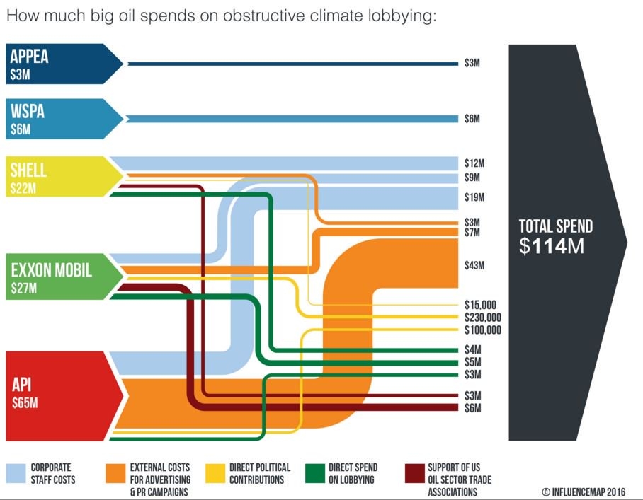
The UK-based non-profit Community Interest Company (CIC) called ‘InfluenceMap’ has produced the below Sankey diagram on obstructive climate lobbying of oil firms and interest groups. These are the spendings in US$ for an unspecified year (possibly 2015).


Source: InfluenceMap, Media Downloads
(via Hypergeometric blog)

Streams are color coded to specify the type of spending (e.g. staff cost, direct lobbying, party donations). Note that the yellow flows (in the range up to 230.000 US$) are not to scale with the others that are on a million US$ range. Some of the elements that represent the sources and the black sum arrow are also overemphasized, showing a height that is larger than the sum of the individual arrow magnitudes. So this is not fully adherent to the principles of a Sankey diagram … but to be fair: they never claimed that it is a Sankey diagram.

This is maybe the first Sankey diagram ever to be featured in the US Senate. Senator [D-RI] Sheldon Whitehouse (yes, that really is his name … you just have to love his “Whitehouse Statement on …” catchphrase) used it in a US Senate testimony in April 2016.

Watch the video how the Whitehouse does quite well explaining the streams of money and to underpin his message with the Sankey diagram. Jump in at 0:25 secs to see Sankey make its Senate appearance…

Sankey Diagram Video Production Line

Just discovered this new Sankey diagram video via e!Sankey Forum. Apparently just meant as a a show case for the possibilities offered by the e!Sankey software development kit (SDK).

We can see mass flows on a production line with two machines feeding ‘Item A’ and ‘Item B’ into the main production line.

These seem to be hourly flow values over a 30-hour time span. There are some red warnings indicating low buffer, and even one or two times when the production runs dry. Interesting…

Found that there are some more (educational) videos on youtube now that deal with Sankey diagrams.

Student Videos on Sankey Diagrams

Found the below two videos while browsing for the keyword “sankey diagrams” on youtube.com.

This seems to be the output of a student assignment at Universidad Nacional de Colombia. Note that the narrative is in Spanish.

In the first video Marcela Rojas explains the basics of building up Sankey diagrams and how to create a national energy balance diagram.

In the other, longer video Paola Cifuentes shows us how she created the ‘balanco energetico minero de Colombia’.

Enjoy!