Tag: Europe

EU Food Flows 2011

This comprehensive and well-structured Sankey diagram on food production, waste and consumption is featured in an article ‘Quantification of food waste per product group along the food supply chain in the European Union: a mass flow analysis by Carla Caldeira et al. (published as open access article under CC BY license in: Resources Conservation and Recycling · June 2019). (Addendum 23/10/20: The Sankey diagram is a (minor) adaptation of a diagram produced by Kemna et al. 2017 in a study from VHK for the European Commission. See comments section for link). The paper “presents a high-level top-down approach to food waste accounting in the European Union.”

Flows are in megatonnes (Mt) wet mass for the year 2011. The diagram shows “feed and food flows, excluding soft drinks, mineral waters and some non-perishable foodstuffs (salt, coffee, etc.)”.

The figure is split in two parts. On the left we see the stages production, processing and distribution, with gaps between the streams to better be able to distinguish them. The food flows reaching the consumption stage (365 Mt) are bundled and shown in a much more compact diagram inset, but still on the same scale, it appears.
Here we can differentiate the amount going to food service (restaurants etc.) and consumption in private households. We also learn that approximately 60 Mt of what is being purchased for consumption still ends up as food waste.
In the other hand, a large portion of rejects and waste in the production stages is fed back into the system (chartreuse colored flow at the bottom) and being used as animal feed. Much more detail there to discover…

Check out this related Sankey diagram on Material Flows in the U.S. Food System
European Copper Streams 2012

After all these colorful Sankey diagrams, here is something soothing for your eyes.

This b/w Sankey diagram shows European copper streams in 2012. It is taken from the 2017 dissertation by Simon Gloser-Chahoud of Technical University Clausthal in Germany with the woooh title ‘Quantitative Analyse der Kritikalität mineralischer und metallischer Rohstoffe unter Verwendung eines systemdynamischen Modell-Ansatzes’ (‘Quantitative analysis of the criticality of mineral and metallic raw materials using a system-dynamic model approach’ …thanks Google Translate!).

Flows are in kt. The dotted line references the geographical boundary of the EU-27 states. We can see that 1.100 kt copper concentrate was imported and 830 kt came from mines in Europe. Import and export of finished products containing copper is almost balanced. The overall addition of copper to the European stock (estimated at 90.000 kt) was at 3.200 kt. Copper in waste streams leaving this stock amounted to 2.500 kt, of which 1.750 kt were fed back into the copper production.

Embodied Emissions of Products in the EU

Embodied emissions (similar to embodied energy) is an interesting perspective on the environmental impact of products we use. It takes into account the full life-cycle of the product and aggregates the emissions produced from raw material extraction, from the actual manufacturing, from the transports along the supply chain, and from the disposal of the product after use.

In many cases ’emissions’ is reduced to greenhouse gas emissions (GHGs) and the impact on climate change caused along the product’s life cycle. In this case we could colloquially also call it the ‘carbon rucksack’ of the product.

Kate Scott from the Sustainability Research Institute, School of Earth and Environment, University of Leeds (UK) in her article ‘Extending European energy efficiency standards to include material use: an analysis’ suggests the European Union should – in addition to its energy efficiency policies – add consideration of material efficiency of products to their climate change strategy. GHGs are considered a lead indicator for material efficiency, as “material-intensive manufactured products … offer significant scope for emissions reductions along product supply chains.

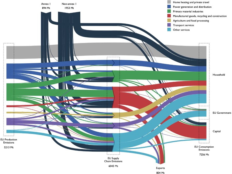
This Sankey diagram of supply chain emissions associated with global product flows of the EU is presented.


Source: Kate Scott, Katy Roelich, Anne Owen & John Barrett (2018) Extending European energy efficiency standards to include material use: an analysis, Climate Policy, 18:5, 627-641, DOI: 10.1080/14693062.2017.1333949 distributed under Creative Commons Attribution License.

The diagram doesn’t show much detail as to the individual stream and relies heavily on color coding. Only group sums are shown. Data is for the year 2007. Flows are in Mt (megatonnes) CO2-equivalents embodied as emissions in the products.

“Production emissions in the EU in 2007 were 5,213 MtCO2e, with the width of each flow on the left-hand side of Figure 1 representing production emissions by sector, the conventional accounting approach. In the same year, the EU’s consumption-based emissions, the right-hand side of Figure 1, were 39% higher, at 7,256 Mt due to the EU’s trade balance. Emissions embodied in EU imports were 2,847 Mt and emissions embodied in their exports were 804 Mt, meaning that the EU is a net importer of 2,043 MtCO2e (imports–exports).”

The black streams from the top represent embodied GHG emissions from raw materials, finished products or product components imported into the EU.

Read the full article here.

European Plastics Packaging Waste Study

Deloitte Sustainability in a 2017 report titled ‘Blueprint for plastics packaging waste: Quality sorting & recycling’ showed the results of “a quantitative and a qualitative analysis of the main packaging resins (PET, HDPE, LDPE, PP) based on the flows in France, Germany, Italy, Spain and the UK, which represent 70% of the plastic waste generated in Europe”.

The plastic waste streams for the year 2014 are shown as a Sankey diagram on page 16.


The collection rate that year on a European average was at 37% and the recycling rate at 13%. Most of the packaging waste goes to incineration and landfill.

The study also looks at improvement potential in plastics waste collection and recycling. The plastic packaging waste streams for a possible 2025 scenario with a collection rate of 74% and a recycling rate of 55% is also shown as Sankey diagram for comparison.

European Energy Transport Capacity 2030

This is an interesting kind-of-a-Sankey figure. Back in August I had posted on Nordic Transport Energy in 2050 with two Sankey diagrams from the ‘Nordic Energy Technology Perspectives 2016’ report published by IEA.

The topic of this diagram (taken from the same report) is the energy transmission or transport capacity between different regions in Europe and covering the area of the European Network of Transmission System Operators (ENTSO-E).


© OECD/IEA 2016 Nordic Energy Technology Perspectives 2016, IEA Publishing. Licence: www.iea.org/t&c

To visualize transmission capacity, Europe has been cut into energy regions, and a gap has been inserted between them to be able to distinguish them better. The width of the “bridges” represent the available energy transport capacity between these regions in 2030.

Some countries are divided into several energy producing regions. For example, if you look at Sweden, it is divided into SE_N1, SE_N2, SE_M and SE_S.

The bands are non-directional, so we do not know which region delivers to which region. And probably the energy transport will be able to go in both directions.

Check out the full report here.

Nordic Transport Energy in 2050

The report ‘Nordic Energy Technology Perspectives 2016’ published by IEA looks at energy scenarios for Northern Europe / Scandinavia and pathways to carbon-neutrality. Several Sankey diagrams are included in this extensive study.

These are the energy flows in the nordic countries caused by transport. The first Sankey diagram is for the current situation (data from 2015), the second for a 2050 carbon-neutral scenario (CNS).


© OECD/IEA 2016 Nordic Energy Technology Perspectives 2016, IEA Publishing. Licence: www.iea.org/t&c

In the 2050 scenario we see a massive shift from diesel and gasoline powered transport to biofuels and electricity. This ambitious target could be achieved with “fuel efficiency improvements on existing technologies but also rapid penetration of alternative drivetrain technologies such as hybrids and electric vehicles” (p. 66).

Check out the full report here.

Material Flows in the EU economy

Up on the EUR-Lex, the European Union’s database on laws, regulations, publications and reports is a staff working paper ‘Measuring progress towards circular economy in the European Union – Key indicators for a monitoring framework’ meant as accompanying background text for a ‘Communication from the Commission to the European Parliament, the Council, the European Economic and Social Committee and the Committee of the Regions on a monitoring framework for the circular economy’.

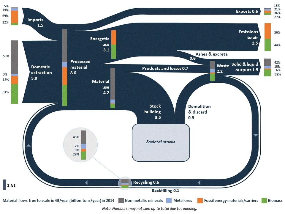
And it shows this beautiful Sankey diagram on material flows in the EU economy (2014).

Beautifully crafted, this diagram shows that “8 billion tonnes of raw materials were processed during 2014 in the EU: of this 1.5 billion (i.e. around 20%) are imported, which indicates the EU dependency on imports of materials. Out of the 8 billion tonnes of processed materials, 3.1 billion tonnes are directed to energetic use, 4.2 to material use and 0.6 are not used in the EU but exported.”

Flows are in Gt/yr (billion tons per year. The composition of the flows is presented at certain points in the diagram as bar charts on top of the dark blue bands: metal ores, non-metallic minerals, fossil energy materials/carriers and biomass. For each of those four groups individual Sankey diagrams can also be found in the working paper.

The EU never stops to surprise me! In this case in a positive way, as Sankey diagrams seem to have arrived at the top echelons of European policy making (or at least with their staff).

Precious Metals and Critical Raw Materials

The EU funded PROSUM research project looks at ‘Prospecting Secondary raw materials in the Urban mine and Mining wastes’. The more than 15 institutions participating in the project have recently published their findings in a final report.

The report has some interesting Sankey diagrams on market input, stocks, waste generation and waste flows for product groups such as vehicles, batteries, precious materials and selected critical raw materials (CRMs) contained in batteries, electrical and electronic equipment (EEE) and vehicles.

Here is the diagram for vehicles in the EU28+2 (=EU28 plus Switzerland and Norway) market. Data relates to the year 2015.

Flows are in tons and ktons, blending two scales in one diagram. This merits its own post, I think. (read it here)

The electric vehicles currently driving on the roads are shown as “Stock”, meaning that the materials are in use and that they could eventually be recovered at the end of the life of the vehicle. This is the large stackd bar between “POM” (placed on market) and “De-reg Vehicles”. Again this stacked bar uses two different scales (tons and ktons).

Official report citation: Jaco Huisman, Pascal Leroy, François Tertre, Maria Ljunggren Söderman, Perrine Chancerel, Daniel Cassard, Amund N. Løvik, Patrick Wäger, Duncan Kushnir, Vera Susanne Rotter, Paul Mählitz, Lucía Herreras, Johanna Emmerich, Anders Hallberg, Hina Habib, Michelle Wagner, Sarah Downes. Prospecting Secondary Raw Materials in the Urban Mine and mining wastes (ProSUM) – Final Report, ISBN: 978-92-808-9060-0 (print), 978-92-808-9061-7 (electronic), December 21, 2017, Brussels, Belgium