Tag: water

China Pearl River Delta Water System

A follower of this blog sent me an e-mail with a Sankey diagram. I think it deserves to be presented here.

He writes [original e-mail, wording slightly modified by me]:

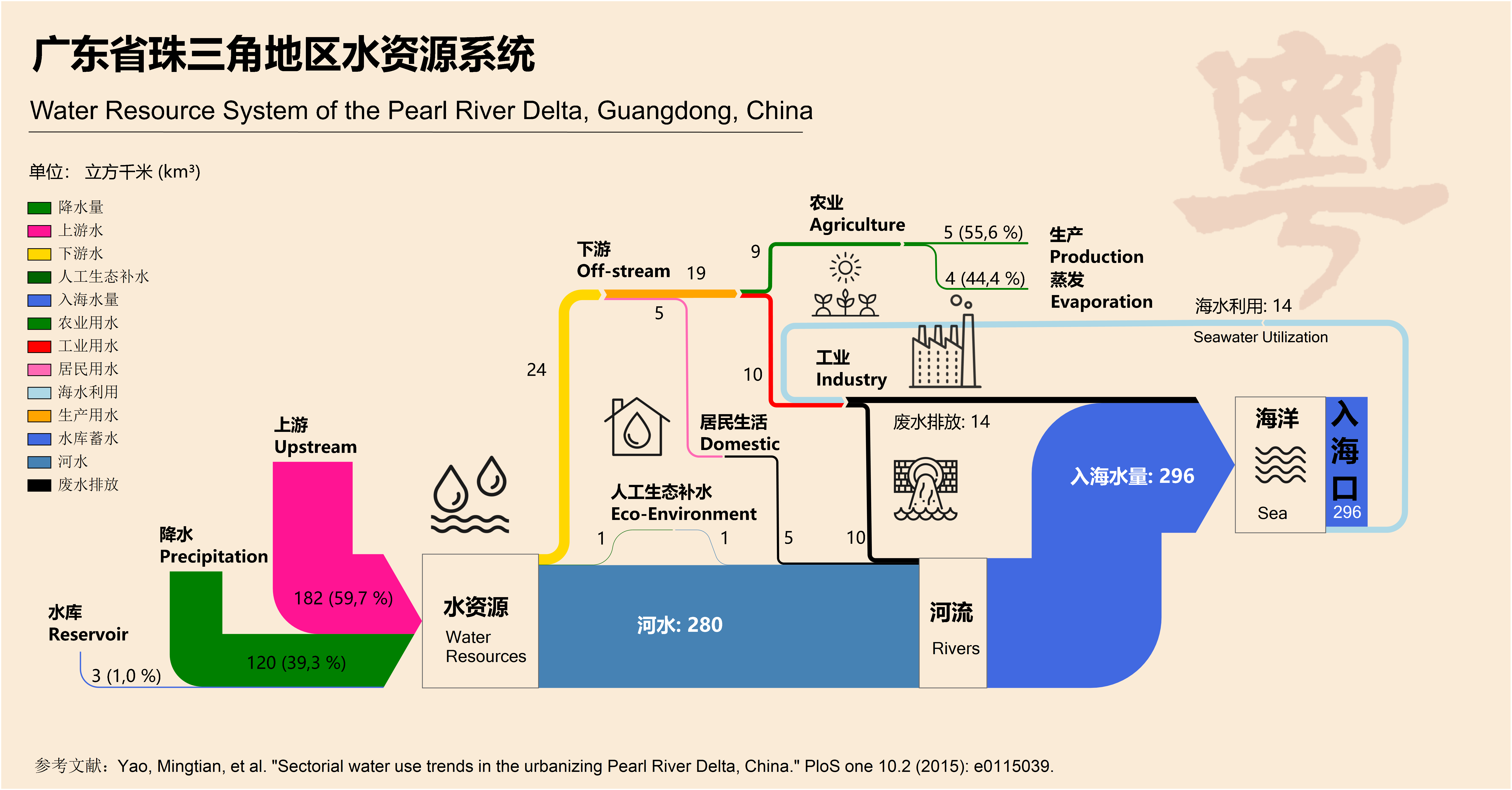
… I was inspired to do this by the Water Use in Qingdao post on your blog. When I discovered an article that had a schematic figure of the Pearl river water use system in my home province Guandong (广东省) I took on the task to create a nice Sankey diagram. I hope you like it. You are free to use it on your blog.

This is the original figure from an open access article Yao M, Werners SE, Hutjes RWA, Kabat P, Huang H (2015) Sectorial Water Use Trends in the Urbanizing Pearl River Delta, China. PLoS ONE 10(2):e0115039.doi:10.1371/journal.pone.0115039.

And here is the Sankey diagram that he created.

Flows are im cubic kilometres (km³) per year. Most of the water (280 km³), both from the upstream river and precipitation in the area, runs directly into the sea. A comparatively small part (24 km³) is taken for industry, agriculture and domestic use. Some water (14 km³) is also extracted from the sea for industry (cooling?).

Nicely done, somewhat colorful … I like! Thanks for sending this to me to share it with the public. A worthy farewell Sankey diagram…
Hydrological Cycle

A 2013 booklet ‘The Energy Sustainability Challenge: How will natural resource constraints change the way we produce and use energy?’ published by BP describes scientific findings in the fields of energy and natural resources. In the section on ‘New tools for systems analysis’ they present two Sankey diagrams. “Sankey diagrams are used to visualise how a resource moves from source to use.”


This one shows the hydrological cycle for precipitation over land areas. “Starting at the left, the distribution of rainfall among the continents is illustrated, with the numbers indicating the volume of water measured in km³. Of that water, the majority falls on forests, followed by grasslands, cropland and other land types. The water contributes to the products of these lands – terrestrial ecosystem services, food and other land use.”

Hong Kong Water Flows

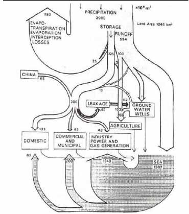
Sometimes I get a little nostalgic… Here is a Sankey diagram of water flows in Hong Kong. My guess is that it pre-dates 1997, so this would be the former British colony Hong Kong. Originally published in Worldbank’s Eco2 Cities book (Hiroaki Suzuki, Arish Dastur, Sebastian Moffatt, Nanae Yabuki and Hinako Maruyama. Eco2 Cities: Ecological Cities as Economic Cities. 2010), it is pictured in this guide(link currently broken) on page 41.


Flows of water are shown in 1.000.000 m³ of water (difficult to see, but I read this as 10 to the power of 6). Obviously hand drawn, so flows are not fully to scale.

Hongkong receives an average 2.000 Mm³ of precipitation (per year?) on a land area of 1.046 km² (interesting: todays area is 1.108 km²). Most of the water directly evaporates, and a large chunk goes into the sea.

This is considered an early example of a material flow analysis (MFA) visualization, and also of an urban metabolism study.

Gudalquivir River Basin Water Flows

I discovered this Sankey diagram in an article by Gutiérrez-Martín, C.; Borrego-Marín, M.M.; Berbel, J. on ‘The Economic Analysis of Water Use in the Water Framework Directive Based on the System of Environmental-Economic Accounting for Water: A Case Study of the Guadalquivir River Basin” (published in Water 2017, 9, 180, open access article licensed under Creative Commons (CC BY 4.0). The Guadalquivir river basin is in Andalusia, Southern Spain.

The authors note that Sankey diagrams for water flows in a river basin or catchment area are useful because they show “at a glance, several aspects of the water cycle such as economic units, abstraction, supply, use, consumption, and returns to environment (soil water not included). In studying water use pathways, Sankey diagrams illustrate quantitative information about flows, their relationships, and their transformations.”

We see water taken (“abstracted”) from surface or groundwater by water supply companies and other users, distribution and water consumption by sectors, water flows ‘lost’ to the atmosphere and return of water to the environment.

Flows in this diagram are in hm³ (cubic hectometres). Note that they decided to use another scale for water used for energy generation (x 10 hm³) since otherwise the yellow-beige would be 10 times wider and maybe spoil the whole diagram.

The diagram has a top-down orientation and numerous loops and flow feedbacks, in contrast to the typical distribution diagrams (aka alluvial diagrams). It is well structured, nicely crafted and pleasing to the eye. Definitely on my top 10 list for 2018.

Cape Town Water Use Sankey Diagram

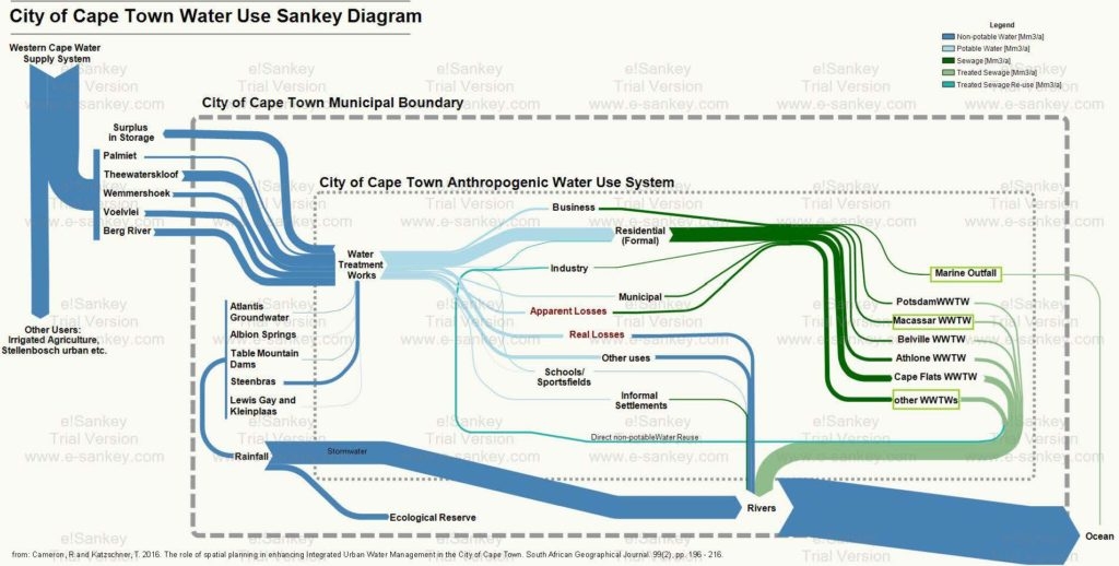
From a post ‘Cape Town’s water crisis : Towards a more water secure future’ on the Future Cape Town blog comes this Sankey diagram on the water use in the city of Cape Town (South Africa).

The author of the diagram, Rebecca Cameron, is with MCA Urban and Environmental Planners and looks at how Cape Town could transition towards a more water secure future. This Sankey diagram was originally published in her article Cameron, R and Katzschner, T. 2016. The role of spatial planning in enhancing Integrated Urban Water Management in the City of Cape Town. South African Geographical Journal. 99(2), pp. 196 – 216.

Absolute flow values are not given in this version of the Sankey diagram. Flows are in million cubic metres per year (Mm³/a). Water from five different sources outside the municipality feed the city of Cape Town, as well as five sources within the city. A breakdown of water supplied by the municipal water works is shown. Additional color coding of the arows indicate water quality (dark green = sewage, light green = treated water).

The author explains:

“This diagram is helpful in that it places all aspects of the water system in to one diagram. Here, water supply, water use, wastewater treatment and stormwater have been considered as a single system where too often the urban water cycle is fragmented when addressed within different sectors. The arrows of flow follow a key to represent the quantity and quality of water. The size of the arrow of flow is proportionally indicative of the quantity of water that flows from one process to one another. The colour of the arrows indicates the quality of the water flow; this includes non-potable, potable, sewage, treated sewage, and treated sewage for reuse. This is important to represent as, to intervene in an urban water cycle, both quantity and quality of water must be considered and used appropriately to move towards a more efficient and sustainable water system.”

From the rivers most of the water goes to the ocean. Through evaporation and precipiation it (hopefully) replenishes the reservoirs again that feed the city (this last part not shown in the diagram).

Desalination by RO Process Retrofit, Sankey

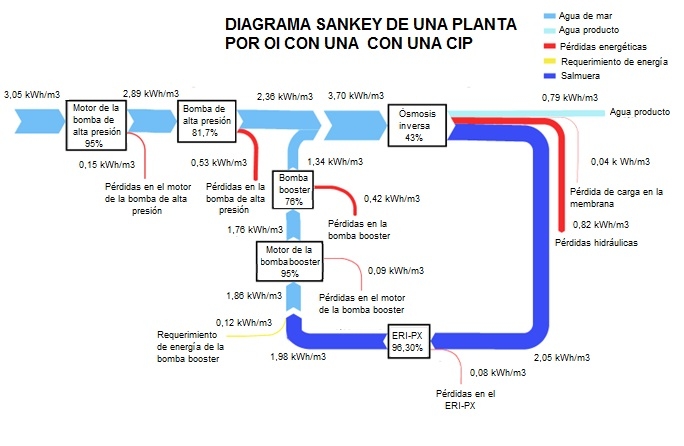
Removal of salt from seawater (desalination) is used to produce drinking water and water for irrigation in the Canary Islands, Spain. This is an energy intensive process.

The article ‘La importancia de los sistemas de recuperación de energía en la desalación de aguas en Canarias’ (The importance of energy recovery systems in water desalination in Canary Islands) by Baltasar Peñate Suarez and Sigrid Arenas (both of Departamento de Agua del Instituto Tecnológico de Canarias, ITC) on the IAGUA blog (in Spanish) describes how existing reverse osmosis (RO) salt removal systems with Francis turbines were retrofitted to be more energy efficient.

The two Sankey diagrams in the blog post visualize the energy flows before and after the retrofit. Energy consumption per cubic metre of water desalinated could be reduced from 3.65 kWh/m³ to 3.05 kWh/m³ by installing isobaric energy recovery devices and last generation membranes.

Check out the blog post to see both Sankey diagrams.

Spain’s Segura River Water System

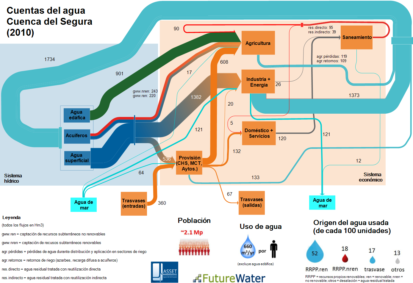
This Sankey diagram for the water system of Segura river in Spain shows “the interchanged fluxes between the hydrological and the economical system”.

This is an output from the EU-funded ASSET (Accounting System for the SEgura river and Transfers) research project and can be found on the FutureWater website. Authored by Sergio Contreras and Johannes Hunink of Future Water (Contreras, S., J.E. Hunink. 2015. Water accounting at the basin scale: water use and supply (2000-2010) in the Segura River Basin using the SEEA framework. FutureWater Report 138).

Flows are for 2010 and measured in cubic hectometres (hm³, 1 hm³ = 1000000 m3 = 1 GL). The left part with the light blue backdrop is the actual hydric sector, while the right side with the light orange backdrop encompasses the technical/economic sector.

Water is extracted from surface waters (agua de superficie), ground water (acuiferos), and – interesting pespective – from soil water (água edáfica). Water from soil (green arrow, 901 hm³) is directly taken up by plants, so consumption is in the agricultural sector only. Agriculture is the largest consuming sector, followed by industry and energy generation, and water provision to households.

Much of the releases of water from industry and energy generation is returned to the water system (1734 hm³).

Additional tidbits of information below the Sankey diagram almost turn this into an infographic.

Water Use in Qingdao, China

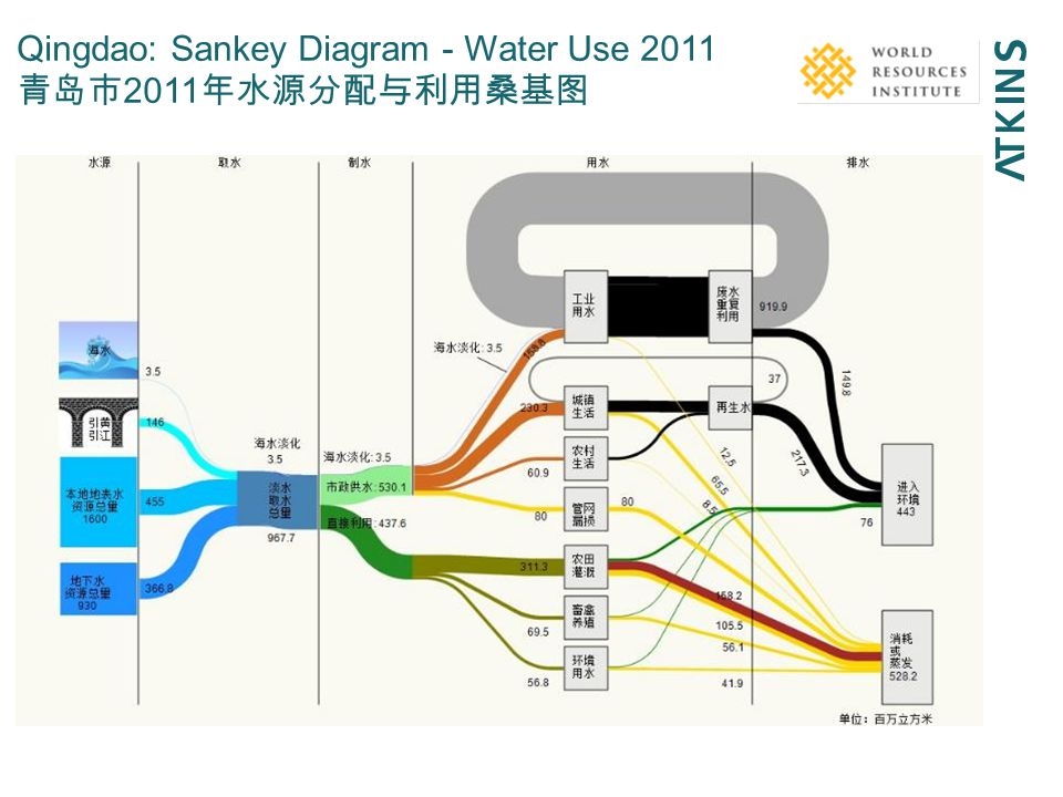
Interesting Sankey diagram on water use in Qingdao, China in 2011. This is from a presentation titled ‘Urban water security – Water-energy-food nexus’ by Josh Weinberg of Stockholm International Water Institute. Atkins and World Resources Institute (WRI) appear as co-authors.

Unit of flow seems to be million m³ (百万立方米). Water origin is mainly surface water (455 mio m³) and local ground water (367 mio m³), with some additional (146 mio m³) brought in from Yellow River and Yangtze River.

Not sure about the split shown with two green flows, possibly breaking down the water use to urban (city of Qingdao) and province.

The middle part shows consumers: Farming (?) is largest consumer with 311 mio m³ per year, followed by ??? with 230 mio m³, and use in industry with 153 mio m³. Polluted water is shown in black.

Maybe someone who reads Chinese wants to chime in…