Tag: world

Global Energy Flows 2018/2050, DNVGL

Fresh off the press last week is DNVGL’s Energy Transition Outlook 2020. This report is a “forecast of the world’s most likely energy future through to 2050” and in my opinion this is really good information. The new edition already factors in the effects of the pandemic.

The spread on pages 122/123 has the following Sankey diagrams, a comparison of the global energy landscape in 2018 and the forecast for 2050:


The individual flows are not labeled with quantities, but we get an idea from the blue stream, that represents 27 PWh/yr electricity in 2018 and 60 PWh/yr in 2050. “One striking change on the supply side of the picture is the emergence of solar PV and wind at the expense of coal and oil. Electrification more than doubles through to 2050, which leads to an increase in the overall system efficiency.”

Make sure to download your copy of the DNVGL Energy Transition Outlook 2020, to study the global energy flow Sankey diagram in more detail.
World GHG Emissions 2016

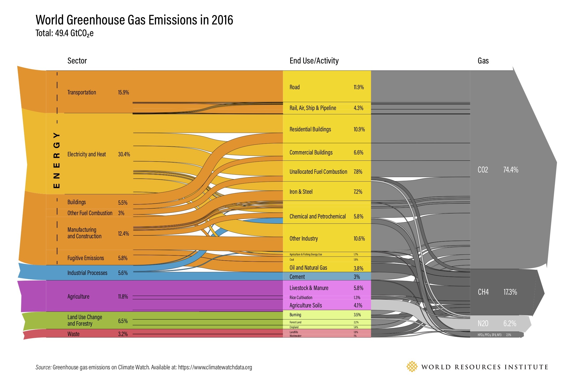
Here is an updated version of the world greenhouse gases emissions diagram for 2016. This was published 2019 by World Resources Institute (WRI) on their website.


Flows are in giga tonnes CO2 equivalents (GtCO2e). Overall emissions contributing to climate change were 49.4 GtCO2e. The first column is a breakdown per sector, the second one lists the activity causing the release. The third column shows the actual gas (GHG)

You can compare the quantities to the previous editions with data for 2000 and 2012, but mind that these figures are structured differently.

In addition to this “static” Sankey diagram there is also an interactive version that lets you explore the individual streams by hovering the mouse over the diagram.

If you like WRI’s work you might want to consider supporting them.

Hydrological Cycle

A 2013 booklet ‘The Energy Sustainability Challenge: How will natural resource constraints change the way we produce and use energy?’ published by BP describes scientific findings in the fields of energy and natural resources. In the section on ‘New tools for systems analysis’ they present two Sankey diagrams. “Sankey diagrams are used to visualise how a resource moves from source to use.”


This one shows the hydrological cycle for precipitation over land areas. “Starting at the left, the distribution of rainfall among the continents is illustrated, with the numbers indicating the volume of water measured in km³. Of that water, the majority falls on forests, followed by grasslands, cropland and other land types. The water contributes to the products of these lands – terrestrial ecosystem services, food and other land use.”

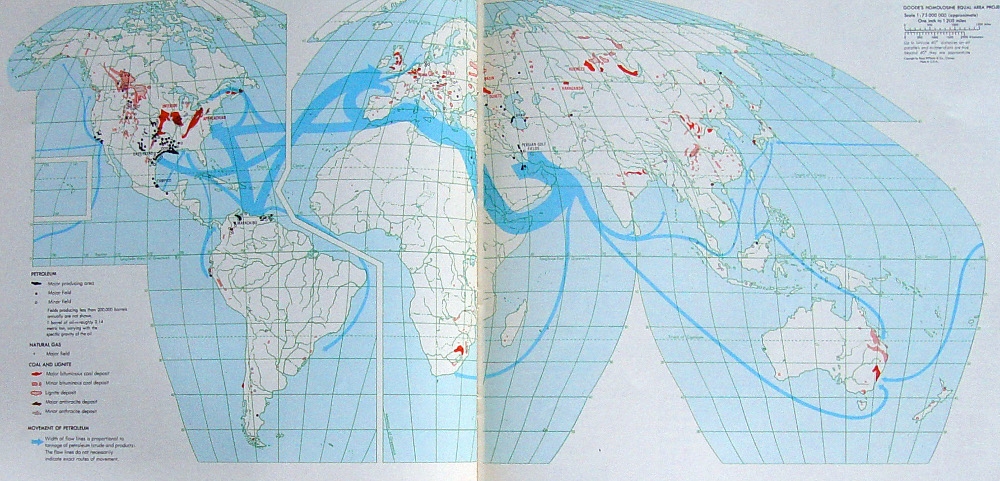
World Oil Flows Map

Did a clean up some of my hard disks and came across a number of gems I had saved. Unfortunately I hadn’t noted the sources for all of them.

Here is one of these. A photo of two facing pages in a book depicting world oil streams. You can find more Sankey diagrams on maps here on the blog if you search for the tag ‘map’. This one is different though, as it uses a special map projection (probably Goode homolosine) with a cut along the Atlantic and Hawai’i as an inset.


Unfortunately I do not know from which book that was taken. Neither do I know the year of reference or the unit of measure for the flows. We can see the oil shipments mainly starting from the Middle East and Venezuela with Europe and the U.S. as main destination markets. Additionally, areas where coal, natural gas and petroleum are extracted are marked on the land areas.

In the botton left corner the legend reads for “Movement of petroleum”: Width of flow lines is proportional to tonnage of petroleum (crude and products). The flow lines do not necessarily indicate exact routes of movement’

World GHG Emissions 2012

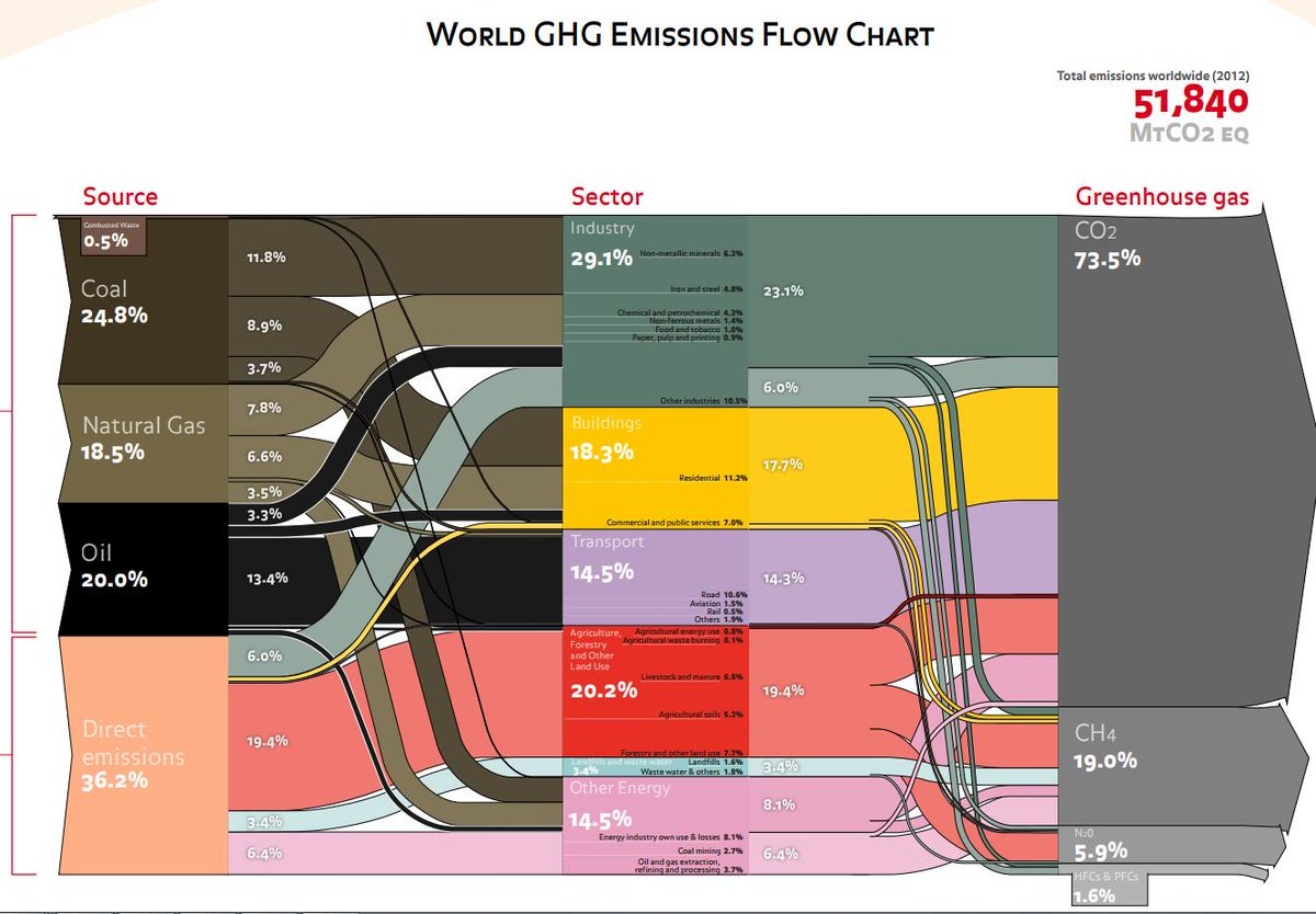
This “dense” or “block-style” Sankey diagram might look familiar to some. Indeed it is based on the greenhouse gas (GHG) emissions Sankey diagram for 2000 published by the World Resources Institute WRI (see this post). Consulting firm Ecofys (now Navigant) has updated the data and refined it, but kept the overall appearance of the figure.


via @ChrisChambers64

Total emissions of climate gases were 51,840 Mt Co2-eq. Carbon dioxide and methane contributed more than 90%. The industry sector is the largest emittor, followed by agriculture and land use.

Very clear and compact Sankey diagram, conveying the most important information about GHG emission sources.

Global Agriculture Biomass Flows 2010

An interesting Sankey diagram on Global Biomass Flows 2010 can be found on the PBL Netherlands Environmental Assessment Agency website.


(Author: PBL, published under Creative Commons License CC BY 3.0)

This is from a research report ‘Integrated analysis of global biomass flows in search of the sustainable potential for bioenergy production’ published 2014 (available here) that estimates the worldwide biomass flows. It explains: “The biomass flows in the agro complex are presented in ExaJoules in the Sankey diagram (…). Using energy density data for all common commodities, the mass data have been converted to energy data. The energy content depends on the moisture content. In this study, the commonly referred weight–energy ratio’s were used.”

Basically, the diagram is made up from two main strands or pathways for biomass that are interlinked: In the top half the food production from agricultural soils (both crops and livestock breeding). In the lower half the grassland/meadows.

This is exclusively for the agricultural sector. The forestry sector is covered in a separate Sankey diagram (in one of my upcoming posts).

Note that small flow quantities (<3 EJ) are not to scale but rather have a minimum arrow width to keep them visible.

Global Food System Sankey

Food losses and food waste has been addressed in a number of scientific research papers in recent years. Peter Alexander et.al. write about ‘Losses, inefficiencies and waste in the global food system’ (In: Agricultural Systems, Volume 153, May 2017, Pages 190-200, doi.org/10.1016/j.agsy.2017.01.014)

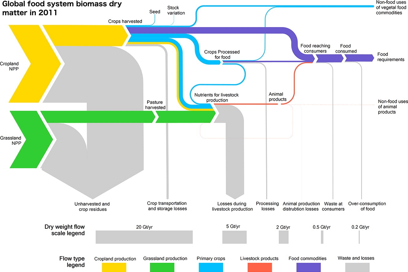
The article contains two beautiful Sankey diagrams. The first depicts the global food system in 2011. Flows are shown as dry mass. Flows are not individually labelled with the underling quantity, but rather a scale at the bottom shows 5 representative flow quantities and their corresponding width.


(under terms of Creative Commons Attribution 4.0 License (CC BY 4.0))

Crop (yellow) and grassland (green) net primary production (NPP) are shown as sources for the global food system. Losses are branching out as grey arrows. These “inefficiencies” of the system are described in detail in the article. The authors observe that “44% of harvested crops dry matter are lost prior to human consumption” and that “the highest loss rate can be found in livestock production”.

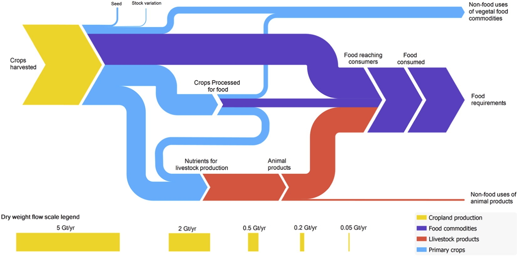
The second Sankey diagram shows a section of the above figure, just the dry matter flows from crop harvest and processing, without any losses. This is interesting because it allows us seeing the share of processed and non-processed food being consumed by humans worldwide, and the the share of crop-based food intake (dark blue) compared to animal-based food intake (red). You could call this the veggie / non-veggie split. Based on dry matter that is.


(under terms of Creative Commons Attribution 4.0 License (CC BY 4.0))

If you want to see the corresponding global food system wet mass, protein and energy Sankey diagrams check out this interesting article. A recommended read for all of us eaters.

Global Paper Flows Sankey Diagram

Researchers from the Institute for Sustainable Resources (ISR) and the Center for Resource Efficiency & the Environment (CREE) at the University College London (UCL) have set up this Sankey diagram of global material flows in the paper life cycle, from primary inputs to end-of-life waste treatment.

Flows are in megatonnes based on data for 2012. We can see the five phases in the paper life cycle, from wood harvest over pulping, paper making, to use and discard/end-of-life. Almost half of the paper used and discarded worldwide in 2012 was recycled (194 Mt out of 399 mt). However, 154 Mt of used paper still ended up on landfills.

The authors further discuss environmental performance metrics. They point out that looking only at the recycling rate may lead to a wrong impression. They propose to also consider another recycling metrics (recycled input rate, RIR), and a material efficiency metrics.

The paper ‘Global Life Cycle Paper Flows, Recycling Metrics, and Material Efficiency’ by Stijn Van Ewijk, Julia Stegemann, and Paul Ekins has been published in the Journal of Industrial Ecology. A summary can be found here, or access the full article at Wiley Online Library (Open Access under Creative Commons license).

Thanks to the author Stijn van Ewijk for pointing me to this recent publication.