Tag: world

World Energy Flows in 1937

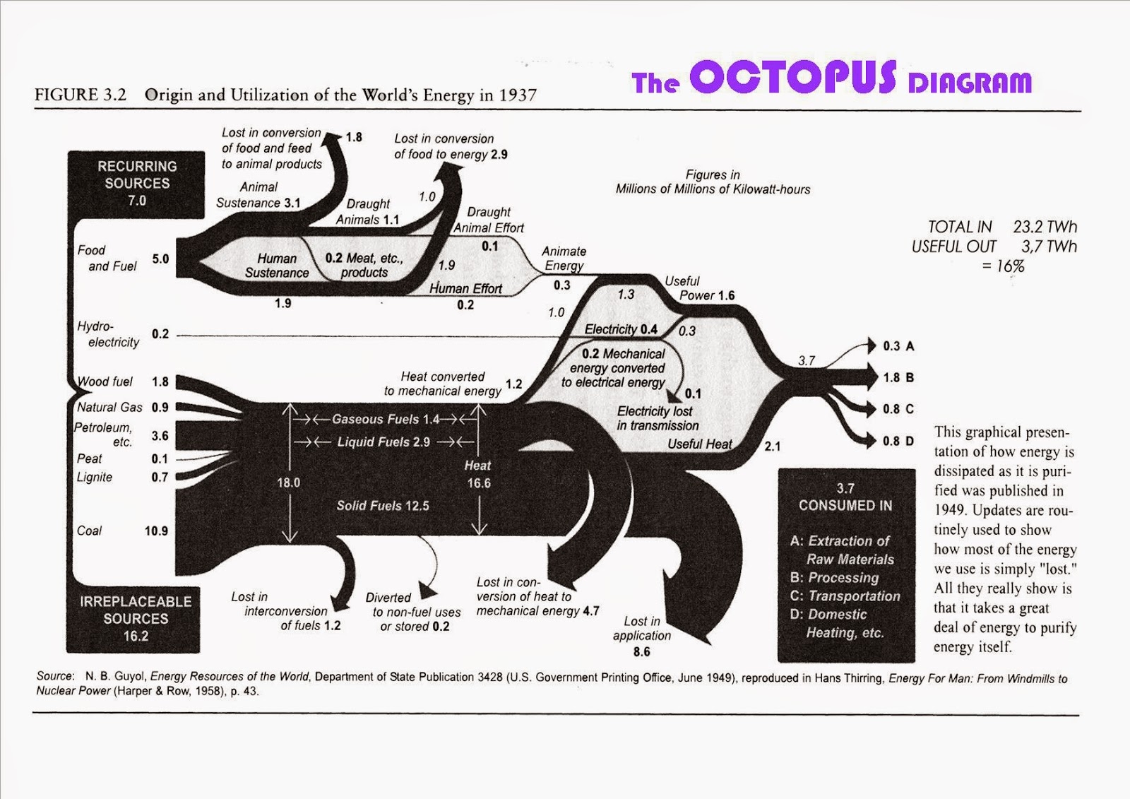
The below Sankey diagram from 1949 depicting world’s energy flows in 1937 is shown in this blog post by Michael Hohmann | LMH Design.


Flows are in TWh.
Michael says: “When I first saw this, I was reminded of seeing an octopus and called it an Octopus Diagram, with the octopus’ head at the input end at left, and the tentacles on the right, in between digesting and distributing everything that the various mouths at the head can gobble up”, asking himself “[w]here does all this Input energy disappear to with so little Output energy ending up as useful for us humans?”.

Coal Trade Flows Map

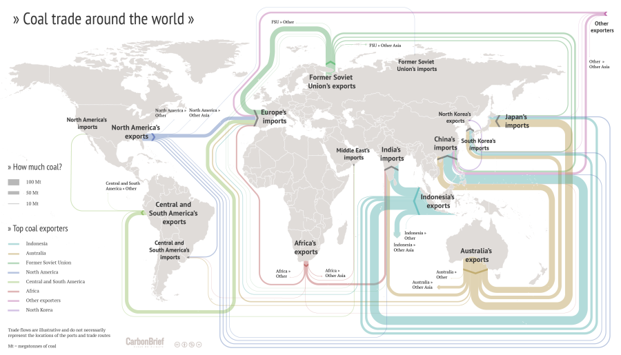
Drawing Sankey diagrams on a world map to show flows between different geographical location is always a challenge. One of the inherent problems is that large (=broad) arrows may run between two points on the map located very close to each other. Another problem is that one wishes to have the arrows more or less along the actual trade routes, which in many cases is close to impossible (take, for example, ships going through the Panama or the Suez canal).

I have shown quite a number of ‘Sankey diagram maps’ here on the blog, but most of them had shortcomings. Now here is an example that does extremely well in tackling the issue of Sankey diagram flows on a world map.


(CC licence – Carbon Brief)

This flow map of coal exports around the world shows the top exporters. It was crafted by Rosamund Pearce for the Carbon Brief article “Mapped: The global coal trade”. She decided to route the Sankey arrows nicely sorted, in parallel, and not along the actual shipping paths. See how much of the coal trade from Indonesia to China is led “virtually” south of Australia and New Zealand? Additionally the arrows are not led precisely to the actual port, but rather connect at a suitable place of each continent. With these simplifications the trade flow map is much clearer, understandable.

Another world coal flow diagram from 2012 can be found here.

World Petrochemical Balance, Sankey

The International Energy Agency (IEA) is a good source for reports on energy, both with a focus on global energy, but also breaking it down to the national level. I have featured their Sankey diagram website that allows to access national energy balances for many countries in this post back in 2013.

Browsing through their reports also sometimes reveals Sankey diagram gems. In their report on ‘Tracking Industrial Energy Efficiency and CO2 Emissions’, however, I found the diagrams on aluminium, steel, pulp/paper and petroleum not particularly sexy.

This is a schematic block diagram. Arrows are labeled with the quantity in Mt/year.

I decided to redo this as a Sankey diagram, maintaining the general structure of the original diagram. The width of the Sankey arrows immediately exhibit where most of the mass (crude oil) is…

I chose three colors: blue for the actual products from petrochemical industry, yellow for recycling streams and losses, purple for the precurors or feedstock (I actually thought I should do away with these, since the ‘hydrogen energy’ flow gave me some headache…). Also decided that the head of the arrow representing 115 Mt/year of post-consumer waste leading towards (!) net additions to stock in the original diagram is erroneous and thus turned the arrow around.

Didn’t spend much time on graphic aspects or fine tuning. I am sure this can be done quite nicely. But even like this I think a Sankey diagram is the better way to get the message across.

Minard’s 1858 Map of World Migration

Martin Grandjean digitized and vectorized Charles Joseph Minard’s World Map of Migration from 1862. His recent post reminds us that no too long ago migrants were also moving from Europe to other places of the world.

via martingrandjean.ch – full vectorized image 2 MB here

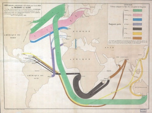
The map, based on data for the year 1858, “shows migration flows that contrast with the maps of the twenty-first century. That year, 86.000 Englishmen left their country, as 45.300 Germans, 20.000 French and 11.600 Portuguese.”

Read this interesting post from the Cartographia blog for additional detail on the map.

From a technical point of view, the only criticism I have of Minard’s map is that the direction of the arrows is not indicated. It requires the reader to know about origins or destinations of migration.

You can see the original Minard migration map (“Carte figurative et approximative représentant pour l’année 1858 les émigrants du globe, les pays dóu ils partent et ceux oú ils arrivent”) in this 2009 post and at Wiki Commons or directly at the Library of Congress.

You might want to check out another related June 2015 article by Martin Grandjean, where he points out some shortcomings of migration maps.

Cartographia blog shows Minard maps

In 2008, the Cartographia blog started a post series called ‘Monday’s with Minard’. Some people consider Charles Joseph Minard the first to use arrow magnitude in his diagrams to represent quantities. (As a consequence, this means that Sankey diagrams would have to be renamed to Minard diagrams!).

What differentiates Minard maps from Sankey diagrams is that Minard’s fine works always have a geographical relation. The most famous one is his Map of Napoleon’s march to Moscow published in 1869. This “carte figurative des pertes successives en hommes de l’Armée Francaise dans la campagne de Russie 1812-13” shows number of men (as width of arrows), geographic movement of the troops on the map both for invasion as well as for retreat, as well as time and temperature on a separate scale.

Cartographia blog has some other nice examples, two of which are shown here:

The first shows migration patterns across the globe. Arrows do not have an arrow head but the country of emigration is color coded. The outline of the countries is distorted to accomoadate large flows connected to them. For a detailed description please consider reading the original blog post. This map is similar to the one I showed in this post.

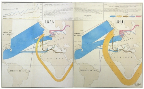
The other is a flow map for wool and cotton for the years 1858 and 1861. “Blue represents cotton and wool from the United States, the orange from British territories in South Asia … One millimeter represents 5,000 tons of cotton or wool.”. As one can see on the 1861 map, cotton imports from Asia have increased dramatically. See the description of the map in the blog post on Cartographia blog.

See all Monday’s with Minard posts here. There has been no activity on the blog since June 2008. I hope to see more of these posts some day.

World and US GHG diagrams from WRI

Last August I reported about a Sankey diagram showing World GHG emissions, published on the website of the World Ressource Institute (WRI). I couldn’t show the diagram due to copyright concerns in that post, but to my delight, Tim Herzog, co-author of the WRI publication and Director of Online Communciations at WRI in a comment to my post granted permission. Thanks, Tim!

So here it is:

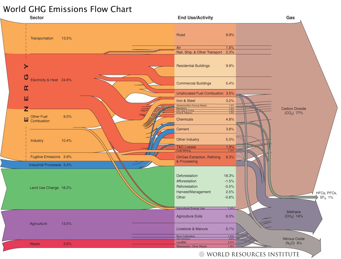
The diagram shows the activity sectors from which of greenhouse gases (GHGs) originate. The largest portion is from energy generation (including transport), followed by land use change and agriculture. Direct emissions from other industrial processes (other than combustion processes) and waste is comparatively small. The arrows on the right side give a breakdown into the individual gases with carbon dioxide as the main greenhouse gas (77%) followed by methane and N2O.

All data is for 2000 and given in CO2 equivalents with the GWP 100a weighting factors for methane, nitrous oxides, HFCs and PFCs from the IPCC 1996 report. The total quantity is an estimate of 41755 MtCO2 equivalent. Land use change shows negative numbers too, because credits can be given for reforestation (newly planted trees absorbing CO2).

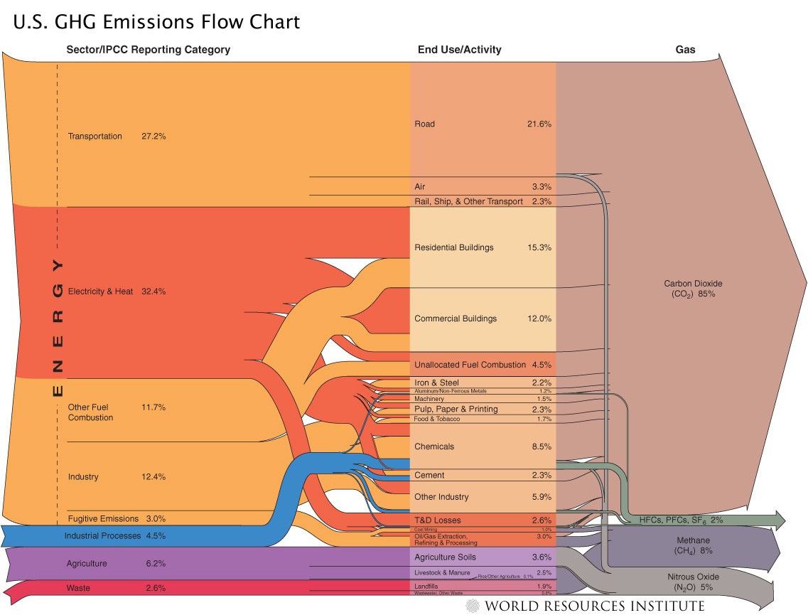
Here is the Sankey diagram from the same report just for the 2003 GHGs in the United States.

The overall CO2 equivalents are 6978 Mt in the US in that year, but the portion of GHGs from fuel combustion is higher. CO2 is 85% of the GHGs. For more details on the US GHG Sankey diagram, go to the WRI web page.

Kudos to the makers of these Sankey diagrams. Apart from the rich content they convey, they are also beautiful examples of how elegant Sankey diagrams can be.
World Greenhouse Gases as Sankey

A great Sankey diagram is available in the Charts&Maps section on the website of the World Resources Institute (WRI), “an environmental think tank that goes beyond research”.

It shows the sectors from which greenhouse gases (GHGs) are released (such as energy generation, land use change, agriculture) and the end use areas or activities, through which CO2, methane and others gases are relased.

Data is for 2000, the diagram was published in 2005. A very well done Sankey diagram indeed, and highly educational.

Unfortunately a request for showing this Sankey diagram here on the blog was not granted by WRI, and an attempt to purchase the publication right (OK, it was not an attempt, it was a price inquiry only) was in vain.

I have to respect WRI’s copyright policies, so you have to click here to view the World GHG Sankey diagram, or download the large version PDF.

They also did a Sankey diagram on U.S. Greenhouse Gas Emissions, available on their website and as a PDF. Enjoy!

World Internet Bandwith Sankey

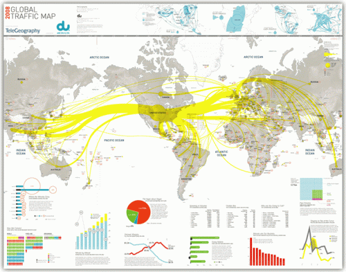
The cutting of two submarine internet cables in the Mediterranean Sea at the end of January, and another one in the Persian Gulf a few days later, was widely reported in the news. The cuts affected internet services and call center operations in large parts of the Middle East and India, sparking discussions about emergency backup plans for offshore software development.

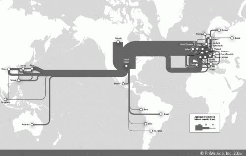
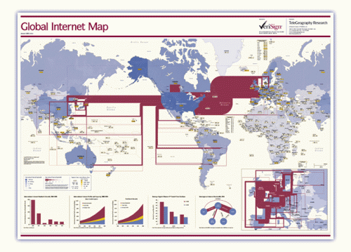
This reminded me of the internet traffic maps I had seen on the Web before. These are available as traffic load maps as well as bandwidth capacity maps of the backbone infrastructure.

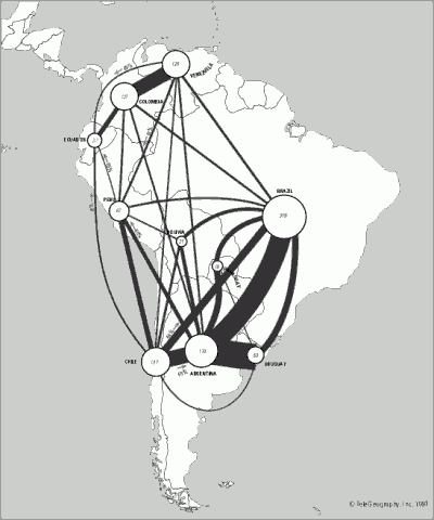
Indeed these maps can be considered as fine examples of Sankey diagrams, with bi-directional (or non-directional?) arrows whose magnitude represent the bandwidth of the transcontinental internet cables. Additional arrow colors could be used, for example, to represent ownership or operation of the cable by different companies.

At the same time the Sankey maps may also serve to indicate communication technology development in different world regions.

BTW, if you want to stick one of these maps prominently on your office wall, they are available as posters here.