The cutting of two submarine internet cables in the Mediterranean Sea at the end of January, and another one in the Persian Gulf a few days later, was widely reported in the news. The cuts affected internet services and call center operations in large parts of the Middle East and India, sparking discussions about emergency backup plans for offshore software development.
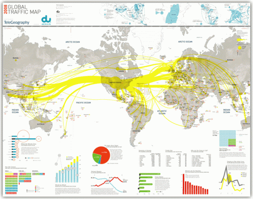
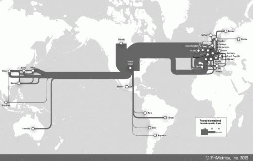
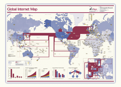
This reminded me of the internet traffic maps I had seen on the Web before. These are available as traffic load maps as well as bandwidth capacity maps of the backbone infrastructure.
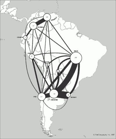
Indeed these maps can be considered as fine examples of Sankey diagrams, with bi-directional (or non-directional?) arrows whose magnitude represent the bandwidth of the transcontinental internet cables. Additional arrow colors could be used, for example, to represent ownership or operation of the cable by different companies.
At the same time the Sankey maps may also serve to indicate communication technology development in different world regions.
BTW, if you want to stick one of these maps prominently on your office wall, they are available as posters here.


4 Comments
Visualcomplexity also has ‘Traffic Flow Maps’ as a project: http://www.visualcomplexity.com/vc/project.cfm?id=15
Hi,
These are very interesting sankey diagram. Would anyone happen to know how to find or use a map where each country is already created as a process (such as in the eSankey software) with the respected name of the country. This would be helpful in drawing the various arrows between each country and interacting with each country.
Cheers
Comments are closed.