Category: Publications

Sankey Diagrams from Cement Production

I would love to share with you two Sankey diagrams from cement production, but better do respect “Crown Copyright”. These two are featured in Gao, Tianming: Analysis of material flow and consumption in cement production process. Journal of Cleaner Production. DOI 10.1016/j.jclepro.2015.08.054 as figures 7 and 9 on pages 560 and 561. One is for the raw roller mill system, the other from the clinker process. Both Sankey diagrams are for mass flows in the process.

To see the diagrams please go to article on Researchgate.

In lieu of the copyrighted material, please enjoy this schematic of a rotary cement kiln.

RenewIT Project: Green Data Centres

The European R&D project RenewIT studied energy concepts for renewable energy supply of data centres. The project partners from Spain, Italy, UK, Germany and The Netherlands looked at 18 different energy models.

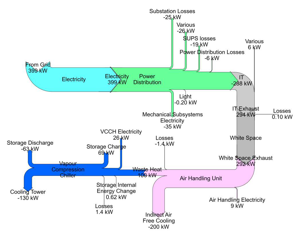
In the final project report each of the concepts are described, accompanied by a Sankey diagram.

The above is figure 3.53 from p. 177 of the report showing the “Sankey chart for the distribution of average energy flows per year within different subsystems of concept 7 for scenario 3”.

Many more equally beautifully crafted Sankey diagrams can be found in the report, check chapter 3.5 Simulation Results of the publication Deliverable D4.5 Catalogue of advanced technical concepts for Net Zero Energy Data Centres. Authors: Nirendra Lal Shrestha, Noah Pflugradt, Thorsten Urbaneck (TUC); Angel Carrera (Aiguasol); Eduard Oró, Albert Garcia (IREC); Hans Trapman, Gilbert de Nijis, Joris van Dorp (DEERNS); Mario Macías (BSC) (get it here)

Energy Flows in Sweden by Counties

Sweden is administratively organized in 21 counties, called “Sveriges län”.

A new report ‘Energistatistik för Sveriges län och kommuner för år 2013’ (Energy Statistics for Swedish Counties and Municipalities on the year 2013), published by Länsstyrelsernas Energi- och Klimatsamordning (LEKS) features energy flow Sankey diagrams for all counties.

Here is an example for Skåne from page 17:

All flows in GWh per year. Percentage breakdown for contribution of fuels (left side) and for consumption (right side).

Actually the energy picture looks quite differently in some counties: For example, Södermanlands län (on page 19) has 33% coal/coke (‘Kol/Koks’). Kronobergs län’s most important energy source with a share of 29% is biomass (‘Biobränsle’).

Twenty-one wonderful Sankey diagrams … a sheer joy for a Sankey fan like me.

Europe Energy Flows 2010

Regular readers of this blog have seen the national energy flow diagrams (energy balances) before. I have featured them from many different countries already.

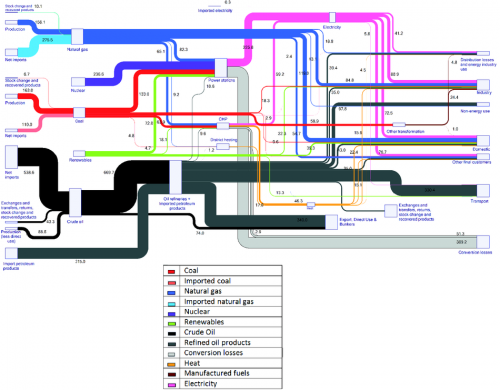
I finally came across a similar Sankey diagram the energy flows of Europe for 2010. It is featured on the European Energy Agency (EEA) website in a report titled ‘Overview of the European energy system (ENER 036) – Assessment published Mar 2013’.

“The figure is a Sankey diagram which shows the composition of the primary energy entering the energy system of the EU-27 in 2010, and where this primary energy was used, either as losses or as consumption by specific sectors of the economy”. It is based on EUROSTAT data for the EU-27 countries.

A legend is available below for the coloured arrows. The diagram is extensively explained and commented on the web page. The content on the source page has been removed, because there is an updated version.

In addition to what we have seen in such diagrams, the primary energy (fuels) is further differentiated with two separate input flows whether the energy carrier was imported or is from domestic European production. This is to visualize dependency on imports.

Energy Balance for Guatemala

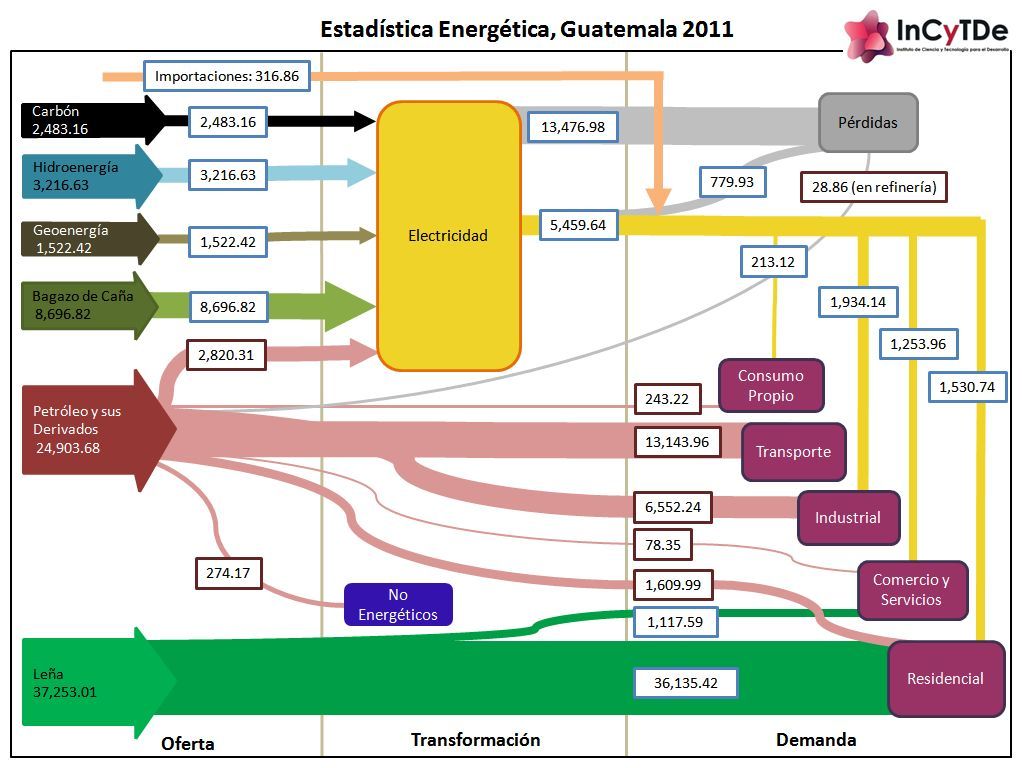
The research institute with the hard-to-pronounce acronymic name INCyTDE (Instituto de Ciencia y Tecnología para el Desarrollo at Universidad Rafael Landívar in Guatemala) has published a Sankey diagram with the energy flows for their country for the year 2011.

In regard to design the diagram has many issues: Apparently it was created using a drawing tool that supports primarily horizontal and vertical arrows and Bezier curves. But the diagram loses a lot with branching and joining of arrows almost non-existent.

Flows are more or less to scale. The unit is not shown in the diagram itself, but explained in the text (kilo barriles equivalentes de petróleo, KBEP = kilo tonnes of oil equivalent, ktoe). Data is from national statistics published by the Energy and Mining Ministry.

The content of the energy balance diagram is quite interesting, especially if you compare it to similar diagrams of other countries or the world average.
Wood is the most important energy in Costa Rica (green arrow ‘Leña’, 37.251 ktoe in 2011). Bagasse from sugar cane (dark green arrow ‘bagazo de caña’, 8.696 ktoe in 2011) is used for almost half of the electricity generation. Petroleum and derivates (dark pink arrow, 24.903 ktoe in 2011) however do play an important role for vehicles (transportation).

Sankey for Building Performance Simulation

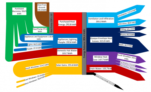
Found this via utsapocalypse. The Sankey diagram is originally from the article ‘Preliminary Investigation of the Use of Sankey Diagrams to Enhance Building Performance Simulation-Supported Design’ by William (Liam) O’Brien of Carleton University, Ottawa.

The paper proposes “the outline for a methodology for creating Sankey diagrams to represent energy flows in buildings, with the eventual intent that the methodology be integrated into a software tool.”

The Sankey diagram shows the energy balance of a house for a mid-winter week. Flows are in kWh, total amount 804 kWh. Energy sources/types are from the left (purchased heat, domestic hot water, solar gains), energy consumption and losses to the right (heat loss through windows, ceilings, walls).

Plenty of colors used in the diagram, Sankey arrows glued together from shapes. As the author mentions “the underlying creation process, when performed manually, can be quite complex”.

Book: Sustainable Materials with Open Eyes

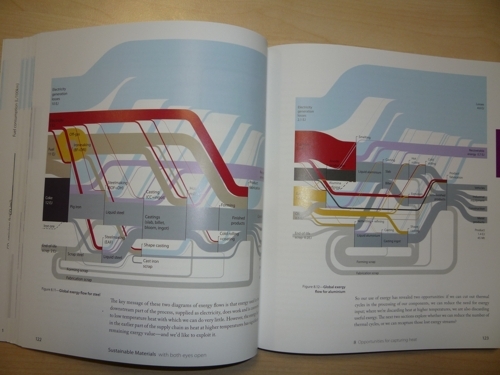
Following up to my Aug 25, 2011 post on Global Steel and Aluminium Flows, I would like to recommend the follwing book that has just been released: Sustainable Materials – with Both Eyes Open: Future Buildings, Vehicles, Products and Equipment – Made Efficiently and Made with Less New Material by Julian M. Allwood and Jonathan M. Cullen.

I’m hardly a hundred pages into reading, but I already love it. The book is very graphical (to say the least), well illustrated, with many graphs and photos, infographics and even historic images. Plus – and this is why it deserves to be presented here on the blog – it features a great number of Sankey diagrams.

I really enjoy the lego bricks in the steel making flow chart (pp. 121-127). You’re also going to love the ‘WhatsApp’-style chat between Henry Ford and the Wright Brothers (p. 181).

This book “faces up to the impacts of making materials in the 21st century. We’re already making materials well, but demand keeps growing and so we need to start using them well to.” (from the back cover)

Sustainable Materials with Open Eyes by Julian M. Allwood and Jonathan M. Cullen can obtained from Amazon and – I am pretty much sure – from your local book dealer. Here is the book’s website.

1939 Graphic Presentation Book

This post on the Visual Think Map blog (new addition to my blogroll) guided me to the fantastic 1939 book ‘Graphic Presentation’ by Willard C. Brinton. It is available in full as a PDF on archive.org.

The book with more than 50 chapters features literally hundreds of graphics…

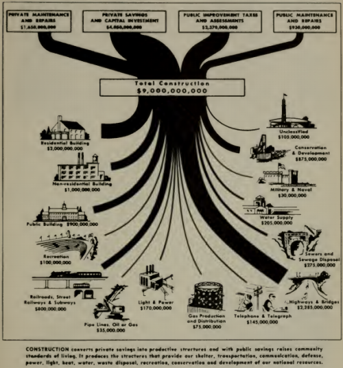
Chapter 8 (pp. 73 to 80) deals with “Flow Charts”, and has the above Sankey diagram on sources of funds and spendings in construction.

The chapter has an emphasis on ‘Cosmographs’ (a brand name at that time, apparently by IBM) and how they are made. I will dedicate one of the next blog posts to cosmographs I think. In the meantime, enjoy browsing Brinton’s book.