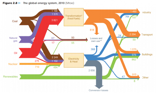
Browsing through my bookmarks (plenty of Sankey diagrams there waiting to be shared with you) I wonder if I have previously presented this one.
This is a Sankey diagram of the global energy flows 2010 from the ‘World Energy Outlook 2012’ by OECD/IEA. Units are in Mtoe.
via Resources Research but the original post could well be from Peak Oil (Kjell Aleklett: An analysis of World Energy Outlook 2012 as preparation for an interview with Science)
