Tag: car

Spendings on Energy Efficiency Measures

This is quite an interesting Sankey diagram from the World Energy Outlook 2014. It visualizes international spending on energy efficiency measures in the transport sector under a hypothetical ‘New Policies Scenario’.

A total of 14.5 trillion US$ would be spent until 2040 to improve energy efficiency in the transport sector. The largest chunk (37%, 5.3 trillion US$) on improving private cars. This amount is further broken down to four geographic regions. The money would be spent mainly on improving the power train, and on development of light-weight components.

The underlying scenarios are described in detail at the beginning of the WEO-2014 study. The authors point out that “[f]or each scenario, we offer a set of internally consistent projections to 2040. None should be considered forecasts.”

“The New Policies Scenario is the central scenario of WEO-2014. It takes into account the policies and implementing measures affecting energy markets that had been adopted as of mid-2014, together with relevant policy proposals, even though specific measures needed to put them into effect have yet to be fully developed. These proposals include targets and programmes to support renewable energy, energy efficiency, and alternative fuels and vehicles, as well as commitments to reduce carbon emissions, reform energy subsidies and expand or phase out nuclear power.”
Electric Vehicle with Energy Recuperation

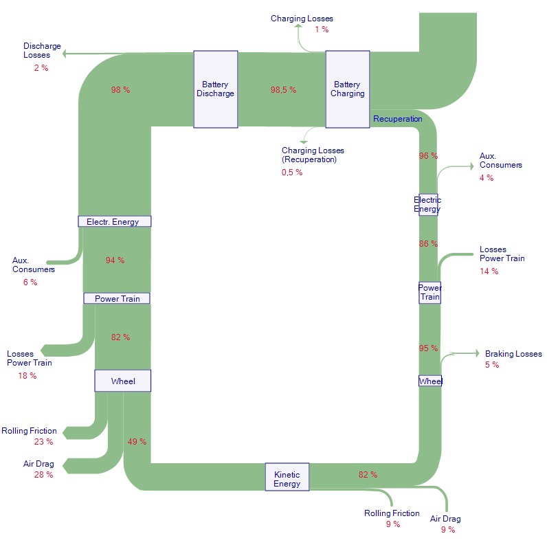
Preparing for a new assignment I searched for some ideas and came up with a diagram for an electric vehicle (EV). The original diagram is from a German text book on aerodynamics.

The Sankey diagram can be read counterclockwise starting at the top, where the vehicle battery is loaded. At every process step there are losses, the largest being rolling resistance and aerodynmic drag. When the driver brakes, energy is recuperated and fed back to the battery.

It took me some time to get this done, since the actual flow values were not explicitly given. Instead the energy efficiency and losses at each step are indicated as percentage values. Getting out my pocket calculator helped determine the values needed to setup the Sankey arrows.

Another one for Car Engine Effciency

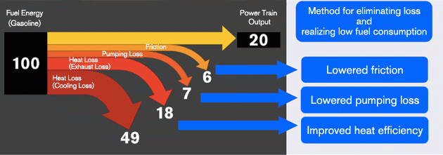
Followup to my post a few days ago on energy efficiency in an engine: Someone mentioned the below diagram that can be found on the Nissan Technology website.

Much simpler, actually a straight-forward breakout Sankey diagram. No sequencing of engine elements where power is lost as in the diagram from the Australia Gov report.
Strong emphasis on arrow heads … but worst of all flows are not to scale! 49 out of 100 should be roughly half the height of the ‘Fuel Energy’ node, but it is only 40%. Fail!

Energy Loss in Vehicle Engine

Was browsing through my bookmarks and saved images and found the below diagram. Blame it on my mood today, but this one calls for bashing.

Published in a 2010 report by Australian Government, Department of Resources, Energy and Tourism. ‘Energy Efficiency Opportunities. Energy–Mass Balance: Transport’ figure 11 on page 26 this so-called Sankey diagram looks like a aerial view of my nephews playing room with his building blocks spread on the floor… While I generally appreciate a Sankey diagram being used in a government report on energy consumption or loss in transport, I think this one is poorly executed.

If you look at the numbers you will even see that they don’t add up correctly at the ‘Motive Power’ node.

The diagram shows how energy from fuel is lost in different stages of a vehicle motor (engine, power train, transmission) with approximately 21% of the energy being used as power at the wheels. This value is just an example, and not for one specific vehicle. But 20% efficiency seems to be more or less the average in a passenger car.

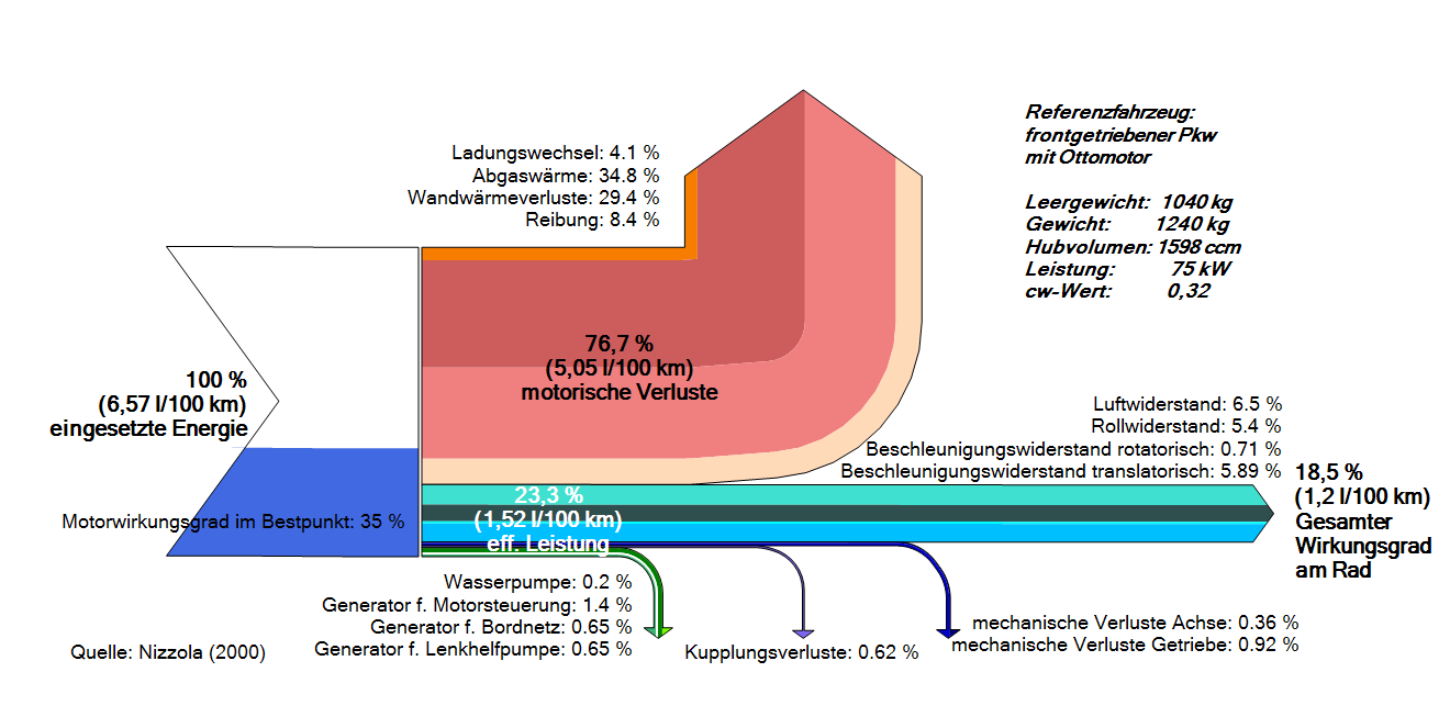
I remembered I had seen another Sankey diagram on the e!Sankey forum with the same topic.

This one is in German but you may be able to understand the main items. The red arrow are losses at the motor. The stacked turquoise-blue arrow to the right (18.5%) is energy-at-wheel. All in all there are many more details, but still the diagram remains rather “compact”.

I am sure there are more Sankey diagrams on energy losses in vehicles out there. Let me know if you find other examples to compare.

Biomass 2-in-1 flipped Sankey Diagram

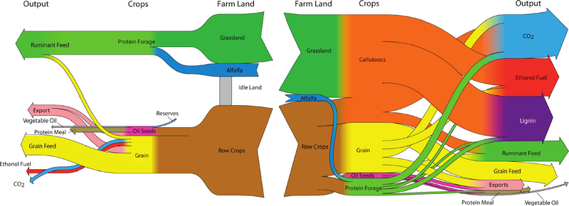
Browsing my previously bookmarked Sankey diagram samples I came across this one which I find interesting. The diagram was shown in a Green Cars Congress blog entry in 2010 and illustrates a study that finds that “large scale biofuel production can be successfully reconciled with food production through the use of land-efficient animal feed technologies and double-cropping”. The authors of the study are Dr. Bruce Dale and colleagues at Michigan State University.

As always I refrain from commenting the underlying content as I am not a domain expert. Rather I would like to focus on what makes this Sankey diagram special.

These are actually two diagrams that are “flipped” over at a vertical center line. The left half of the diagram has a right-to-left orientation and shows the “114 million ha of cropland used now to produce animal feed, corn ethanol, and exports”. Some cropland sits idle and is not used productively. The right half is a second Sankey diagram and shows a different use of the cropland with “major crops and outputs for the maximum ethanol production scenario”. No units in the Sankey diagram but the central columns seems to represent the land area (million ha), while the two outer vertical columns (Crops, Output) show mass (tonnes?) on a different scale.

In contrast to the first scenario it can be observed that “30% of total US cropland, pasture and range, up to 400 billion liters (106 billion gallons US) of ethanol can be produced annually”. Ethanol can be used as an alternative non-fossil car fuel. CO2 emissions are also higher but this is from biogenic sources.

Misc Sankey Diagrams Uncommented 04

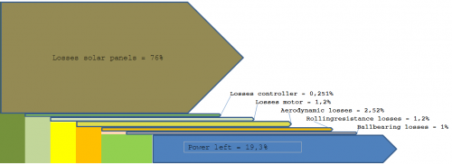
Found these two Sankey diagram on Wikiversity. I think it was somewhere on one of the sub-pages on the small solar vehicle… They show energy losses at the different components of the vehicle, such as at the solar panels or through rolling resistance. Percentage values.

These diagrams are made up from rectangles and simple arrows. Only straight arrows, no curves. The blue color of the border of some of the thinner arrows adds a strange effect…

Micro-grid model Sankey

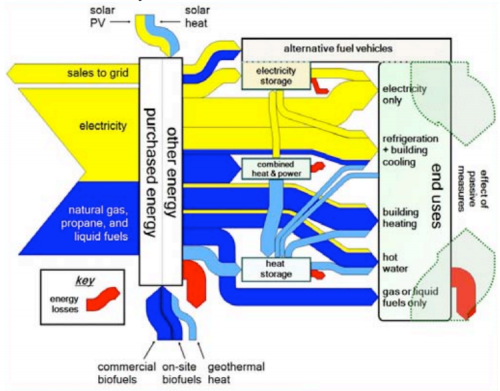
Found the below Sankey diagram in the article ‘Plug-in Electric Vehicle Interactions with a Small Office Building: An Economic Analysis using DER-CAM’ by Ilan Momber et al. from Berkely National Lab published in Proceedings of the 2010 IEEE PES General Meeting, Power Systems Engineering in Challenging Times, 26-29 Jul 2010, Minneapolis MN.

The Sankey diagram is for illustration only, and consequently shows no numbers. Yellow arrows represent electricity, blue arrows heat. The red Sankey arrows show where losses occur. The article itself is mainly on plug-in vehicles (PEV), that’s why the ‘alternative fuel vehicles’ are emphasized on the right side in the uses section.

The underlying model DER-CAM “solves a commercial building’s microgrid problem of investment and operation optimization given its end-use energy loads, energy tariff structures and fuel prices, as well as an arbitrary list of equipment investment options. … [It] can report a cost, carbon footprint, or combination minimizing equipment choice and (typically hourly) optimal operating schedule for the microgrid, including CHP and renewable sources.”

Superimposed Sankey diagrams

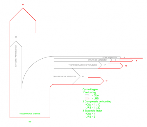
The below Sankey diagram from the JS Systems homepage tries to show the differences between a normal Otto engine and the “JS Motor”. The prototype JS rotation motor, from what I grasp, has different compression and expansion parameters and could prove to be twice as efficient.

To show the difference in efficiency, two Sankey diagrams have been superimposed. The diagram with the grey outline is for the Otto engine, the one with the red outline is for the JS engine. The diagram shows energy losses branching off to the right (e.g. thermodynamic losses 17% in a typical Otto engine, 13% only in the JS motor). Useful energy is represented by the flow to the top.

I am not endorsing this motor, nor have I seen it work. But I like the idea of presenting a comparison in one Sankey diagram instead of two separate Sankey diagrams.

Also, please check out this previous blog post on Sankey diagram overlay.