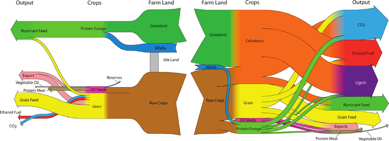
Browsing my previously bookmarked Sankey diagram samples I came across this one which I find interesting. The diagram was shown in a Green Cars Congress blog entry in 2010 and illustrates a study that finds that “large scale biofuel production can be successfully reconciled with food production through the use of land-efficient animal feed technologies and double-cropping”. The authors of the study are Dr. Bruce Dale and colleagues at Michigan State University.
As always I refrain from commenting the underlying content as I am not a domain expert. Rather I would like to focus on what makes this Sankey diagram special.
These are actually two diagrams that are “flipped” over at a vertical center line. The left half of the diagram has a right-to-left orientation and shows the “114 million ha of cropland used now to produce animal feed, corn ethanol, and exports”. Some cropland sits idle and is not used productively. The right half is a second Sankey diagram and shows a different use of the cropland with “major crops and outputs for the maximum ethanol production scenario”. No units in the Sankey diagram but the central columns seems to represent the land area (million ha), while the two outer vertical columns (Crops, Output) show mass (tonnes?) on a different scale.
In contrast to the first scenario it can be observed that “30% of total US cropland, pasture and range, up to 400 billion liters (106 billion gallons US) of ethanol can be produced annually”. Ethanol can be used as an alternative non-fossil car fuel. CO2 emissions are also higher but this is from biogenic sources.

1 Comment
And every input from fossil fuel based fertilizers. 😀
(This is why this diagram has no direction, it is baseless in the truest sense of the word.)
Comments are closed.