Tag: cogeneration

Cogen System Thermodynamic Analysis

An analysis of energy efficiency and exergy effciency of a cogeneration system in a sugar refinery in São Paulo state in Brazil is presented in the ‘Análisis energético, exergético y económico de un sistema de cogeneración: caso para una planta azucarera de San Pablo’ by Omar R. Llerena of Universidade de São Paulo (Published in: Ingenius no.19 Jan/Feb 2018 under Creative Commons license CC BY-NC-SA 4.0)


Flows are in kW, and even though this diagram appears to be ‘casero’ made from blocks, triangles and curve shapes, the flow widths seem pretty much to scale.
Acronym ‘CC’ is for the combustion chamber and ‘CR’ stands for a heat recovery boiler (caldera de recuperación).

The article also features a Grassman diagram for the exergy analysis. So, if you are interested, please visit the article here.
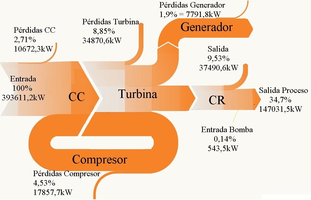
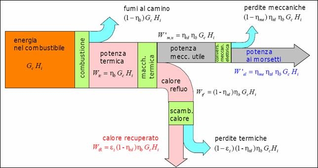
Cogeneration system Sankey diagram

Just another quick Sankey diagram before the weekend. This beautifully crafted black&white diagram is from a scientific article ‘Exergy assessment of a cogeneration system with micro-turbine and absorption chiller’ by Martínez Reyes et.al. published in Proceedings of COBEM 2005 (18th International Congress of Mechanical Engineering).

This is for a cogeneration system with a 30 kWe gas micro-turbine and a 35 kWt absorption chiller. Flows are in kW with a scale of 1 cm = 100 kW in the original size. Good handling of the loop flow.

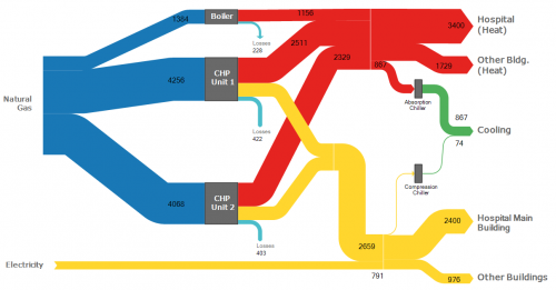
CHP in Hospital, e!Sankey 4 Sample

Closing my blogging activities for this year with a simple, clear, colorful Sankey diagram. This one is shipped with the demo version of e!Sankey 4 as a sample diagram.

This is for energy flows (heat and electricity) in a hospital. Flows are in MWh per year. Natural gas is used to fire a steam boiler and two cogeneration (CHP) units. Heat is used directly for heating in hospital buildings (red arrows). Power from CHP and electricity from the grid shown as yellow arrows.

Energy Efficient Technologies, Cogeneration

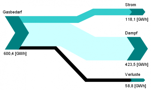
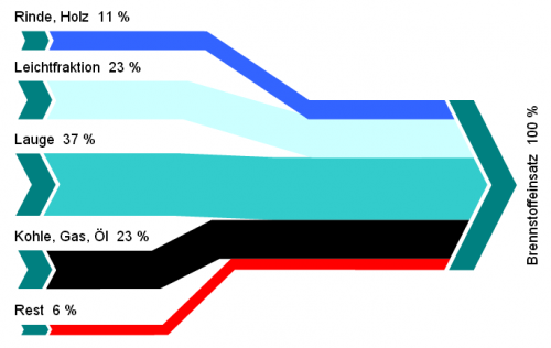
The following Sankey diagrams are from a report published in 2005 by Austrian Environment Protectionn Agency (UBA). The report is on energy efficient technologies and measures to increase efficiency and features practical examples from industry.

Both Sankey diagrams are from the section on cogeneration (chapter 5, p. 105 and p. 106). The first one shows how natural gas is being used to create 118 GWh electricity and 423.5 GWh steam with an efficiency of 90%.

The second diagram is the breakdown of fuels used in another industrial cogeneration plant. It only features percentage values.

Both sets of data could also be displayed in pie charts, but the Sankey diagrams with directed arrows make an allusion to the output from gas, and to the input feed (in the second diagram).

Cogeneration Visualized – Part 2

Following up to my recent post on cogeneration Sankey diagrams from Czech websites, here are a few more.

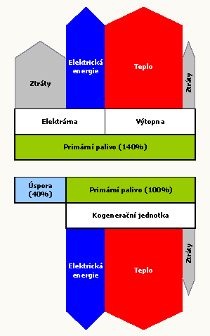
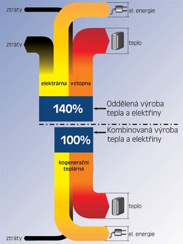
First, a rather simple one which has some fancy arrow heads, partly overlapping other arrows. This one is from the CEZ Energo website and just a schematic visualization of the cogeneration principle.

The next one has a strictly vertical orientation and is built from rectangles and simple block arrows. It uses the same values as in the diagram I shows in the last post. Found on the Plzenska Energetika website.

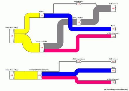
The last one can be found on the TZB Info engineering website. Actually there are two separate Sankey diagrams being compared. A left-to-right orientation, the flow quantities labels sit on the node. This is the only one drawn with a Sankey diagram software (judging from the node symbols I would say it is most likely the discontinued Sankey 3.1 by Fichtner)

.

If you find other cogeneration Sankey diagrams pls drop me a line…

Cogeneration Visualized – Part 1

I love Google’s image search. This is one of the main sources for new Sankey diagrams on this blog.

The other day I used the Czech term for cogeneration (‘kogenerace’) … and immediately had five new diagrams to share with you. Two of them can be found below…

As in most cogeneration schema diagrams, two energy production systems are compared in one diagram. The classic one, and the combined heat and power CHP system. Heat (teplo) and electricity (elektrina) output is set to the same size and primary energy requirement is being compared. Losses (ztráty) branch out to the other side. In the first one these two systems (found on the EkoWATT website) are shown in a vertical orientation:

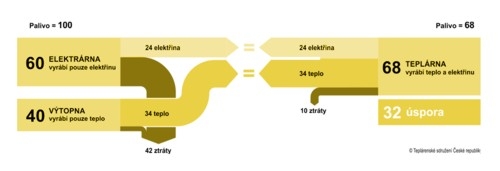
The second one (from All for Power website) has a horizontal orientation:

The cogeneration system is 1.4 times more efficient (140:100) in the first diagam, the second Sankey diagram has cogeneration 1.47 times more efficient (100:68).

Two or three more to come in another post next time.