Tag: wood

Wood Biomass in The Netherlands

This Sankey diagram on wood biomass flows in the Netherlands is featured in the study ‘Sustainable biomass and bioenergy in the Netherlands’ by Goh, Mai-Moulin and Junginger from Utrecht University.


Flows are in million tons (MT) dry mass for the year 2014. The diagram has a very clear structure. Import streams are from the top and exports leave to the bottom. Domestic Dutch production is from the left, use of wood biomass in the Netherlands is to the right. Paper and cardboard, alongside pulp are the largest flows, but mainly being imported and exported again, or circulating domestically as recycled paper.

The report has two other Sankey diagrams on oils and fats and carbohydrates used in different sectors in the Netherlands. See the full report here.
Wood Flows in Auvergne Rhône-Alpes

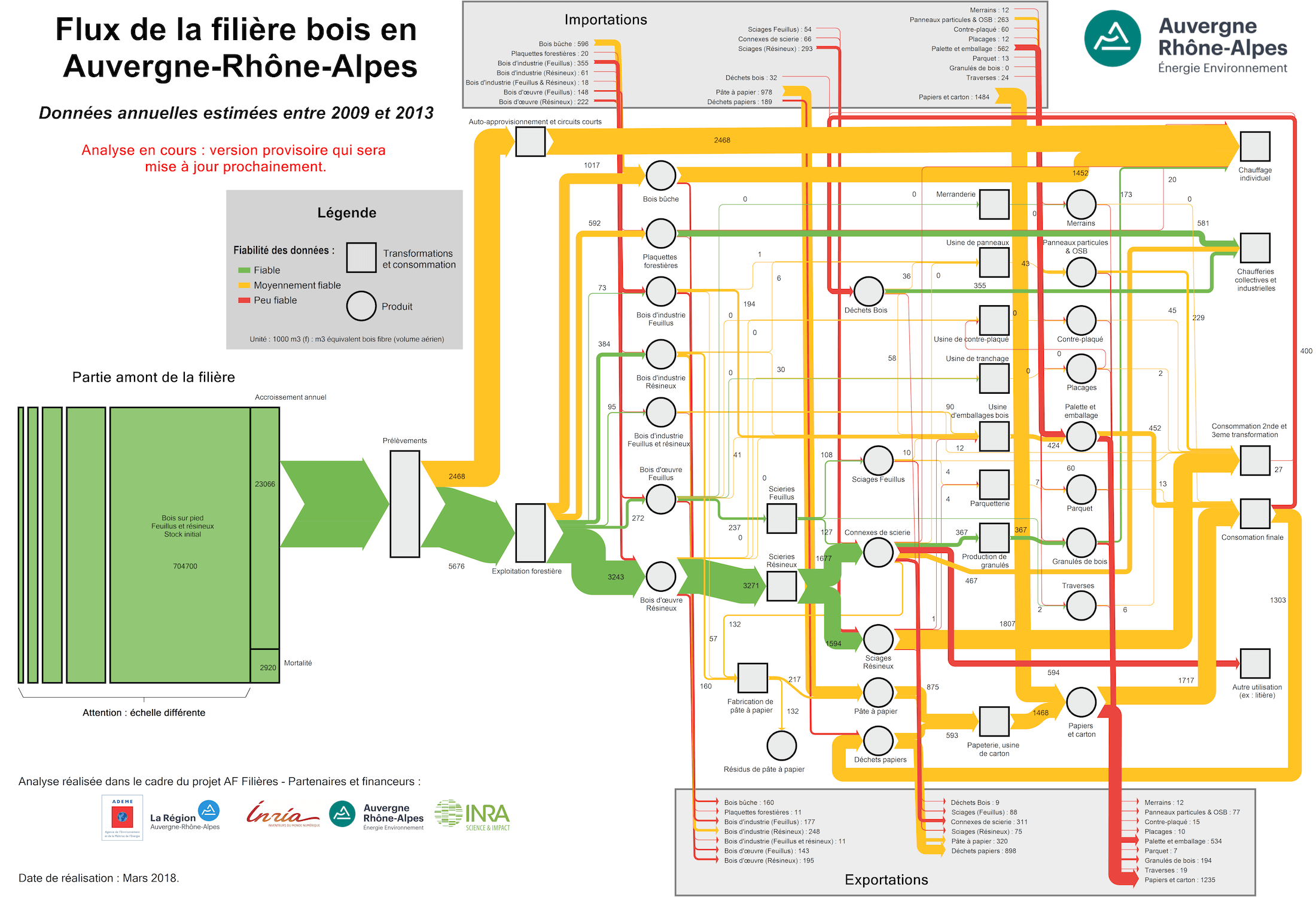
Following up to my post on energy flows from biomass in the Auvergne Rhône-Alpes region, here is another great Sankey diagram on wood flows by Auvergne-Rhône-Alpes Énergie Environnement (AUR-EE) agency.


Flows are in 1,000 m³ (f) wood fibre equivalents (read more about this unit here). The annual average of the years 2009 to 2013 in the region is visualized.

Wood is used for energy generation (top part), wood products (middle section), and pulp & paper (bottom part). Imports of wood or wood-based products come in from the grey box at the top, and export streams leave to the bottom grey box. Import and export in this case is from/to the area outside the Auvergne Rhône-Alpes region.

The green box on the left represents the existing standing wood stock (estimated at 704,700 thousand m³ wood fibre equivalents), which has an annual increase of 23,066 m³ (f) on average. Only 8,144 m³ (f) are removed from the forests per year.

The color coding relates to the data reliability (fiabilité des données): Green flows are based on reliable data, while yellow is for medium reliability and red for less reliable.

Chemicals from Lignocellulosic Biomass

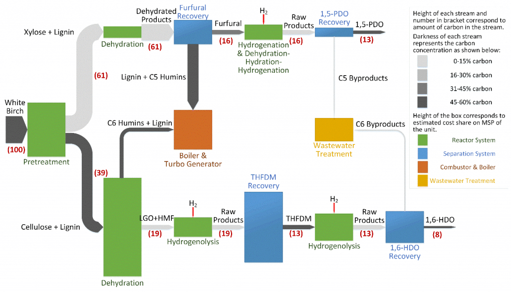
One of the research topics in the research group of Prof. Christos T. Maravelias at University of Wisconsin – Madison is ‘Renewable Chemicals from Lignocellulosic Biomass’. One line of research is into producing chemicals such as 1,4-butanediol (1,4-BDO), 1,5-pentanediol (1,5-PDO) and 1,6-hexanediol (1,6-HDO) from wood chips.

This process Sankey diagram is from the research description page of the Maravelias group.


The red numbers relate to the carbon content in the process (starting with 100% carbon molecules in the feedstock, white birch wood). The coloring of the Sankey arrows is used to signal carbon concentration. And the height of the process nodes shows the cost share of a unit in the process (no absolute cost, just relatively to each other). Interesting! Read more here.

Also see: TriVersa process

Finland Wood Flows, Two Versions

The below Sankey diagrams both show wood biomass flows for Finland for the year 2013.

The first one was published in the report VTT Technology 237 ‘Sustainability of forest energy in Northern Europe’ by researchers from VTT Technical Research Centre of Finland and Natural Resources Institute Finland (Luke).


Authors of this figure are Eija Alakangas and Janne Keränen. The diagram is oriented top-to-bottom and shows how the 104.4 Mm³ of round wood that grew in Finnish woods in 2013 were used. Basically there are two (three) main pathways, with a lot of arrows branching out to depict certain uses. 38.3 Mm³ of round wood was used in pulp industry, 26.2 Mm³ in the mechanical wood industry. Another 9.5 Mm³ of wood is used directly for energy generation.

The second Sankey diagram seems to be a remake of the above. It was published in a VTT Research Report on ‘Cascading use of wood in Finland – with comparison to selected EU countries’ by Laura Sokka, Kati Koponen, Janne T. Keränen.


Here the overall orientation is left-left-to right. The color scheme seems similar. There are some minor differences in the energy use part (orange and dark red arrows).

The first diagram has some images and comes across a little more playful than the second one. Although they depict the same data, I perceive them quite differently.
Is it due to the scaling or the vertical vs. horizontal orientation? Let me know your impression in the comments please.

Energy Flows in Wood Gasification Plant

Most Sankey diagrams I find on the web are from Germany, Switzerland or Austria. Anybody in the know, if this due to the visualization type being part of the engineering curriculae in these countries?

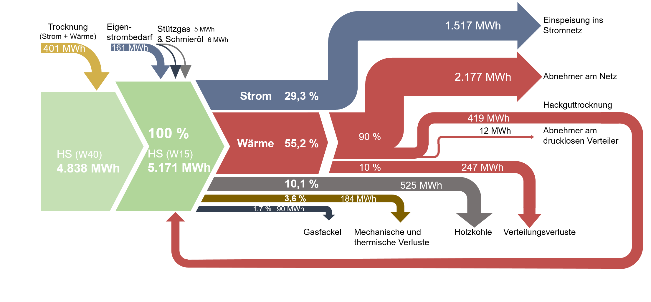
Here is one I found on ‘The Wood Power Plant’ blog by Austrian firm Syntec. It is originally taken from a student master thesis on ‘Life Cycle Analysis of Electricity and Heat Generation of a Wood Gasification Plant including District Heating Network’ (German title: ‘Lebenszyklusanalyse der Strom- und Wärmeerzeugung einer Holzvergasungsanlage inklusive Nahwärmenetz’, thanks Google Translate – you are my friend!) by Elena Käppler of University of Applied Sciences Vorarlberg.

While being graphically quite appealing there are some issue with this Sankey diagram. Flows don’t seem to add up correctly: for example the main stream 4.838 MWh and the 401 MWh coming in at the top would be larger than 5.171 MWh.
Also, some flows are not true to scale. Check out the red arrow representing 247 MWh (going down to ‘Verteilungsverluste’) and compare it to the red one going back in a loop, which represents 419 MWh (‘Hackguttrocknung’).

Tracing Wood Fibre in Canadian Forestry

As part of the Canadian SPRUCE-UP research project one activity is dedicated to Genomic, Ethical, Environmental, Economic, Legal or Social (GE³LS) aspects of this applied genomics project. As part of their work the scientists have developed the Canadian Forest Service – Fiber Cascade Model (CFS-FCM) simulation model.


(see high res image here)

This Sankey diagram shows one specific scenario for a downstream flow of wood fibre from Canadian forests to products. Flows are in metric tonnes (probably for one reference year), with the exception of the ‘Bioenergy’ flow, shown in terajoules (TJ).

EU28 wood flows Sankey diagram

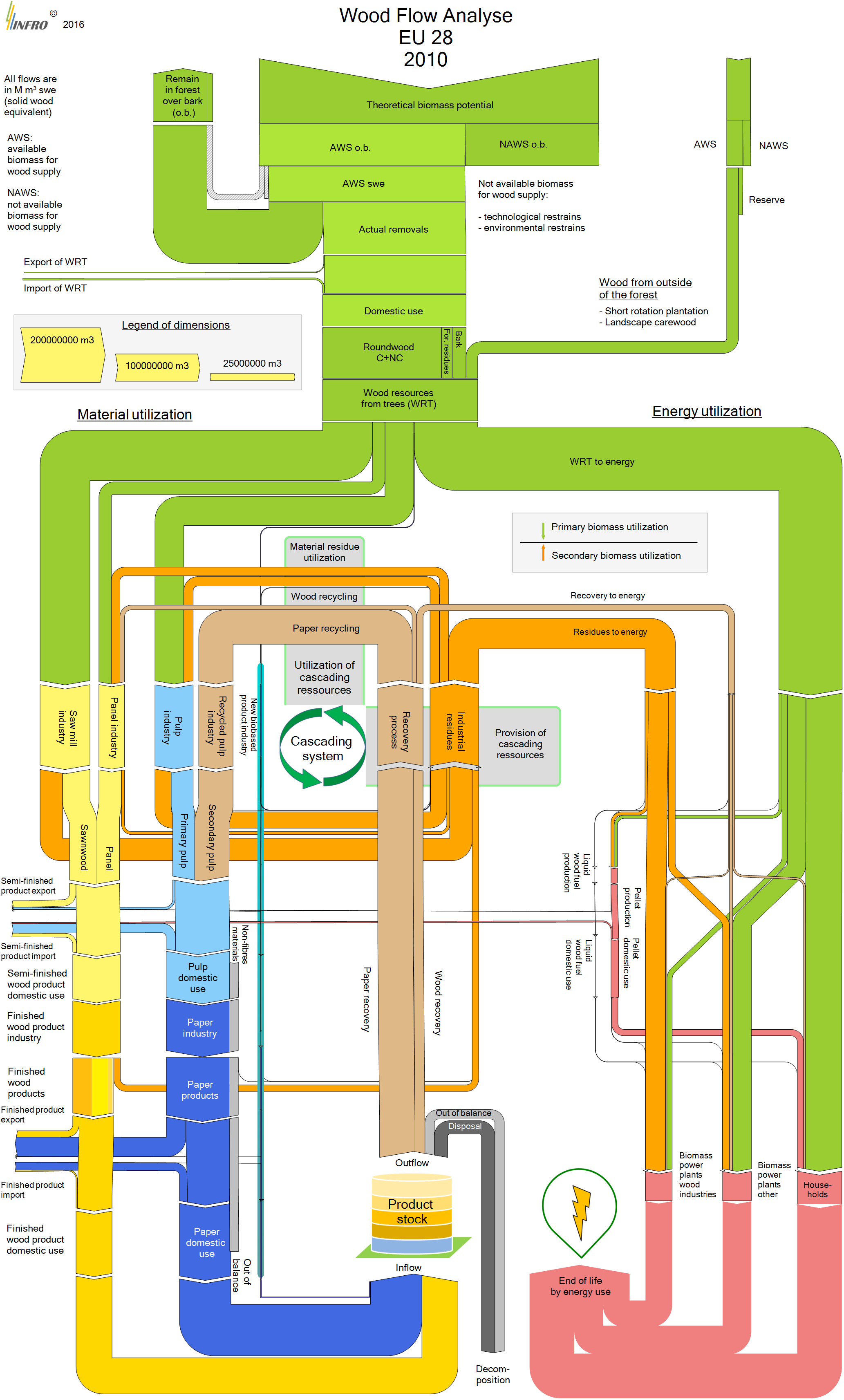
The European research project CASCADES’ objective was “to define the cascading use of wood and assess the environmental and socio-economic impacts of cascading, to identify and analyse the barriers preventing cascading”. As a central element of the project a wood flow analysis was conducted.

From page 26 the 2016 final report [Vis M., U. Mantau, B. Allen (Eds.) (2016) Study on the optimised cascading use of wood. No 394/PP/ENT/RCH/14/7689. Final report. Brussels 2016. 337 pages)] comes this Sankey diagram depicting wood flows in the European Union (EU-28).

All flows are in Mm³ swe (solid wood equivalent). No absolute numbers are given to quantify the flows, instead three sample arrows serve a reference to the scale (“Legend of dimensions”).

The wood biomass is either used as material (left branches) or as energy (right branch). On the material side wood industry (yellow path) and paper industry (blue path) take up most of the biomass. Residues of both industries along with a good chunk of the post-consumer paper waste are being recovered and led in a cascading loop, until they eventually shift to the energetic side.

A complex and interesting Sankey diagram with much to discover. The CASCADES report describes all the areas of the wood flow system, identifies hotspots and describes measures for optimization.

Sankey diagram on Austrian Wood Industry

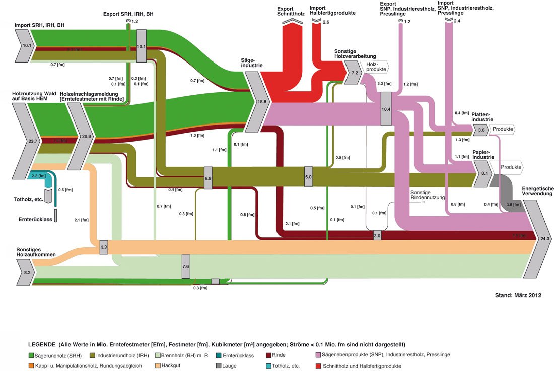
A beautifully crafted Sankey diagram on wood in Austria can be found in the 2012 article ‘Die Bedeutung von Holz als erneuerbarer Energieträger’ (translation: ‘The importance of wood as a renewable energy source’) by Kasimir Nemestóthy on the waldwissen.net website. These are the wood streams in Austria in 2010.

All streams in solid cubic metre of wood (“Festmeter”, fm). Smaller streams less than 0.1 mio solid cubic metres are not displayed.

Here is how the diagram is structured: on the left the sources of wood with imports, harvesting from forests and other non-forest wood sources. Imports and harvested wood is directed mainly to sawmills (“Sägeindustrie”) and to paper industry. Non-forest wood as well as losses from wood industry (bark, wood chips) are for energetic use.

The dark green arrow is saw round wood with the bordeaux-colored stream representing bark. The brown arrow is industrial round wood of lesser quality, mainly used in paper industry. The light pink and light green arrows represent wood chips and firewood. Along with remains from the saw mills and paper industry it is destined for energetic use.

One minor design flaw at the top (arrow from imports to saw mills) where the green arrow overlaps the orange and red arrow in the curve), but by the untrained Sankey eye this will probably rarely be noticed.

There is a second Sankey diagram in the article that details the energy use, but I will save that one for a separate post.