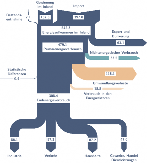
If you are using a big data analysis tool aka business intelligence (BI) visualization tool you are probably aware that many of them have added distribution diagrams (relationship diagrams), a specific subtype of Sankey diagrams. However, it is not always straight forward to produce them.
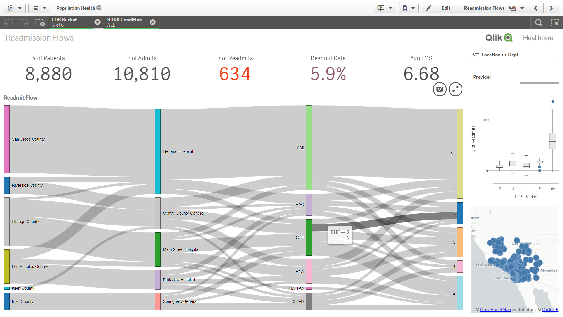
Qlik Sense users who need some background before producing their own graphs of this type might want to check out this blog article on ‘Visualizing Flows with Sankey’ on the Qlik blog. Or this one from the Qlik healthcare user group.
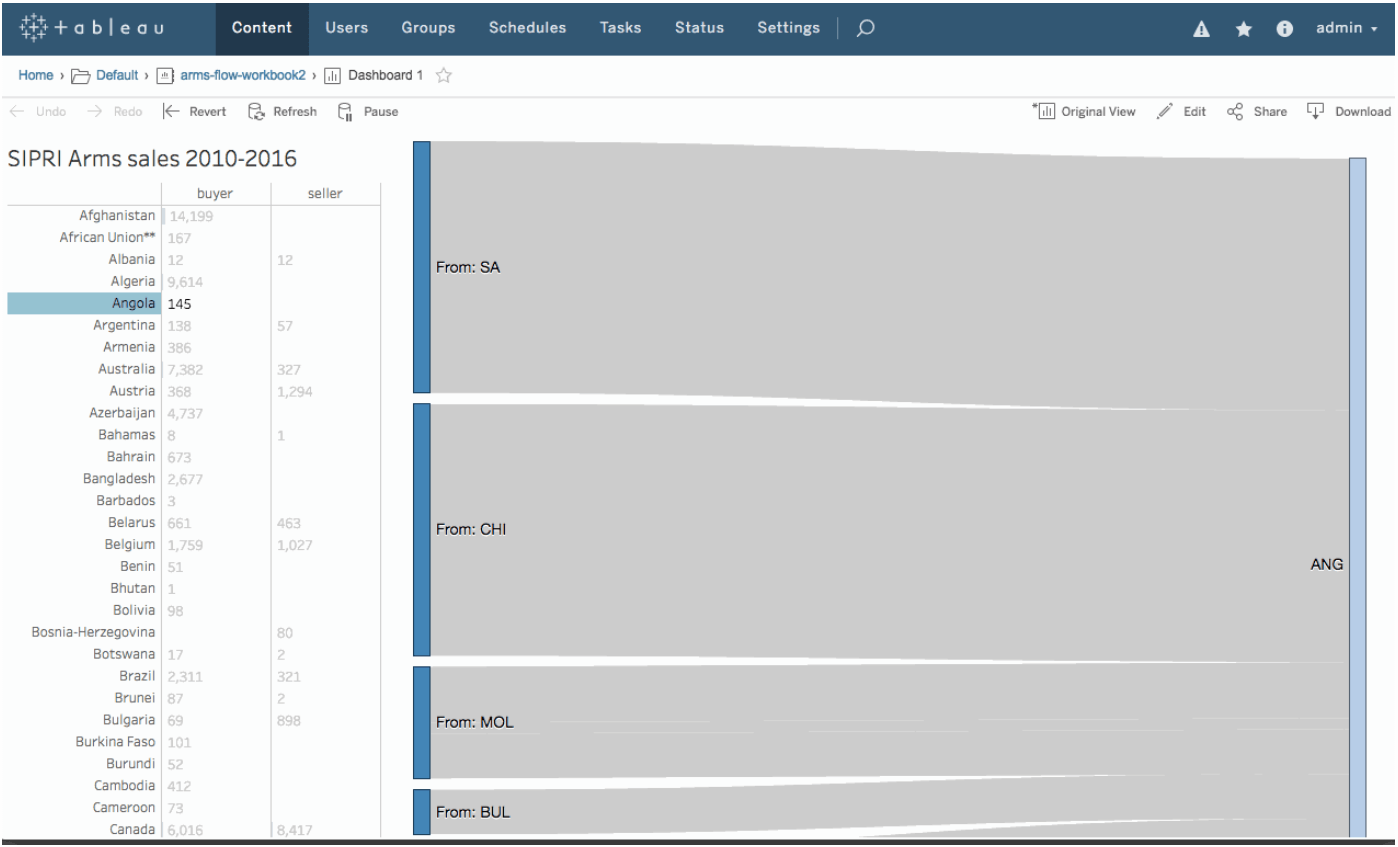
Users of Tableau can get an idea of how to do Sankey diagrams from this Tableau community board post and some detail background from Yoshi Arakawa’s blog here. I have mentioned the Sigmoid curves here on the blog in a December 2018 post.
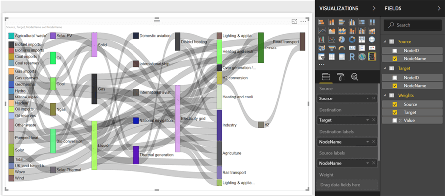
Microsoft Power BI also has category relationship diagrams, although they might “not [be] available by default in Power BI Desktop”. The post by Siddharth Mehta at MSSQLtips.com shows the 16 steps to produce your Sankey diagram from data managed in Power BI.
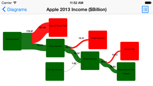
All three visualizations look very similar. This is because all three tools base their implementation on Mike Bostock’s d3-Sankey package.
