Tag: remake

Tokyo, Paris, Mexico City: MSW flows

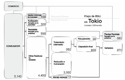
A comparison of the different pathways that municipal solid waste (MSW) is going in large metropolitan centres such as Toyko, Paris and Mexico City is presented in the article ‘La recogida de basura en Mega-ciudades: En el marco de la sostenibilidad’ by Fabian Tron. Available in Revista INVI v.25 n.70 12/2010 on Scielo in Spanish.


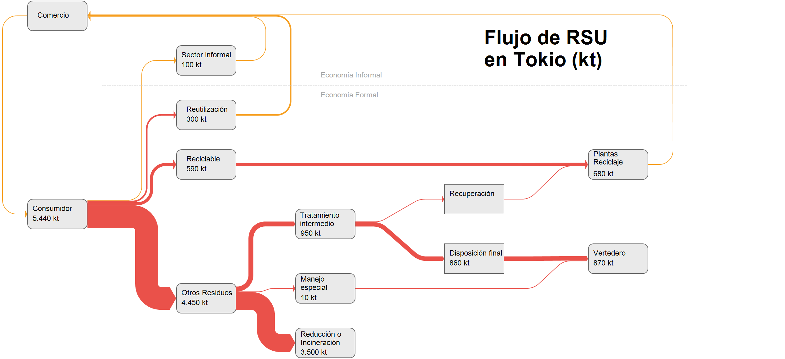
While the data on waste quantities itself is quite old and dates back to 2005, I found the system how household waste is handled differently in these three cities quite interesting. To get an idea of the “weight” of the different pathways, I decided to do a remake of the three figures as Sankey diagrams. Here is the one for Tokyo.


Flows are in 1000 tonnes (kt) per year. There is an informal sector (Economia Informal) where waste streams are not under control of the municipality. The largest part of non-recyclable household waste goes directly to incineration or “reduction”. The remainder is led to treatment plants and eventually most of it ends up in landfill (Vertedero). Note that smaller flow quantities are over-emphasized and are not to scale (otherwise they would hardly be visible in the diagram).

If you want to see the two other Sankey diagrams, please let me know in the comments.
LatAm BEN – Panama

Skipping the remaining countries in South America (Venezuela, Guyana, Suriname, French Guiana) for the time being, my series of Sankey diagrams depicting the National Energy Balance of Latin American countries continues with Panama.

Data for the Balance Energético Nacional (BEN) is available on the website of the Ministry of Energy (Secretaría Nacional de Energia), but I could only find this visual representation of the Matriz Energético done in Excel.

Arrow lines are all the same width and glued together from horizontal and vertical line segments. To be featured here on the blog, it has to be some kind of Sankey diagram, with the magnitudes of the arrows or bands representing the flow quantity.

I checked the sieLAC page maintained by OLADE, but there I could only find energy flow diagrams up to the year 2010.

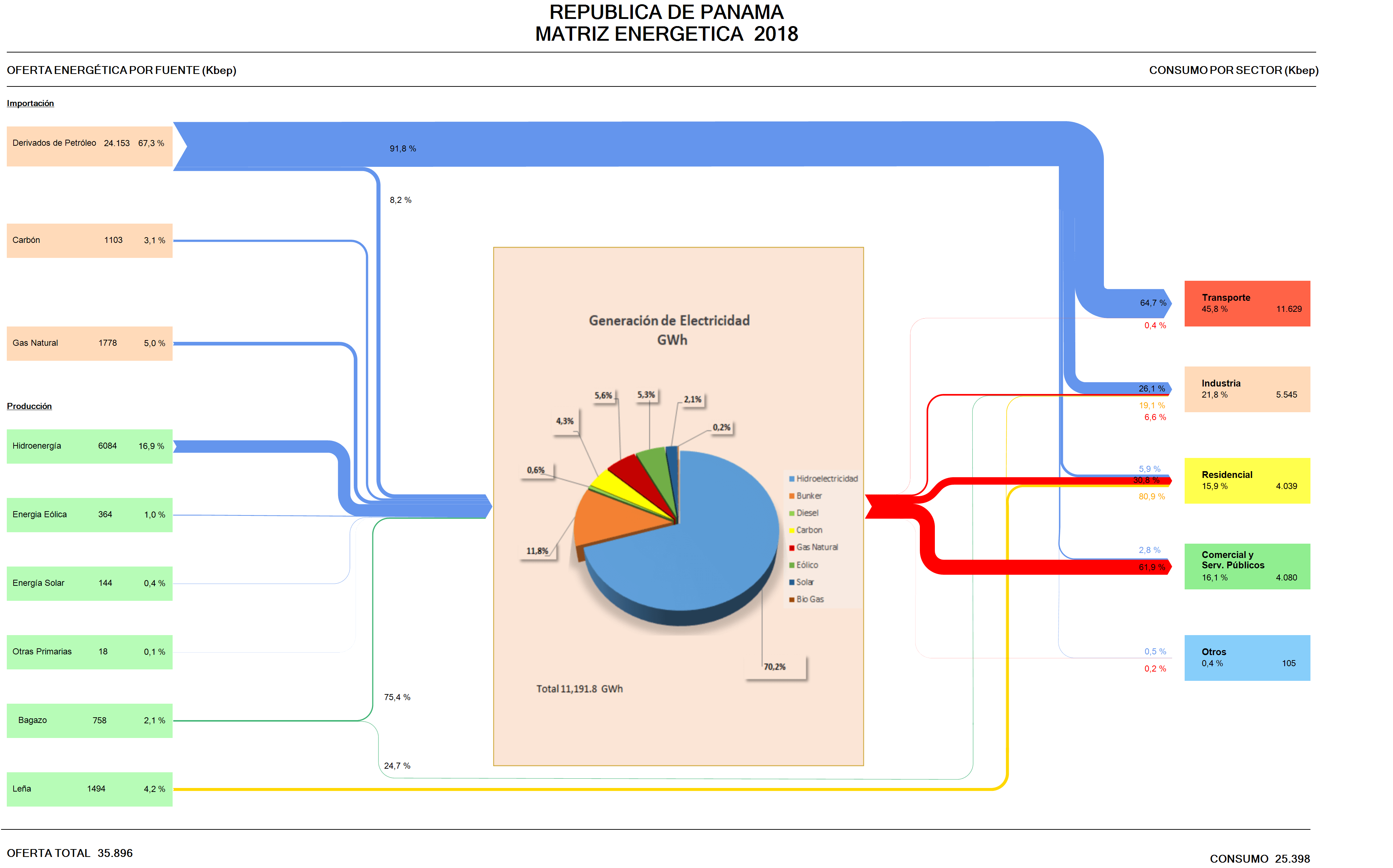
So I decided to “translate” this Excel figure (which has all the numbers) into a Sankey diagram. As it turned out, the work wasn’t straightforward, since this figure uses two, actually three different units. Primary energy on the left and consumption per sector is in kbep (kilo barrels of oil equivalents). The pie chart in the middle that represents the electric energy generation is just an insert with data in GWh. The arrows in the Excel figure are labeled in percent. I started out using the kbep scale, but then was unable to convert the quantities for the streams, since actually energy losses are omitted in the figure.

Here is my remake:


I chose to work with the percentage scale for the downstream splits per fuel, setting the magnitude of the energy generated at the same size as the input. We can see that the energy landscape is dominated by imported petroleum derivates consumed for transport. Actually this is almost three times as much energy as is being used for energy generation. Domestic energy production is mainly from renewables with only some coal and natural gas.

Colors and general layout of the remake stick pretty much to the original figure.

UK Resource Flow 2014

This Sankey diagrams for the resource flows in the UK in 2014 can be found in the Digest of Waste and Resource Statistics – 2018 Edition. The report is published annually by UK’s Department for Environment, Food & Rural Affairs (DEFRA). This is for all mass flows nationwide, but excluding fossil fuels and energy carriers. Unit of flows is megatonnes (mt) per year.

That figure didn’t quite convince me. Apart from the the pixelated arrow segment borders where arrows don’t run vertically (see red arrow), I found that some flow quantities were missing. Further, I didn’t like that the blue recycling back flow was exaggerated (read: not to scale) and the 91 mt arrow as wide as the green 143 mt biomass flow (at least in some segments). To be fair, the footnote for the diagram warns “that the ‘pipes’ are not all to scale”, but my impression was that this effect was mainly used to emphasize the thinner arrows.

I did a quick redo of this resource flow diagram only to find out that it was impossible to determine some of the missing flow quantities. I could find some of them in the report, but was unsuccessful for others. So I had to estimate them (which is indicated with an asterisk in my version).


Warning: Some values based on estimates, please do not use the data from this figure.

As you can see the recycling stream is less wide in my remake. Didn’t fully hit the right color codes, but tried to stick to the original layout as much as possible.

LatAm BEN – Bolivia

In my mini-series on National Energy Balances (Balance Energético Nacional, BEN) of countries in South and Central America, I have reached the Plurinational State of Bolivia.

I couldn’t find any Sankey diagrams on the website of the Ministerio de Hidrocarburos, which apparently is responsible for drawing up the energy balances for Bolivia. However, I was sure they must exist, as a press release for the launch event of the report exists. Finally I found a publication of the ministry for 2000-2009 in the BIVICA library and it has some black/white energy flow diagrams.

There have been newer editions of the report until at least 2015, and here is the BEN Bolivia for 2014 (from the OLADE library), You might remember that OLADE, the inter-governmental Organización Latinoamericana de Energía plays an important role in motivating countries to draw up their BEN and runs a website where BENs are available for many Latin American countries).


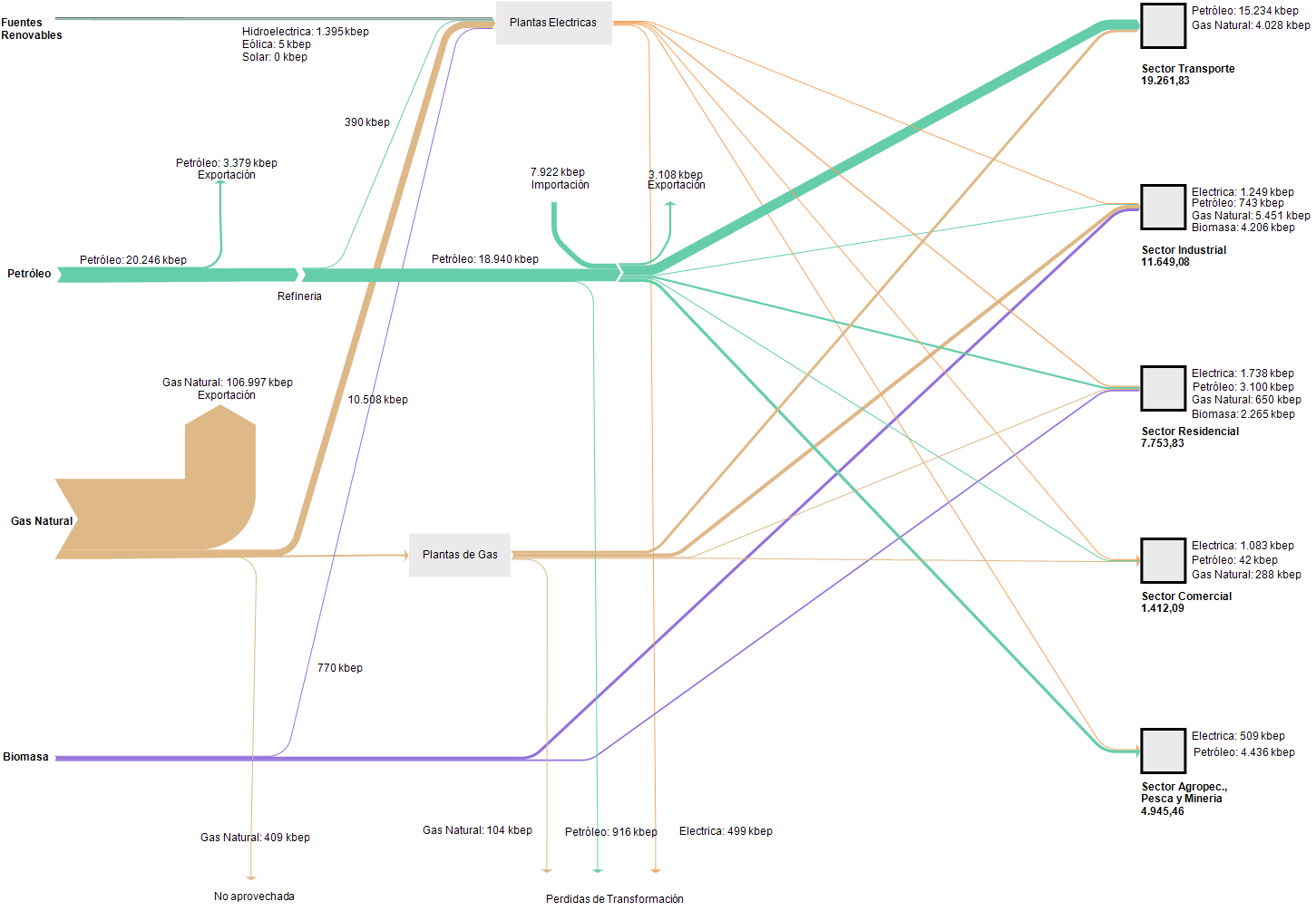
The unit of flows is ‘kbep’ (kilo barrels of oil equivalents / miles de barriles equivalentes de petróleo). Now, this Sankey diagram is definitely not to scale: the width of the flow representing 133,902 kbep of gas would have to be almost 6 times wider than the one standing for 23,065 kbep of petroleum. The biomass flow would have to be much thinner in comparison, hence it is over emphasized in the diagram for the reader who is unaware. My feeling is that the person who did this wasn’t acting with bad intentions, but had no technical means or support to do this properly and just glued it together from round rectangles, arrows and other shapes.

Definitely a candidate for a remake, if I find the time… Edit: I found some time to remake this BEN for Bolivia with flows being to scale. Quite a difference to the above! It becomes obvious, that the country is primarily a natural gas exporter. I didn’t notice this dominance of energy export at first. Now with the flows being to scale, the details and differences of the other flows are hard to tell. One would have to remove the natural gas export to show more of the domestic energy flows.

An analysis of the BEN Bolivia and some background on the data is available (in Spanish) in this paper.

Finland Wood Flows, Two Versions

The below Sankey diagrams both show wood biomass flows for Finland for the year 2013.

The first one was published in the report VTT Technology 237 ‘Sustainability of forest energy in Northern Europe’ by researchers from VTT Technical Research Centre of Finland and Natural Resources Institute Finland (Luke).


Authors of this figure are Eija Alakangas and Janne Keränen. The diagram is oriented top-to-bottom and shows how the 104.4 Mm³ of round wood that grew in Finnish woods in 2013 were used. Basically there are two (three) main pathways, with a lot of arrows branching out to depict certain uses. 38.3 Mm³ of round wood was used in pulp industry, 26.2 Mm³ in the mechanical wood industry. Another 9.5 Mm³ of wood is used directly for energy generation.

The second Sankey diagram seems to be a remake of the above. It was published in a VTT Research Report on ‘Cascading use of wood in Finland – with comparison to selected EU countries’ by Laura Sokka, Kati Koponen, Janne T. Keränen.


Here the overall orientation is left-left-to right. The color scheme seems similar. There are some minor differences in the energy use part (orange and dark red arrows).

The first diagram has some images and comes across a little more playful than the second one. Although they depict the same data, I perceive them quite differently.
Is it due to the scaling or the vertical vs. horizontal orientation? Let me know your impression in the comments please.

Global Plastics, Ellen MacArthur Foundation

This week the global plastics flows topic made the news and social media with the publication of the EU Plastics Strategy and Chancellor Philip Hammond presenting the United Kingdom’s plan for tackling plastic waste.

Ellen MacArthur Foundation has long been active in research and awareness building in this field. It aims at supporting a transition to a circular economy. The foundation tweeting under @circulareconomy contributed this Sankey diagram. It is from a 2016 report they produced together with the World Economic Forum and McKinsey.

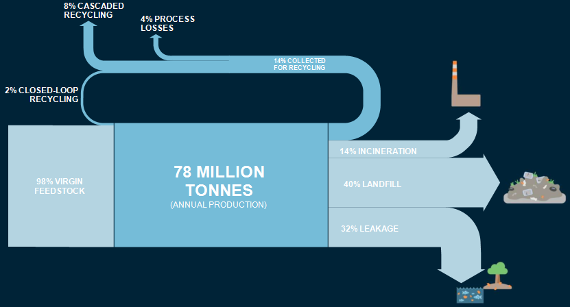
The Sankey diagram shows indeed, that “today, plastic packaging material flows are largely linear”. This beautifully crafted diagram had already caught my attention back in 2016 when I first saw it.

However, I had this subtle feeling that something was wrong here. Not regarding the content or the data … but rather that something wasn’t OK in the Sankey diagram, Just my gut feeling. Now, seeing the Sankey diagram again in the above tweet this week, I finally sat to quickly do a remake of this Sankey diagram. Here it is:

I stuck to the original layout and design as closely as possible, using the same color codes and even the white all caps font. While transfering the numbers (all percentage values, so no issue there), it immediately became clear to me what caused my irritation. Can you identify it yourself by comparing the two pics?

Won’t give it away now and wait for your comments. Will post the answers to this small ‘spot-the-difference contest’ here next week.

[Edit 24 Jan] Blog reader ‘First!’ was the first to comment and point out that the 2% recycling flow does not seem to be to scale (i.e too wide / overemphasized) in the Sankey diagram published by Ellen MacArthur Foundation, and possibly the same issue with the two arrows representing 14% each.

Heat Flow Retro Sankey Diagram Remake

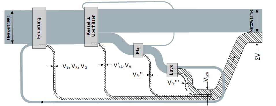
‘Dubbel’s Handbook of Mechanical Engineering’ could be considered a bible for mechanical engineering students in Germany. Despite its 900 pages it is still called a pocket book (‘Dubbel – Taschenbuch für den Maschinenbau’) in German quite euphemistically. Since it was first published in 1914 by Heinrich Dubbel it has seen some 24 editions and roughly 920,000 copies sold. Since 1994 it is also available in an English translation from Springer Publishers.


Someone challenged me, if I could do the above figure from Dubbel’s book (“Wärmestrom in einer Kesselanlage”, heat flow in a boiler system). I did various copies and here are the two I like best:

In this version losses are shown in grey with a gradient to dark grey.

The other one sticks closer to the original with the hatch pattern on the arrows representing losses. I had to fill the nodes since the contrast between the colored arrows and the hatched arrows was just too harsh.

I confess I couldn’t do the labels with prime marks and subscript directly in e!Sankey. So I did them in Word, created tiny images and rotated them as work around. Later I found out that the whole image was probably originally intended to be displayed vertically, but rotated to the left only to save space in the book.

Anyway … a fun challenge. I hope you like the result. Let me know your opinion.

World Petrochemical Balance, Sankey

The International Energy Agency (IEA) is a good source for reports on energy, both with a focus on global energy, but also breaking it down to the national level. I have featured their Sankey diagram website that allows to access national energy balances for many countries in this post back in 2013.

Browsing through their reports also sometimes reveals Sankey diagram gems. In their report on ‘Tracking Industrial Energy Efficiency and CO2 Emissions’, however, I found the diagrams on aluminium, steel, pulp/paper and petroleum not particularly sexy.

This is a schematic block diagram. Arrows are labeled with the quantity in Mt/year.

I decided to redo this as a Sankey diagram, maintaining the general structure of the original diagram. The width of the Sankey arrows immediately exhibit where most of the mass (crude oil) is…

I chose three colors: blue for the actual products from petrochemical industry, yellow for recycling streams and losses, purple for the precurors or feedstock (I actually thought I should do away with these, since the ‘hydrogen energy’ flow gave me some headache…). Also decided that the head of the arrow representing 115 Mt/year of post-consumer waste leading towards (!) net additions to stock in the original diagram is erroneous and thus turned the arrow around.

Didn’t spend much time on graphic aspects or fine tuning. I am sure this can be done quite nicely. But even like this I think a Sankey diagram is the better way to get the message across.