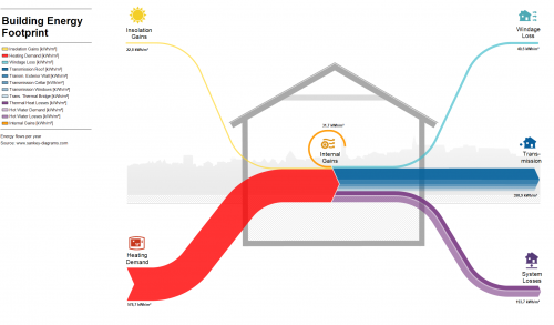
Just to get going again after the summer break, here is a schematic Sankey diagram of a plus energy building. Swiss architectural firm Moosmann Bitterli uses this kind of visualization to offer their energy planning services.
Building Energy, Simple Sankey Diagrams
From my collection of Sankey diagrams here are three very similar samples depicting energy flows in a building. All three are from Germany (did I mention that more than half of the Sankey diagrams seem to be from Germany or Austria?).
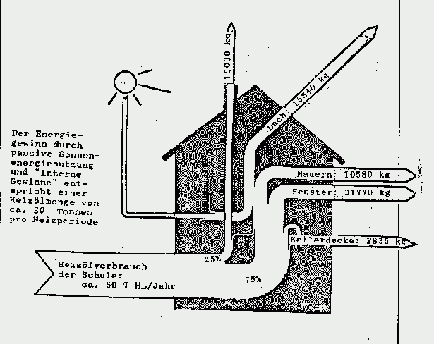
These are all very simple Sankey diagrams. This first one is a hand-drawn goodie from the times when reports were still done with a typewriter. It shows use of fuel oil (‘Heizol’) in a school building, and interesting to see, the flows are given in kilograms fuel oil rather than to represent the heating value. The school building consumes 80 tonnes of fuel oil per year.
Note that flows are not to scale (arrow for equivalent of 10580 kg fuel oil annual heat loss through walls is about the same width as the one representing 31770 kg heat loss through windows). So this Sankey diagram doesn’t deserve an A…
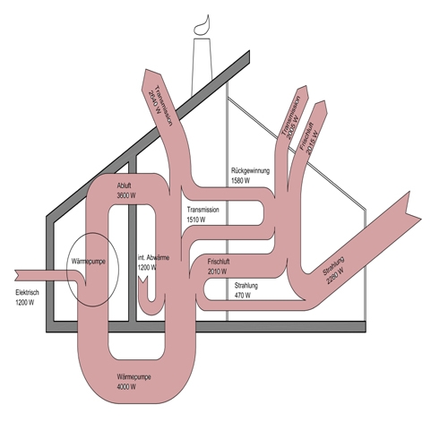
The next building energy flow Sankey diagram shows flows in Watts (W). Not sure where I found this one. Flows again are not proportional (spot the 470 W flow and compare it to the others). Main inputs are radiation (‘Strahlung’) and electric energy. A heat pump cycling energy can be seen, so it seems that this one is maybe for a passive house.
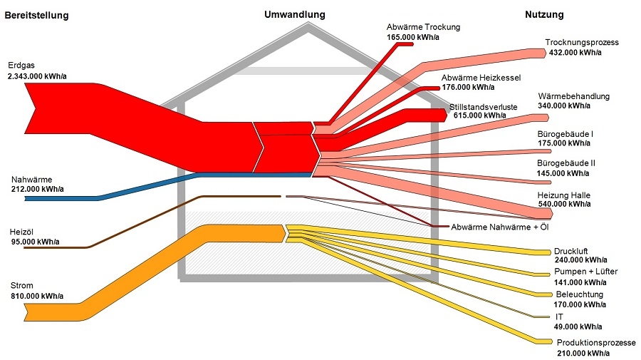
This last one done with a Sankey diagram software hence flows are to scale in this one (although I have some doubts regarding the width of the fuel oil input arrow on the left). Flows are in kWh per year. Main fuel type is natural gas (red), some district heating (blue). Electric energy in yellow, consumed by IT, lighting, air compressors, and so on. This energy flow Sankey diagram is probably for a factory building or complex.
I will try to add the sources where I found these three diagrams. Please forgive my negligence this time.
Energy Flows in Building Sector
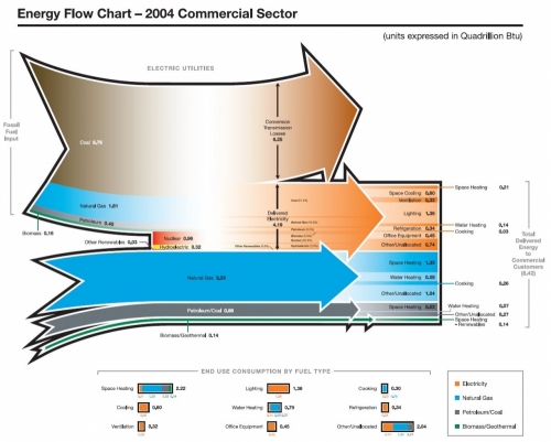
An energy flow chart for energy use in the residential building sector is shown on the Autodesk Sustainability Workshop page ‘Measuring Building Energy Use’. There is also a similar Sankey diagram for energy sources consumption in the commercial building sector.
Both are taken from a Pacific Northwest National Laboratory (PNNL) report from 2006 prepared for Department of Energy (DOE) titled ‘Energy End-Use Flow Maps for the Buildings Sector by D.B. Belzer (PNNL-16263).
Residential building sector energy flow chart:
Commercial building sector energy flow chart:
Both Sankey diagrams are built up the same way. The top part of each diagram shows electricity generation, the bottom part the energy flows for heating. Significant conversion and transmission losses can be identified by the arrow branching out at the top. Flows from the left represent the energy sources: coal (brown), natural gas (blue), biomass/solar (green). To the right the flows are broken down to the individual consumption, such as heating, cooling, lighting, other electric appliances, etc.
All units are in quadrillion BTUs for the U.S in 2004.
Estonia House Energy Balance
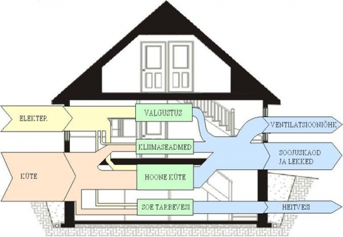
Similar to the Sankey diagram shown in a post last week, the below Sankey diagram also shows the energy balance of a house. Found it on an Estonian blog.
Unfortunately just a schematic Sankey diagram without figures or units. Energy “input” and losses. Looks to me like a hand drawn sketch. Valgustus is lighting, Kliimaseadmed is air conditioning, Hoone Küte is heating, and Soe Tarbevesi is warm water (thanks to Google Translate).
Sample Diagrams in e!Sankey
I am subscribed to different newsletters and RSS feeds to keep track of the Sankey diagram software market, trying to stay up-to-date on new software available or updated versions.
The latest release of e!Sankey (v3.2, the second one this year after v3.1 in January) seems to be mainly a bugfixing release. However, what’s nice is that they have included a number of new sample diagrams and templates.
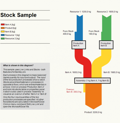
This is a Sankey diagram depicting the energy balance of a family home.
The one below has an interesting feature where balance differences (or as they call it: “stocks”) occur at a process, in a top-to-bottom direction.
Most samples feature a description panel, some of them a color legend for flows. There are more in the trial version. Nice
Grieger Family Personal Energy Balance
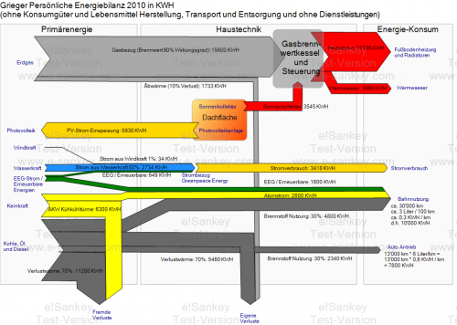
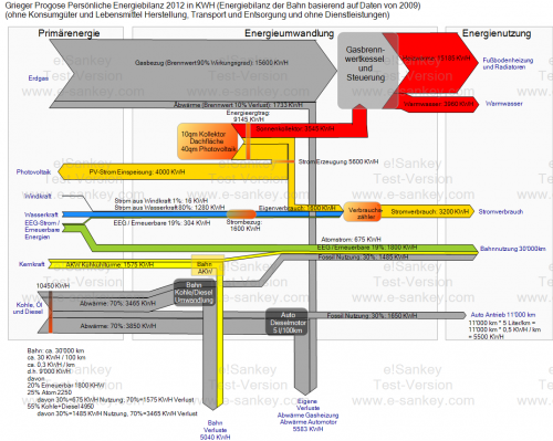
The “personal” energy balance of the Grieger family home for 2010 and a forecast for 2012 were presented in two blog posts here and here on Klaus Grieger’s blog.
All consumptions are traced back to the primary energy demand and include losses (dark rey arrows) in power generation by using efficiency factors.
2010
2012 forecast
The details of these Sankey diagrams are probably most interesting for those who understand German.
A PV system on the roof of the Grieger house permitted to feed back 5930 KWh of electric energy to the grid in 2010. In 2012 some of this energy is used directly (“Eigenverbrauch”), leading to a reduced energy bill for electricity purchased. Note that the Grieger family gets “green power” from hydro, wind and other renewables.
Another change between 2010 and 2012 is an updated mix of energies German Rail use (nuclear, coal and gas fired power plants).
Note that the two diagrams do not have the same scale. The consumption of heat is the same in 2010 and the 2012 forecast, so is primary energy demand from natural gas (grey arrow “Erdgas” at the top). Still, the 2012 Sankey arrows are wider than in the 2010 version. It would be nice to have the two Sankey diagrams side-by-side and be able to compare them by looking at the arrows widths.
Sankey for Building Performance Simulation
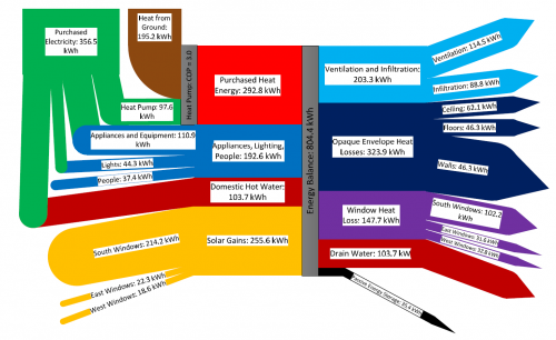
Found this via utsapocalypse. The Sankey diagram is originally from the article ‘Preliminary Investigation of the Use of Sankey Diagrams to Enhance Building Performance Simulation-Supported Design’ by William (Liam) O’Brien of Carleton University, Ottawa.
The paper proposes “the outline for a methodology for creating Sankey diagrams to represent energy flows in buildings, with the eventual intent that the methodology be integrated into a software tool.”
The Sankey diagram shows the energy balance of a house for a mid-winter week. Flows are in kWh, total amount 804 kWh. Energy sources/types are from the left (purchased heat, domestic hot water, solar gains), energy consumption and losses to the right (heat loss through windows, ceilings, walls).
Plenty of colors used in the diagram, Sankey arrows glued together from shapes. As the author mentions “the underlying creation process, when performed manually, can be quite complex”.
Misc Sankey Diagrams Uncommented 03
From the Mostly Uncommented Series, here is another one that has been sitting in my collection.
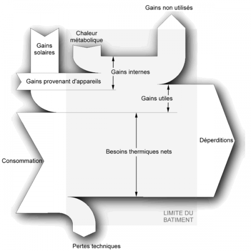
Black/White Sankey diagram for energy gains and losses in a building. Titles in French. Shadow effects. No values given. Unnecessary crossing of Sankey arrows. Not sure where I downloaded this from, will have to check my bookmarks. In the meantime, pls have a nice week-end…
