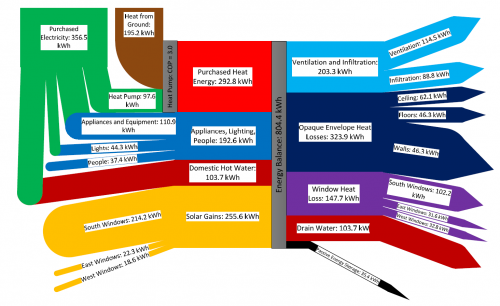
Found this via utsapocalypse. The Sankey diagram is originally from the article ‘Preliminary Investigation of the Use of Sankey Diagrams to Enhance Building Performance Simulation-Supported Design’ by William (Liam) O’Brien of Carleton University, Ottawa.
The paper proposes “the outline for a methodology for creating Sankey diagrams to represent energy flows in buildings, with the eventual intent that the methodology be integrated into a software tool.”
The Sankey diagram shows the energy balance of a house for a mid-winter week. Flows are in kWh, total amount 804 kWh. Energy sources/types are from the left (purchased heat, domestic hot water, solar gains), energy consumption and losses to the right (heat loss through windows, ceilings, walls).
Plenty of colors used in the diagram, Sankey arrows glued together from shapes. As the author mentions “the underlying creation process, when performed manually, can be quite complex”.
