Tag: vertical

Non-Ferrous Metal Waste Paths

Another spectacular Sankey diagram from the final report of the project “Resource conservation through material flow-oriented secondary raw materials management” published by German Environment Protection Agency (Umweltbundesamt, UBA). This one is on non-ferrous metals in waste and recycling paths Germany. Flows are in mio. t for the year 2013.


I had presented another Sankey diagam from this report (on paper and cardboard streams) here on the blog back in January. You can access the full report here.

Rapeseed Production

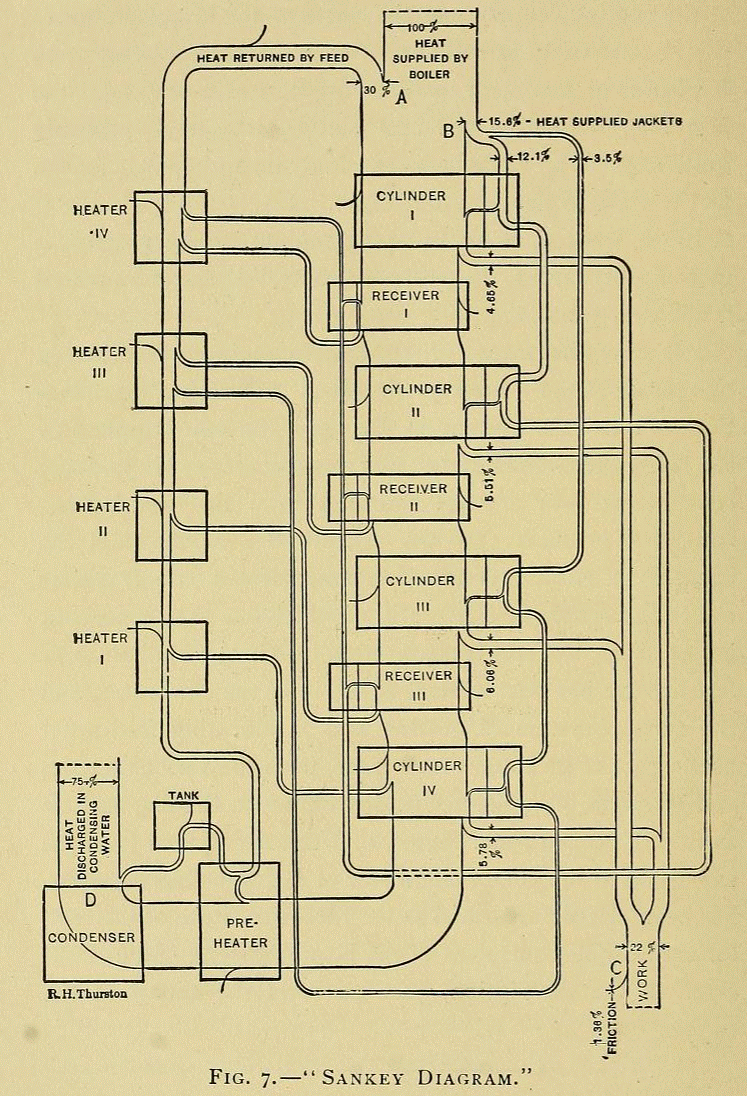
From the museum of Sankey diagrams, here is a black&white classic. This Sankey process diagram for rapeseed oil production is taken from the year 2002 dissertation ‘Simultane Öl- und Proteingewinnung bei Raps’ (Simultaneous oil and protein production from rapeseed) by Andreas Waesche, Berlin Technical University.


Flows are in kilograms per ton of rapeseed input. Black is the water fraction, dark gray is oil, and light gray is oil free dry matter. Rapeseed husks, filtered matter and liquid rejects branch out on arrows to the right. Extract from the T4 separation stage (‘Extrakt als Ruckfuhrung’) is fed back into the second node although this loop is not shown here.

Paper and Cardboard Streams Germany 2013

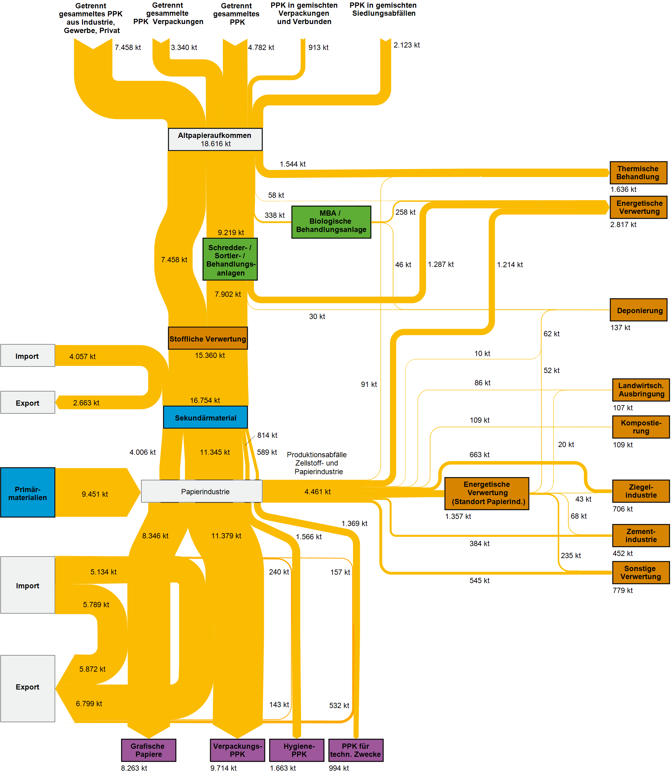
German Environment Protection Agency (Umweltbundesamt, UBA) has published the final report of its project “Resource conservation through material flow-oriented secondary raw materials management” (German: “Stoffstromorientierte Ermittlung des Beitrags der Sekundärrohstoffwirtschaft zur Schonung von Primärrohstoffen und Steigerung der Ressourcenproduktivität”).

The study had been commissioned to three research institutes that were tasked to “analyse the Federal Statistical Office’s waste statistics … and carry out detailed investigations for 30 materials with focus on determining the recovery routes of these secondary raw material quantities and their derived substitution potentials.”

The report is gold for Sankey diagram aficionados: For all of the thirty materials analysed we can find Sankey diagrams depicting the streams through the economy and different recycling paths and secondary use options. Here is an example for paper and cardboard.

Flows are in kilo tonnes (kt) of material in 2013 in Germany. Inputs at the top are sources of paper fibres from waste collection. The general direction of flow is top-to-bottom with energetic use and reuse in other industries branching out to the right (brown boxes). Imports come in from the left and exports leave to the left again. Interesting to see, for example, that exports of graphical paper products almost exactly match the imports, while packaging paper exports (see stream to purple box “Verpackings PPK”) are slightly higher.

Beautifully crafted Sankey diagrams. A pity this isn’t available in English, but for those who love these self-speaking diagrams, here is the link to access the full report. Enjoy!

Aircraft Crashes Cause/Phase Relationship

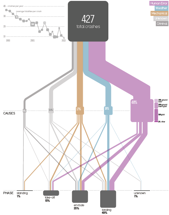
This one is from a very interesting 2015 blog post titled ‘Visualizing the causes of airline crashes’ by Rick Wicklin on the SAS blog.

The original graphic discussed is from David McCandless’ book ‘Knowledge is Beautiful’. Wicklin, a researcher in computational statistics at SAS has praise for the beauty of McCandless’ infographics, but criticizes the use of a Sankey diagram, points to two main issues with the diagram, and suggests to instead use a mosaic plot to convey the message.

The underlying data is for the time frame 1993 to 2013. The 427 aircraft crashes in that period are broken down in two categories: the cause of the crash (human, mechanical, weather, criminal) and the phase of flight when the crash occured (landing, en route, take off, standing on ground).

In addition to the width of the bands linking the nodes, the size of the nodes themselves are used to represent a percentage share. (This is BTW one of the problems that Wicklin identifies, read more here).

The inset at the top left should also be mentioned, as it shows that the absolute number of aircraft crashes over two decades has a downward trend… maybe a consolation to those that who are afraid of flying…

Brexit Negotiations Outcomes – Outdated!

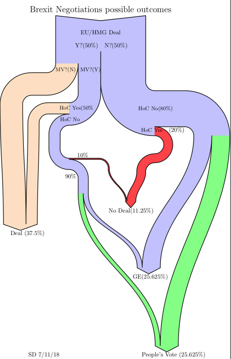
As Boris Johnson makes a dash to Luxembourg today for negotiations with Juncker on Brexit, this Sankey diagram from a blog post ‘Brexit Negotiation Outcomes using a Sankey Diagram’ by Sean Danaher at Progressive Pulse – less than a year old (Nov 9, 2018) – is soooo outdated. In fact the situation was (and still is) so fluid that any attempt to describe it can be outdated within a week or even a day…


This is a decision-tree diagram, just that the estimated probabilities for a decision are shown as weighted paths. Decision paths can merge again when they lead to the same result.

Note: I try to keep this blog non-political. The only other politics related Sankey diagrams are here (Scottish referendum) and here (Trump).

Adyen Income Statement Sankeyfied

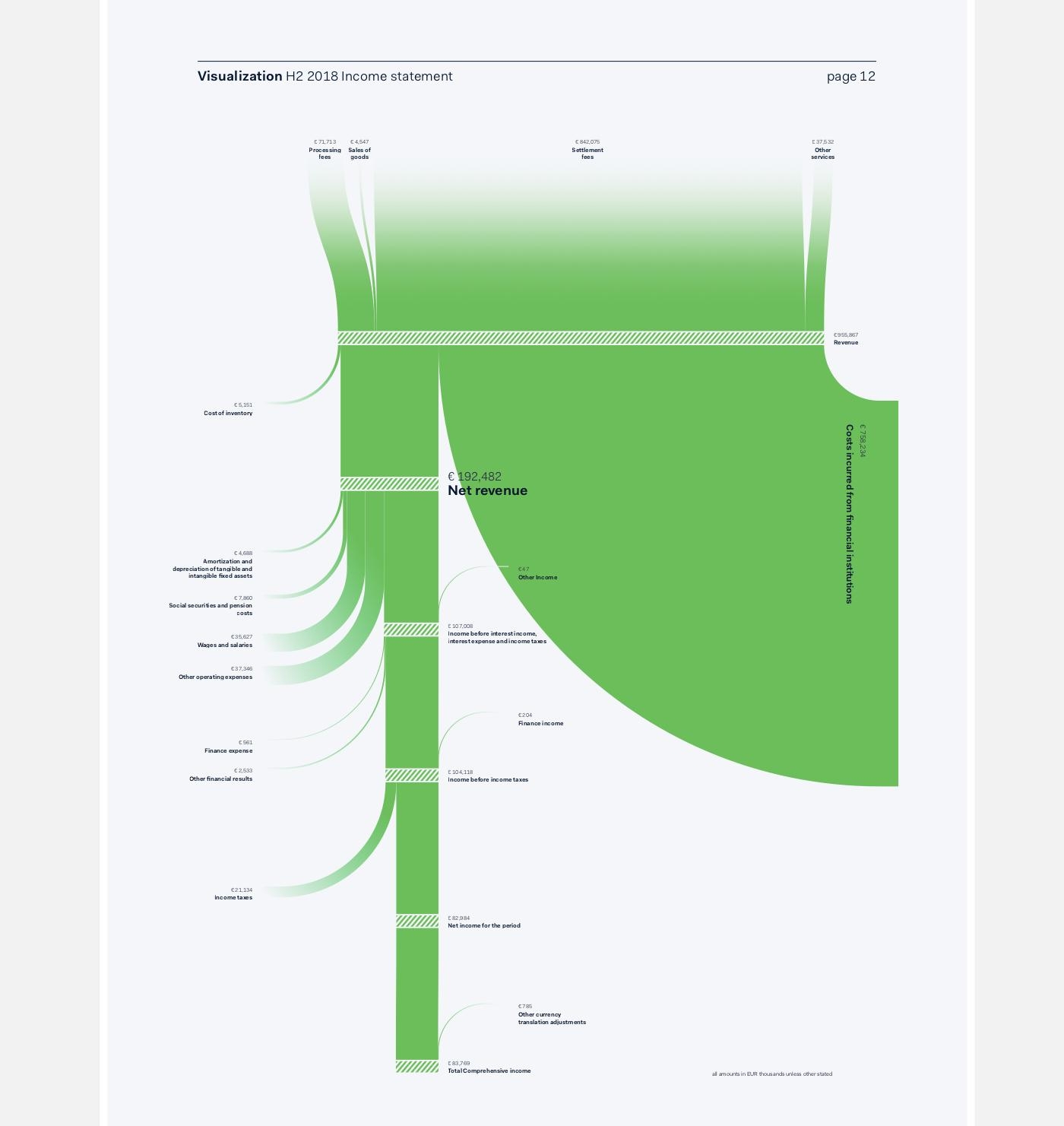
Amsterdam-based graphic designer Nadieh Bremer (a winner of a 2017 Information is Beautiful award) has created this Sankey diagram for the H2 2018 shareholder report of Adyen.

Definitely a novelty in a financial report (at least I have never seen a Sankey diagram in a such a publication).


via Twitter @NadieBremer

Apart from the fact that it is beautifully crafted and clean, it is also quite a tweak of the d3.js Sankey library … After all, this is not the typical d3.js Sankey diagram (with left-to-right orientation, only with boring grey bands, or even arrows superimposing each other where they curve). Here we have a top-to bottom flow, with streams branching out to the left and to the right, flows smoothly curving in to join the main streams, saturated color, and an interesting hatching pattern on the nodes.

Nadieh writes on her decision to use a dedicated software: “The main reason was the fact that the final numbers could change (slightly) until just days before the publication, making it quite a chore to have to remake these if they were all crafted in Illustrator.
Furthermore, by programming the logic of these visuals, I could prepare 90% of the required effort a month before the deadline by using the numbers from the previous report. When I finally received the final numbers, it was only a matter of changing the underlying data, and some small tweaks to get these final visuals ready.”

Gudalquivir River Basin Water Flows

I discovered this Sankey diagram in an article by Gutiérrez-Martín, C.; Borrego-Marín, M.M.; Berbel, J. on ‘The Economic Analysis of Water Use in the Water Framework Directive Based on the System of Environmental-Economic Accounting for Water: A Case Study of the Guadalquivir River Basin” (published in Water 2017, 9, 180, open access article licensed under Creative Commons (CC BY 4.0). The Guadalquivir river basin is in Andalusia, Southern Spain.

The authors note that Sankey diagrams for water flows in a river basin or catchment area are useful because they show “at a glance, several aspects of the water cycle such as economic units, abstraction, supply, use, consumption, and returns to environment (soil water not included). In studying water use pathways, Sankey diagrams illustrate quantitative information about flows, their relationships, and their transformations.”

We see water taken (“abstracted”) from surface or groundwater by water supply companies and other users, distribution and water consumption by sectors, water flows ‘lost’ to the atmosphere and return of water to the environment.

Flows in this diagram are in hm³ (cubic hectometres). Note that they decided to use another scale for water used for energy generation (x 10 hm³) since otherwise the yellow-beige would be 10 times wider and maybe spoil the whole diagram.

The diagram has a top-down orientation and numerous loops and flow feedbacks, in contrast to the typical distribution diagrams (aka alluvial diagrams). It is well structured, nicely crafted and pleasing to the eye. Definitely on my top 10 list for 2018.