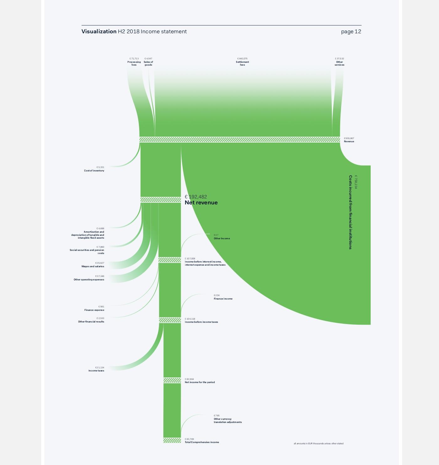
Amsterdam-based graphic designer Nadieh Bremer (a winner of a 2017 Information is Beautiful award) has created this Sankey diagram for the H2 2018 shareholder report of Adyen.
Definitely a novelty in a financial report (at least I have never seen a Sankey diagram in a such a publication).
via Twitter @NadieBremer
Apart from the fact that it is beautifully crafted and clean, it is also quite a tweak of the d3.js Sankey library … After all, this is not the typical d3.js Sankey diagram (with left-to-right orientation, only with boring grey bands, or even arrows superimposing each other where they curve). Here we have a top-to bottom flow, with streams branching out to the left and to the right, flows smoothly curving in to join the main streams, saturated color, and an interesting hatching pattern on the nodes.
Nadieh writes on her decision to use a dedicated software: “The main reason was the fact that the final numbers could change (slightly) until just days before the publication, making it quite a chore to have to remake these if they were all crafted in Illustrator.
Furthermore, by programming the logic of these visuals, I could prepare 90% of the required effort a month before the deadline by using the numbers from the previous report. When I finally received the final numbers, it was only a matter of changing the underlying data, and some small tweaks to get these final visuals ready.”
