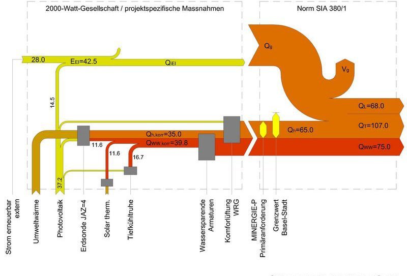
Another sample Sankey diagram in German from the building sector. Swiss architectural firm Moosmann Bitterli has this on their website to showcase their services. Not sure what the unit of flow is, but definitely energy related.
Swiss Sankey Sweetness
Unpretentious and humble, quietly producing beautifully crafted Sankey diagrams … this is one reason why I admire the Swiss (and also for their Swiss Schoki, cheese and engineering skills).
This is the energy flow chart for the Swiss canton ‘Basel-Stadt’ for 2014 published by the Statistics Agency of the canton (Statistisches Amt des Kantons Basel-Stadt).
Flows are in Gwh. Nine different energy sources on the left, but only three sectors of energy use: transport, residential and non-residential. Observe how the colors of the icons match the corresponding colors of the arrows. Flow quantities below approximately 150 GWh are not true to scale and are drawn with a minimum width to keep them visible. The footnote alerts the reader to this graphical pecularity.
This Sankey diagram does set a standard for other similar energy flow charts, in my opinion.
Download the report from here (in German), the diagram is on page 11.
Lausanne Energy Balance
From a paper ‘Integration of deep geothermal energy and woody biomass conversion pathways in urban systems’ by Stefano Moret, Emanuela Peduzzi, Léda Gerber and François Maréchal published at Researchgate, this figure of the energy balance of the city of Lausanne (Switzerland).
Flows are in GWh for the year 2012.
Sankey diagram presently not available. Please view article directly at Researchgate.
Switzerland Energy Flows 2015
This Sankey diagram for energy flows in Switzerland 2015 is by Max Blatter of energie-atlas.ch.
Flows are in TJ. The diagram has a consistent color coding: electricity in light blue, oil and derivates in orange, natural gas and biogas in yellow.
Sectors where energy is used are shown at the bottom right with private housholds, industry, services, traffic and agriculture.
Interesting to see that Switzerland’s electricity exports and imports were about equal size in 2015 (blue arrows to/from the top).
A 2007 energy flow Sankey diagram for Switzerland was presented in this post.
Comparison of Swiss Waste Incinerators
Rytec, a Swiss-based consulting firm, is the author of a 2011 report that compares 29 waste incinerators in Switzerland in regard to their energy flows.
The report ‘Einheitliche Heizwert- und Energiekennzahlenberechnung der Schweizer KVA nach europäischem Standardverfahren’ (translation: Uniform heating value and energy indicators calculation for Swiss waste incinerators according to European standard method) was comissioned by Swiss Environment Agency (BFU) and Swiss Energy Agency (BFE).
The annex contains 29 Sankey diagrams like the following:
All waste incinerator Sankey diagrams are structured similarly, allowing direct comparison of efficiency and energy output mix. Data is for 2009.
The first diagram is for KVA Basel (waste incinerator Basel), the second for KVA Oftringen (waste incinerator Oftringen, Aargau). Basel is much larger (incinerated waste with energy content of 710 GWh in 2009) and serves an urban area. Oftringen is smaller and seems to be more of a regional waste incinerator (incinerated waste with energy content of 237 GWh in 2009).
Basel apparently sells off the heat to the district heating system or neighbouring industry (yellow arrow ‘Wäremexport’) and converts only a small fraction to electricity. Oftringen on the other hand sells off electric energy (43 GWh) with apparent losses (grey arrow 122,5 GWh).
A lot more to discover when comparing these two (and the other 27) Sankey diagrams.
Energy Flows in Wood Gas Process
From a presentation by Swiss company CTU Clean Technology Universe AG comes this Sankey diagram for energy flows in a wood gas process.
The diagram is set up for wood with 50% humidity and an energy content of 1 MJ. The process steps drying, gasification, methanation, CO2 removal yield gas with an energy content of 0,71 MJ (71%). Much of the offheat is recovered in the process, excess heat is fed to district heating.
Wood in brown, gas in orange, heat in red and electricity in blue.
Another Sankey diagram for wood gas here.
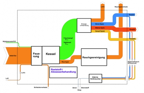
Rytec: Analysis of Waste Incineration Plant
Consulting firm Rytec analyzes energy and heat utilization level of Swiss waste incineration plants and visualizes the processes using Sankey diagrams.
This Sankey diagram from their website is a simplified view and offers no details as to the actual figures. More detail can be found in this project summary (PDF).
Diagram labeled in German, but thanks to my friend Google Translate, I can identify ‘heating’, ‘boiler’, ‘energy conversion’ and ‘flue gas losses’. Orange streams to the top are losses.
Swiss Energy Balance 2005
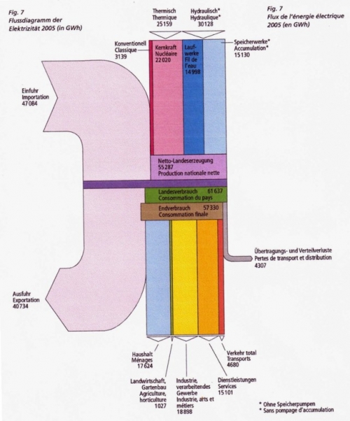
From the Swiss Energy Statistics for 2005 published by BFS comes the following Sankey diagram.
Flows are in GWh. The large pale streams on the left are imports and exports. The vertical bands are domestic energy production (different types of electricity generation) at the top. A breakdown of the consuming sectors is shown in the lower part.
Will try to dig out a more recent energy balance for Switzerland to compare.


