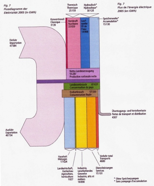
From the Swiss Energy Statistics for 2005 published by BFS comes the following Sankey diagram.
Flows are in GWh. The large pale streams on the left are imports and exports. The vertical bands are domestic energy production (different types of electricity generation) at the top. A breakdown of the consuming sectors is shown in the lower part.
Will try to dig out a more recent energy balance for Switzerland to compare.
