Tag: energy

U.S. Energy History 1800-2019

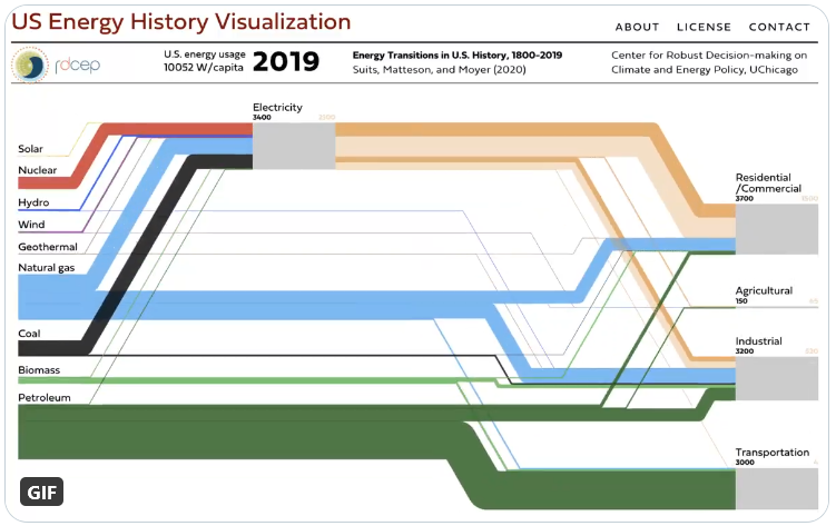
You can watch the changes in United States energy generation and use in a very cool animated Sankey diagram.

This was developed by University of Chicago’s Center for Robust Decision-making on Climate and Energy Policy (RDCEP) and is based on Suits, Matteson, and Moyer (2020) “Energy Transitions in U.S. History: 1800–2019”.


Click here to access RDCEP website and view 220 years of U.S. energy history.

You can play the whole period or use the timeline slider to jump to a specific year. At the top, next to the year, see the per capita use of energy rises from 3.660 W/cap to over 10.000 W/cap today.

Energy Consumption Logistics Center

Here is another Sankey diagram out of Germany. Found this in a 2017 doctoral thesis titled ‘Wechselwirkungen und Auswirkungen von Planungsalternativen auf die Gesamtenergiebilanz und die CO2-Emissionen von Logistikzentren’ by Julia Freis, Lehrstuhl für Fördertechnik Materialfluss Logistik, Technical University Munich (TUM).

From what I understand using Google Translate this seems to be one of the energy scenarios (maintaining a 17°C temperature) for a logistics hub. Flows are in kWh per year.

China Carbon Emissions from Energy

Energy generation in China is dominated by the use of hard coal. This Sankey diagram is from an article titled ‘A Method for Analyzing Energy-Related Carbon Emissions and the Structural Changes: A Case Study of China from 2005 to 2015’ by Honghua Yang, Linwei Ma and Zheng Li (Tsinghua University) in: Energies 2020, 13, 2076; doi:10.3390/en13082076. It shows carbon flow and emissions (I take that as CO2 only, although it might include CH4 if biogas was used)


Published under the terms and conditions of the Creative Commons Attribution(CC BY 4.0) license

Depicted are energy-related carbon flows in China in 2015. Unit of flow is 10 Mt C, which in the last column also translates into Mt CO2.

The sectors Transport (“Vehicle”), Industry (“Factory”) and Buildings are further broken down into the individual services the energy provides, like illumination, thermal comfort, hygiene.

There is another energy flow diagram for China in 2015 in this article, and it shows that there are also other energy sources (hydro, wind, nuclear, solar), but these don’t show up in the carbon flow diagram.

Global Energy Flows 2018/2050, DNVGL

Fresh off the press last week is DNVGL’s Energy Transition Outlook 2020. This report is a “forecast of the world’s most likely energy future through to 2050” and in my opinion this is really good information. The new edition already factors in the effects of the pandemic.

The spread on pages 122/123 has the following Sankey diagrams, a comparison of the global energy landscape in 2018 and the forecast for 2050:


The individual flows are not labeled with quantities, but we get an idea from the blue stream, that represents 27 PWh/yr electricity in 2018 and 60 PWh/yr in 2050. “One striking change on the supply side of the picture is the emergence of solar PV and wind at the expense of coal and oil. Electrification more than doubles through to 2050, which leads to an increase in the overall system efficiency.”

Make sure to download your copy of the DNVGL Energy Transition Outlook 2020, to study the global energy flow Sankey diagram in more detail.

France’s Grand Est Region Energy Flows

Le Grand Est is a French administrative region in the north-east of the Hexagone, comprising Alsace, Champagne-Ardenne, and Lorraine. ATMO Grand Est is a not-for-profit, government-backed association that is monitoring air quality in the region and looking at ways to improve it.

As part of their work they have prepared energy flow diagrams, not only for the whole region, but also on the communal level. More than 100 Sankey diagrams, depicting the energy flows and the use of energy are available on the ATMO website. Visit the resources section and check “Diagrammes de Sankey” in the filter list at the right.

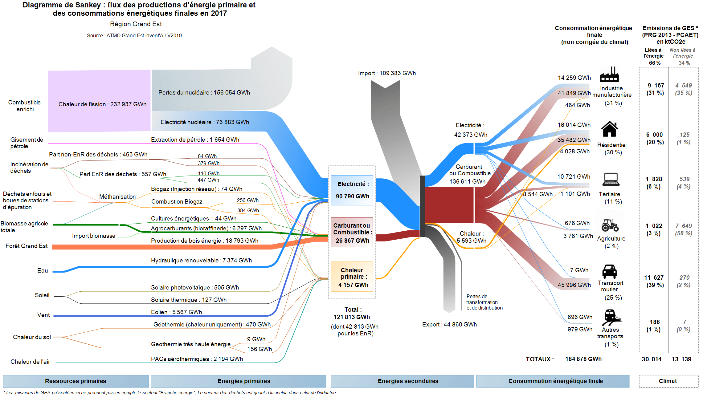
Here is the figure for the overall region with energy consumption and use in Grand Est in 2017. Flows are in GWh.


On the left we see primary resources, with the largest source being nuclear fuel. With an efficiency of only 33% this still delivers most of the secondary energy consumed in the Grand Est region. The grey stream from the top are “imports” to the region, most likely from other parts of France (or from neighboring Germany). The energy consuming sectors are shown on the right. A table next to them points out the GHG emissions linked to the energy.

Each of the individual Sankey diagrams for the CCs (communauté de communes, rural communities) and some CAs (communauté d’agglomération, semi-urban communities) available have exactly the same structure, but they can look strikingly different.

Here is one example from CC Portes de Meuse, a community with just over 17,000 inhabitants


CC Portes de Meuse can apparently cover three-quarters of their energy demand from wind and wood, with only 25% being imported. (Not sure though how they can have 260 GWh energy use in road transport, unless most vehicles are already electric).

Note that although both Sankey diagrams have a similar structure and flows are both in GWh in 2017, this diagram mustn’t be compared directly to the one above in regard to the width of the arrows, since they are on a different scale.

Great work by ATMO Grand Est, and I am sure these visualizations are useful when discussing energy consumption, GHG and air pollution among stakeholders in the communities or the region. They have already announced the Invent’AIR v2020 version to be published in the near future.
Energy Flows in US Manufacturing Sector

From the report “Advancing the Landscape of Clean Energy Innovation” published February 2019 by Breakthrough Energy, IHS Markit, and Energy Futures Initiative comes the below Sankey diagram showing energy flows in the United States manufacturing sector.


Figure based on data from U.S. Department of Energy, 2010 Manufacturing Energy and Carbon Footprint. Flows are in Trillion BTUs (TBtu, Trillion British thermal units). Energy used in manufacturing is steam (heat), electricity and fuels. Energy use is broken down into 5 types of processes in the manufacturing sector. “Applied Energy” is shown in green (58%), and use losses in light grey (42%).

Misc Sankey Diagrams Uncommented 25

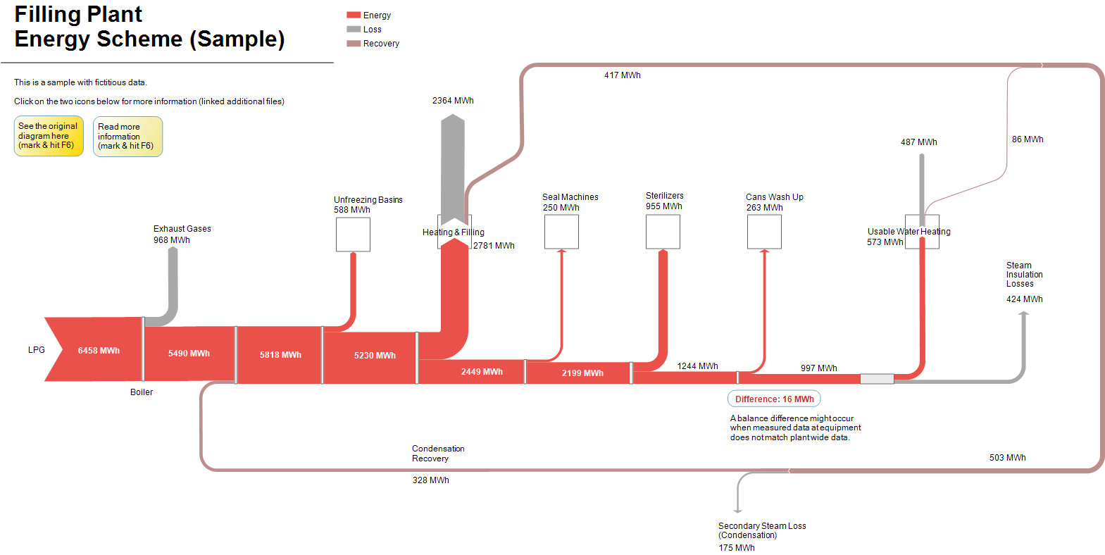
Just a quick Friday afternoon post in order not to let this week slip past without a post. This is a sample from the latest e!Sankey demo version.

The Sankey diagram represents energy flows in a canning plant with heat being distributed to the various steps of the process. Recovery of energy (red-brown arrow) from two of the steps.

Energy Use per Industrial Sector, Indonesia

The article ‘Tracing the energy footprints of Indonesian manufacturing industry’ by Yales Vivadinar, Widodo W. Purwanto & Asep H. Saputra from Department of Chemical Engineering, Universitas Indonesia, Depok, Indonesia (published as Open Access in: Energy Science and Engineering 2016; 4(6): 394–405) looks at typical energy usage in different industrial manufacturing sectors in Indonesia.

There are Sankey diagrams representing “energy maps” for basic chemicals, cement, pulp, paper, spinning, weaving and textile finishing. I am showing two of them below. The first one is for the basic chemical industry.

Flows are in kboe (thousand barrels oil equivalent) for the year 2013. Losses are shown as grey arrows. The second one is for textile finishing:


For those of you interested, please read the full paper here.