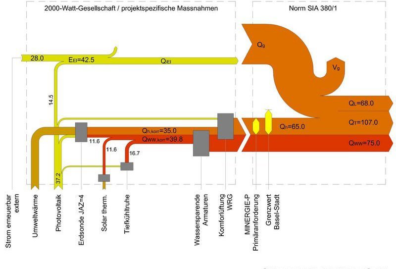
Another sample Sankey diagram in German from the building sector. Swiss architectural firm Moosmann Bitterli has this on their website to showcase their services. Not sure what the unit of flow is, but definitely energy related.
Energy Usage Timeline 1800-2017
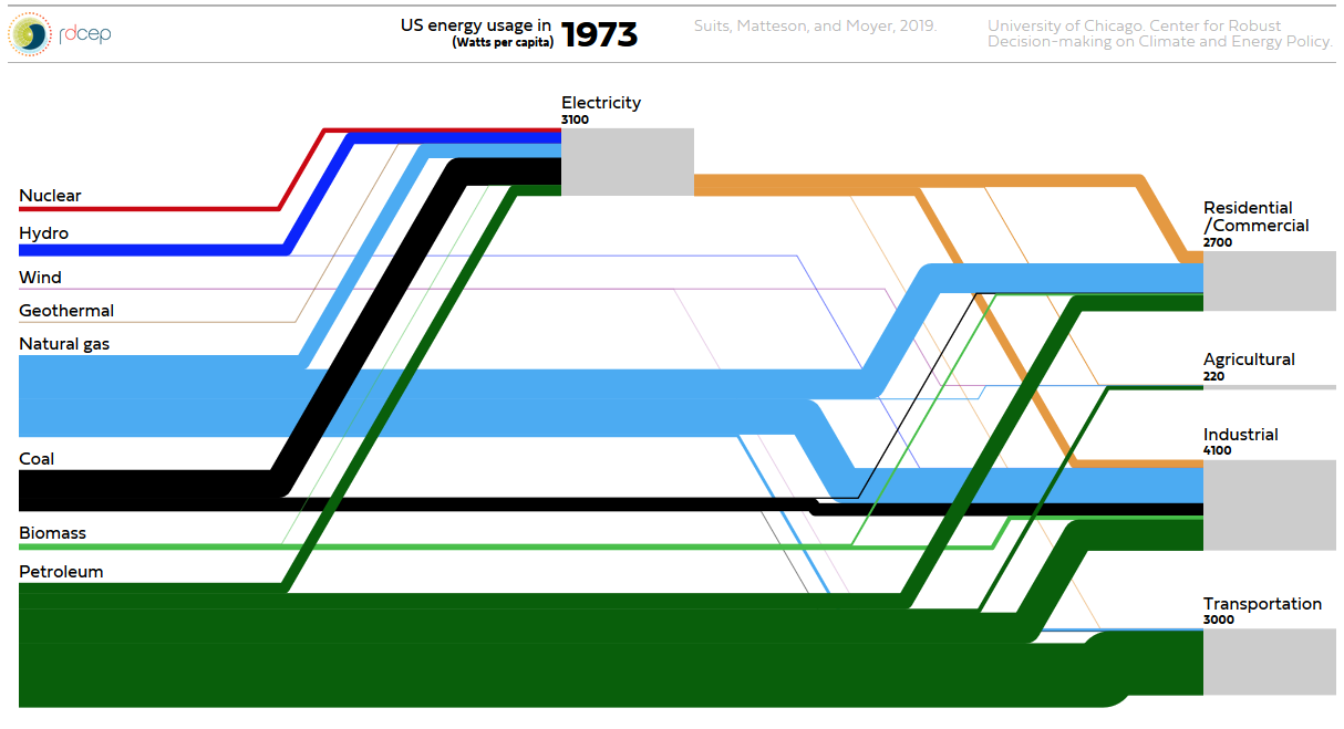
Watch this beautiful animated Sankey diagram for per capita energy usage in the United States from 1800 to today… Created by Suits, Matteson, and Moyer. University of Chicago, Center for Robust Decision-making on Climate and Energy Policy. Click here to go to plasm.ist website and watch animation. Update: new website here
Energy Transition in Germany, Study
A great number of Sankey diagrams are coming out of Germany, don’t know why that is…
This one is from a study on the (stalling) progress of the ‘energy transition’ (some prefer to call it ‘energy turnaround’, ‘Energiewende’ in German). German Energy Agency (dena) and University of Cologne (EWI institute) have published an intermediate progress report. On climate change, Angel Merkel’s coalition has set the ambitious goal of reducing Germany’s greenhouse gas (GHG) emissions to 55% of the 1990 emission levels by 2030. One pillar of the energy turnaround is the increased use of renewable energy sources.
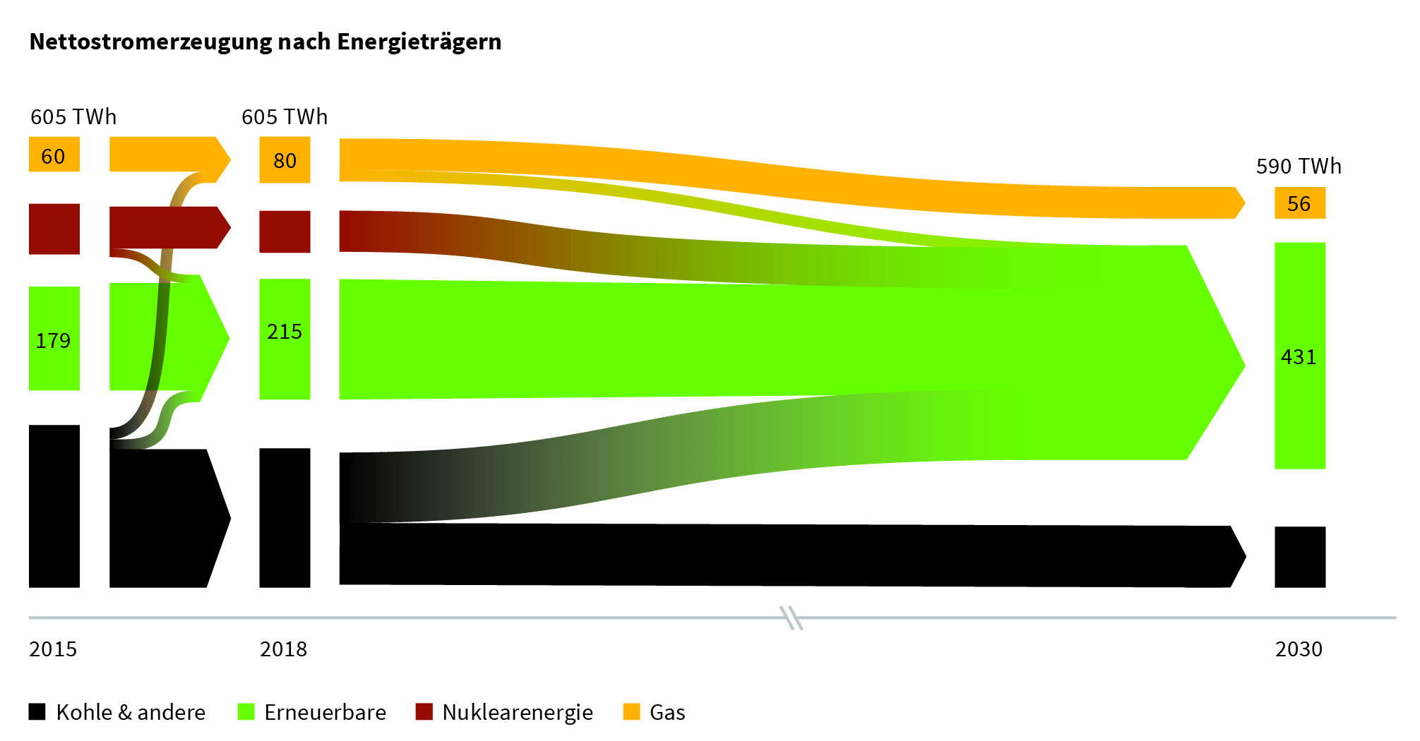
The study (PDF here, in German) contains a number of Sankey diagrams like this one:
The overall energy consumption of 605 TWh/year in 2015 hasn’t been reduced until 2018, but there is already a noticeable shift away from coal (black streams) and an increase in renewables. On the path to 2030 nuclear energy is to phased out completely and coal an gas are to be reduced significantly in favor of renewables with the overall consumption down to 590 TWh/year, mainly by means of energy efficiency measures.
UK Iron and Steel Industry Energy Flows
A hidden gem (or should I say an easter egg) buried deep in an old report ‘ENERGY TRENDS. June 2011’ published by the Energy Statistics Team of the UK Department of Energy and Climate Change (DECC).
This is from page 47 of the report. Flows are in TWh. The flow chart is explained on pages 44 to 46, and the actual data for each of the numbered flows can be verified in the table on page 45.
Misc Sankey Diagrams Uncommented 21
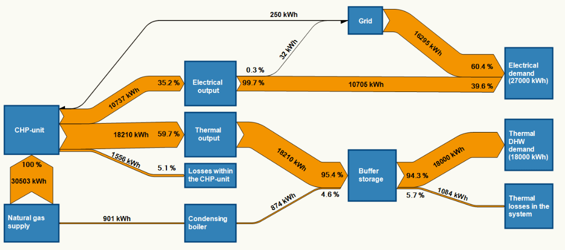
Another Sankey diagram, found on the D2Service EU research project web page.
Misc Sankey Diagrams Uncommented 20
Uuh-uh, already Friday afternoon… Here is another quick, almost uncommented Sankey diagram, just to not leave you without one for the weekend.
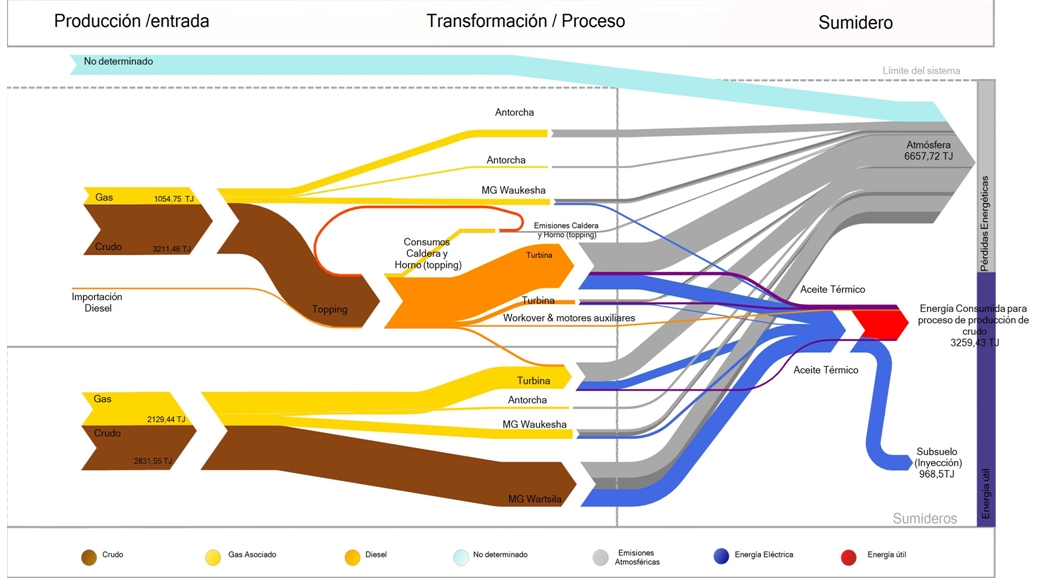
Argentinian environmental consultancy and engineering firm Neoambiental uses this Sankey diagram on its website (go to section 4) to market their professional experience in energy efficiency studies.
Flows are in TJ. Feedstock is crude (brown arrows) and associated gas (yellow). Grey flows are losses or unused energy, while red represents the actual used energy.
Living Sankey Diagrams
A reader of the blog, Olov, has produced the following video. He calls this a “Living Sankey Diagram”. The background can be found on the Sweco Blog (in Swedish). Basically he suggests to take energy declarations for buildings (‘Energideklarationen’) one step further and have visual energy monitoring for building using realtime data.
Energy consumption of a house is shown over a period of a year with up to 3 or 4 datasets per day. We can see heat (red) and electricity (orange). Not sure about the temperature indication at the top left, possibly meant to be the difference to a default temperature (Olov, if possible, please explain by commenting below).
Main consumers in the building are hot water generation (‘Tappvarmvatten’), room heating (‘Radiatorer’), ventilation and cooling. Some PV cells (‘Solceller’) at times add to the purchased energy (‘Köpt Energi’). The pink flow shows heat recovery (‘Värmeåtervinning’). The building is classified in energy class B.
Here, a data series has been used to produce the Sankey diagrams and then the frames were converted to a video. This makes for a nice effect and allows watching your energy flows in retrospect. For example, the PV cells feed energy mostly during the months, while in the same period heat demand and recovery is very limited.
This was apparently produced using e!Sankey. To really do an energy monitoring and produce the Sankey diagram every couple of minutes, there is a software development kit (SDK) the allows linking to a data source (energy measurement data) and pushing the “living Sankey diagram” to a website. Another example can be found here.
Botswana Energy Flows
Botswana, a country with just over 2 million population, borders South Africa to the North. Would you be able to tell its capital?
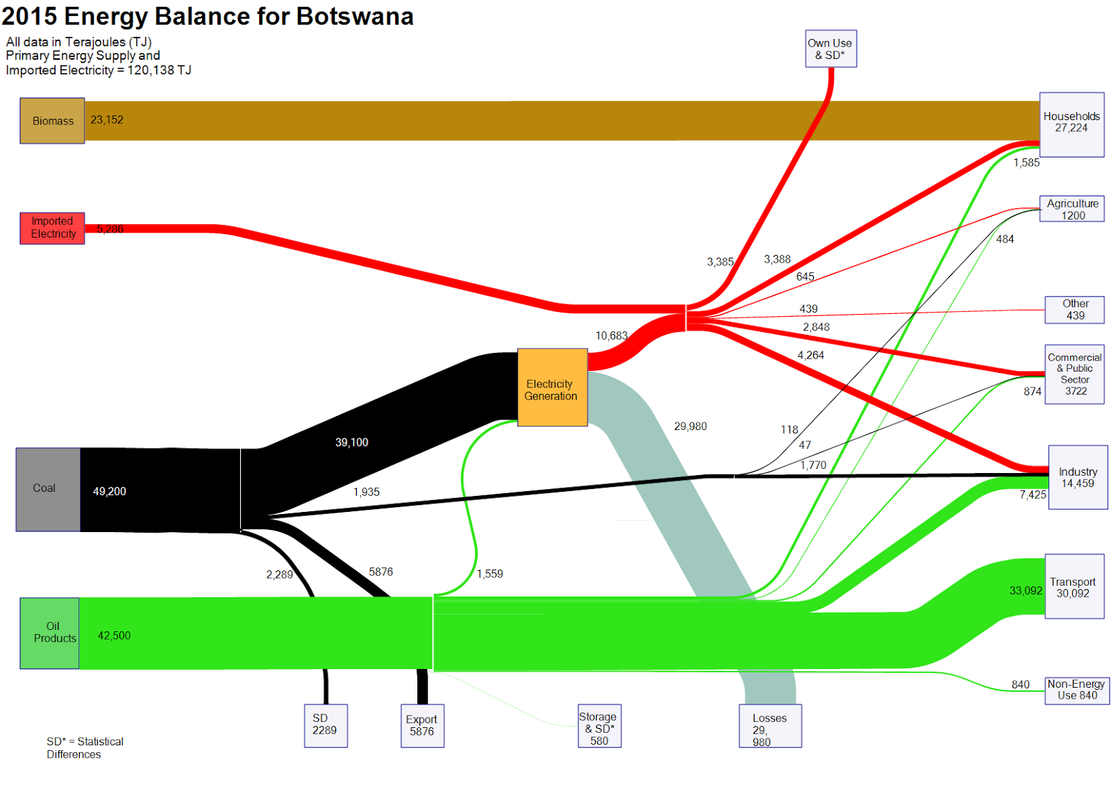
Nevertheless, a Sankey diagram with the energy balance of Botswana can be found on the web. Mike Mooiman, a professor at Franklin Pierce University, New Hampshire and a former visiting scholar at University of Botswana featured it on his ‘Energy in Botswana’ blog. These are the energy flows for the African country for 2015 (based on IEA data).
Flows are in terajoule (TJ) and overall energy demand was 120,138 TJ. Biomass (wood) is the predominant fuel in private households (e.g. for cooking). Locally mined coal accounts for 40% of the primary energy and is used for electricity generation with an efficiency factor of below 30%. Imported oil products account for over 40% of the energy consumed (mainly for transportation).
The 2012 energy balance for Botswana is also available on Mike’s blog.
