Category: Fakes

Misc Sankey Diagrams Uncommented 15

Just before the weekend another Sankey diagram for you. One reader suggested I should present a Sankey diagram that contained an Easter egg (without specifying whether he meant flows going in a round, egg-like arrow path or a joke hidden inside the diagram)

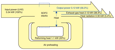
Here is one from Japan. It has two loops, and qualifies as a joke too. Just look at the quantities displayed and you know what I mean…

This is from an NTT Technical Review article ‘Development of SOFC Power Generation Module with High Electrical Generation Efficiency’ by Yoshiteru Yoshida, Katsuya Hayashi, and Masayuki Yokoo.
Lying with Sankey diagrams (6)

I really find it innovative when consulting firms show Sankey diagrams on their website to illustrate their work, and market their services.

However, I find it weird when these diagrams violate the basic rules of Sankey diagrams and flows are not proportional to the flow quantity. That doesn’t really contribute to build up confidence in their capabilities.

‘nough ranting … Have a nice weekend!

Lying with Sankey diagrams (5)

Haven’t posted much in this mini-series recently … not that there would be a lack of Sankey diagrams that have technical defects or simply misrepresent flow quantities with deliberate arrow widths.

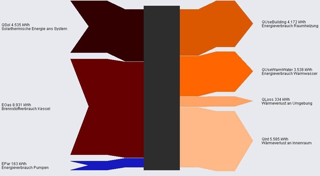
In this Sankey diagram from a website by AEPC the blue arrow is grossly exaggerated and not to scale with the other flows.

Flows are in KWh. Energy inputs (solar, fuel for boiler and pumps) on the left. Uses and losses to the right.

Building Thermal Energy Model, Sankey Fail

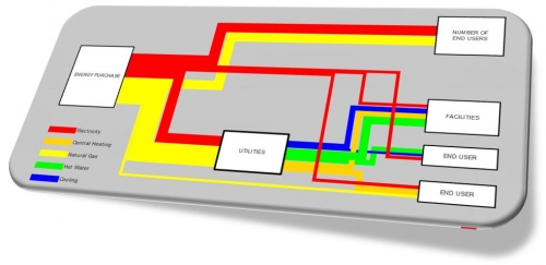
A Swiss software company features a screenshot on their website, depicting a thermal energy model for a building. I’m not mentioning the source, because it is a bit embarassing…

Despite the general good impression of the diagram and the tech labelling of the arrows, the width of these arrows seems completely arbitrary. Well, to be fair … they don’t call it a Sankey diagram.

Simple gone wrong

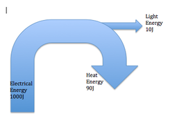
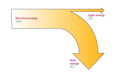
Something is wrong here ….

Not only does the arrow ‘light energy’ branch out behind the other arrow without causing a reduction in magnitude for the remainder ‘heat energy’. But also 1000 J is split into two arrows of 90 J and 10 J.

And while still in ‘mild rant’ mode, here is another one from an educational website…

Teachers, don’t use these in class

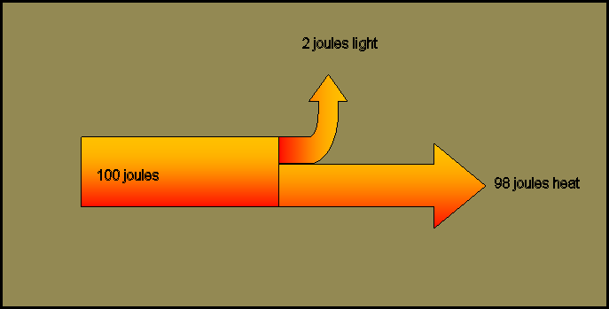
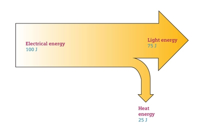
I have nothing against large companies providing free didactic materials like videos and images to support education. But the below Sankey diagram samples from the image bank of a large multinational company are a fail!

Teachers should better not use them in class, as their smarter students may identify the fundamental error in them:

Can you spot the error?

Leaked: Sankey Diagram Tablet

Phineas got hold of a design study through one of his informants… Looks as if at least one of the large manufacturers of tablets is working on a dedicated ‘Sankey Diagram Tablet’. It is expected that either Apple’s next iPad, the new Samsung Galaxy Tab, or possibly Microsoft’s tablet with Surface surface will be Sankey diagram enabled. Further details in regard to the technical specifications are unknown…

Well, I am waiting anxiously for this new product release, and have prepared my sleeping bag to camp out the night at the doors of the retail shop to be the first to get hold of it.

Happy april fools day! 😉