Tag: trade

MapProvision Sankey Overlay

MapProvision is an online service to present data as dynamic layers on an online map. They have now added an Sankey overlay feature.

This screengrab is a from a sample provided by them using World Trade Organization import and export data for 2017.


Here I have selected imports of machinery being imported to Mexico. Flows displayed are based on value of the goods in mio US$ per year. Hovering over the arrows reveals detailed data, a summary of imports for the selected category is shown when hovering over the bracket at the destination.

This comprehensive blog post has more details on how to adapt the Sankey overlay and the different options you have, including color settings and minimum width for Sankey arrows. It also contains an embedded example for fish import to Japan.

Nice work and fun to play around with. Doing Sankey diagrams on a map is particularly challenging in my opinion due to routing issues and because in many cases trade flows between neighbouring countries tend to be high volume, so that the shortest Sankey arrow paths are typically the widest ones (as is the case with the U.S. here).
Resource Imports into China 2014

With all the news and discussions about trade balance and tariffs and exports of goods from China to the U.S. we mustn’t forget that China is also a large importer of resources from all over the world.

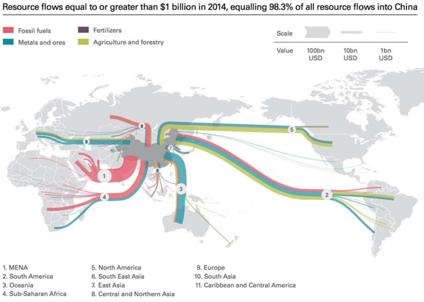
The below Sankey diagram is a good visualization of the resource dependencies and import such as fossil fuels, minerals and ores, as well as agricultural / forestry products. I found it in an article on the Diálogo Chino blog but it was originally published in a 2016 report ‘Navigating the New Normal: China and Global Resource Governance’ by Wei Jigang et. al. published jointly by Development Research Center (DRC) of the State Council of the People’s Republic of China and The Royal Institute of International Affairs Chatham House. The image from an article ‘Will China’s new Silk Road be green?’ by Lily Pike on Diálogo Chino is republished under a Creative Commons license.

All Sankey arrows run towards China (imports in 2014) and flows are color-coded to show the resource type. There are no absolute numbers, but the value of goods imported in billions of USD is represented with a clustered scale that shows three representatives 100 bn USD, 10 bn USD, and 1 bn USD. The largest (in terms of value) stream is from the Middle East, while Latin America and Australia are the second and third largest regions delivering resources to China.

The original report is here with the image on page 64 and more detail on the data.

US Trade Flows, yet another option

After showing two variants for visualizing the U.S trade balance in my last post, I got aware of yet another option. The first figure (infographic by Spiegel Online) used the length of the arrows to express the value of imported and exported goods. My remake version used the magitude (width) of the arrows, as is typical for Sankey diagrams.

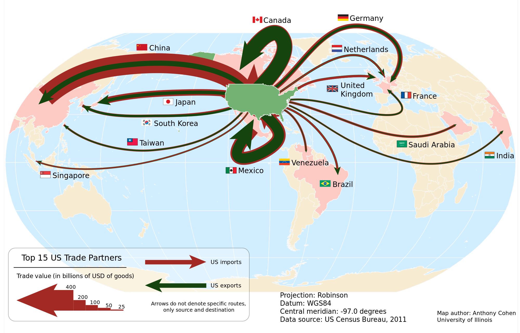
In this figure (by Anthony Cohen, University of Illinois, 2012 / Wikicommons) for US trade in 2011 the arrows for import (red) and export (green) are proportional to the total value of goods, just as we are used to see it in a Sankey diagram. But the arrows are superimposed, with the narrower green export arrow on top of the wider red import arrow. This creates another, somewhat more dramatic impression.

Data shown is for 2011 in billion USD for the 15 most important trade partners. Arrows are not labeled with absolute figures, instead a legend at the bottom indicates the width of five default arrows. The arrow from and to Mexico is a problem (no joke intended!), but the legend clarifies that arrows don’t indicate a specific geographic routing.

US Trade Balance, two versions

When German Chancellor Angela Merkel meets with POTUS today, one topic that’s most likely going to be addressed is the trade deficit between the United States and the EU, Germany in particular.

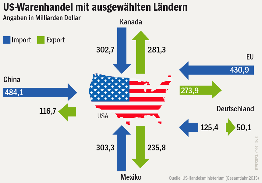
The Spiegel, a major German news outlet, has illustrated recent articles on this subject with the figure below. It shows the volume of trade between the United States and ‘selected countries’ (China, Canada, Mexico and the EU) in 2015. The values indicate the value of goods exported (green arrows) to these countries, and imported (blue) from them into the U.S. in billion US$.


Source: Spiegel Online

The interesting thing in this infographic is that the length of the arrows represents the value of goods traded. For example, the arrow for exports from the US to Europe (274 bnUS$ in 2015) is little over half the length of the blue incoming arrow (431 bnUS$ in 2015). This works fine, with the only exception being the green arrow for exports to Mexico.

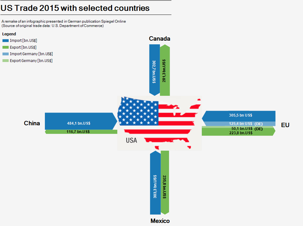
This infographic of course invited a remake as Sankey diagram. As you all know, in Sankey diagrams the widths of the arrows represent the quantity.

I did two or three different versions, all very similar to the original infographic in style and color, even using the lower states map icon (sorry Alaska and Hawaii). I was not sure at first whether the separate arrows for Germany were values already included in the EU trade volume, or if they were meant to be on top of it. A quick look into the original data revealed that indeed they are included in the EU figures already. I therefore decided to highlight the German share in the Sankey diagram with a slightly brighter color, but keep those arrows stacked.

Here is my Sankey diagram version of the Spiegel infographic.

Not sure which version I prefer, but using the length instead the widths of the arrows to represent the flow quantity is definitely a unique approach. Worth sharing with you, I think.

Gold Market: Demand and Supply

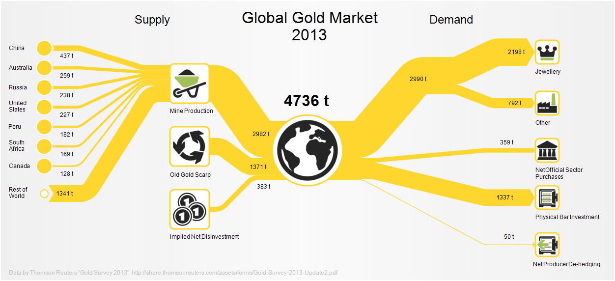
Taking it easy with a casual Friday post. This Sankey diagram shows the world wide gold supply and demand in 2013.

This is from a post in the e!Sankey forum and available as sample file in their new release.

Data is from the ‘Thomson Reuters Gold Survey’. 4,736 tons of gold were traded that year with roughly 3,000 tons production from gold mines. Largest demand was from jewelry makers (2,198 tons) followed by people who purchased gold bars (1,337 tons).

Coal Trade Flows Map

Drawing Sankey diagrams on a world map to show flows between different geographical location is always a challenge. One of the inherent problems is that large (=broad) arrows may run between two points on the map located very close to each other. Another problem is that one wishes to have the arrows more or less along the actual trade routes, which in many cases is close to impossible (take, for example, ships going through the Panama or the Suez canal).

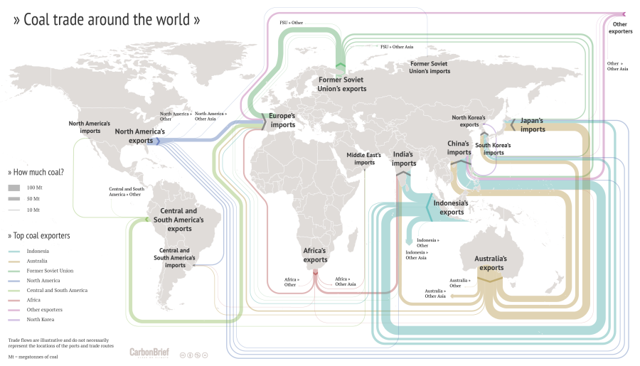
I have shown quite a number of ‘Sankey diagram maps’ here on the blog, but most of them had shortcomings. Now here is an example that does extremely well in tackling the issue of Sankey diagram flows on a world map.


(CC licence – Carbon Brief)

This flow map of coal exports around the world shows the top exporters. It was crafted by Rosamund Pearce for the Carbon Brief article “Mapped: The global coal trade”. She decided to route the Sankey arrows nicely sorted, in parallel, and not along the actual shipping paths. See how much of the coal trade from Indonesia to China is led “virtually” south of Australia and New Zealand? Additionally the arrows are not led precisely to the actual port, but rather connect at a suitable place of each continent. With these simplifications the trade flow map is much clearer, understandable.

Another world coal flow diagram from 2012 can be found here.

Poland Trade Balance

The ‘Blog Audytorów Sledczych’ had two interesting Sankey-style diagrams.

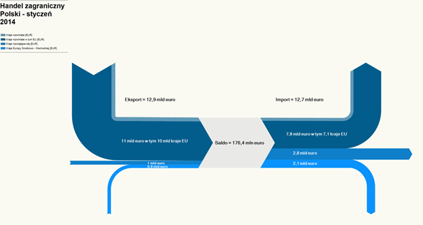
The first is the trade balance of Poland for the month January 2014. Flows are in Euro (trade volume). There is a trade surplus of 176,4 million Euros. Unfortunately only the legend shows what the arrow colors mean, but it is not legible in this screenshot.

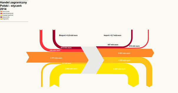
The second one focuses on the five main trade partners of Poland. Here the value of imported goods is higher (8,7 billion Euro) than the value of exported goods (8,5 billion Euro).

Again the legend is somewhat difficult to decipher, but we can see Germany, Czech Republic, UK and Russia. Largest trade partner (both regaring import and export) is Germany (large orange arrows).

Trade imbalance is visually barely noticeable, just by a slight step when looking at the incoming and outgoing arrows.