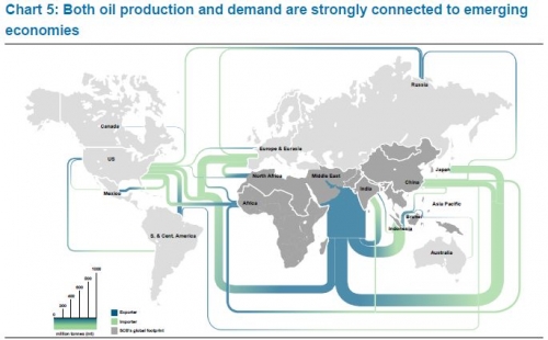
The 2012 GEA Global Energy Assessment report (GEA Global Energy Assessment – Toward a Sustainable Future, Cambridge University Press, Cambridge UK and New York, NY, USA and the International Institute for Applied Systems Analysis, Laxenburg, Austria) features five maps showing energy trade in the world on pages 128/129.
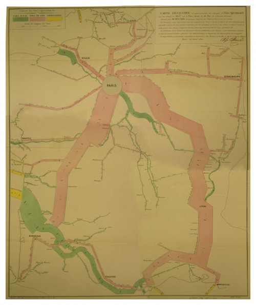
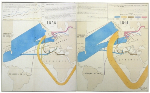
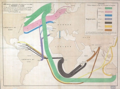
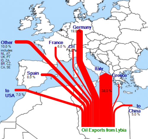
These can almost be considered Sankey diagrams, so I am featuring them here on the blog.
This one is for embodied energy in trade goods.
And this one is a classic oil and oil product trade flows map:
Flows lead from a specific color-coded region to another. The quantities are clustered in arrows with three different widths as shown in the legend (1, 5, 10 Exajoule)
