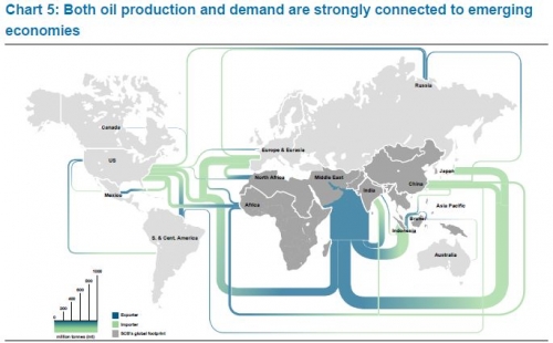
I am back after a few weeks of holiday. To get into posting again, here is a quick one I found at Graphic Design Forum in a discussion thread on software for creating trade flows (in this case oil flows) on a world map.
Flows in million tonnes (per year?). Scale element at the bottom left. No visible arrow direction, but instead a blue to green gradient on each band (blue for export, green for import). Middle East region being the largest exporter remains a problem with a very wide Sankey arrow leaving through the Indian Ocean.
