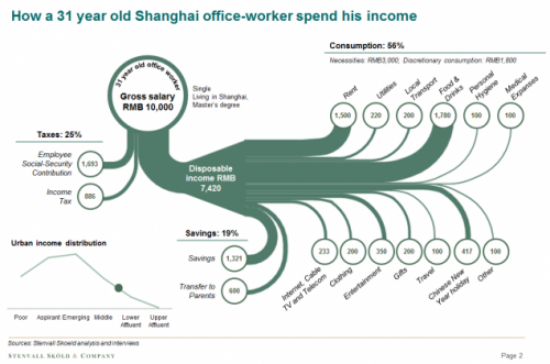
Carl-Johan Skoeld of China-based strategic advisory firm Stenvall Skoeld & Company presented the following Sankey diagram in his recent post on ‘How a 31-year old Shanghai office worker spends his money’.
(Stenvall Skoeld & Company via ChartPorn)
This is a fine sample of a Sankey diagram that merits some more explanation:
In fact, these are two combined Sankey diagrams. The overall sum of 10,000 RMB income breaks down to some 25% taxes, 19% savings and 56% spendings (consumption). The Sankey arrow representing the disposable income is then zoomed to allow for more detail to be seen. Hence the Sankey arrows in the left part of the diagram are not the same scale as the ones on the right. The arrows branching out to the top are considered “necessities”, while the one that go downwards represent “discretionary spendings”. Circles at the end of the arrow show the amount in Chinese currency. As the author points out, “this example is from one of the respondents and not an average of all respondents.”
