Tag: oil

World Oil Flows Map

Did a clean up some of my hard disks and came across a number of gems I had saved. Unfortunately I hadn’t noted the sources for all of them.

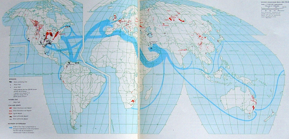
Here is one of these. A photo of two facing pages in a book depicting world oil streams. You can find more Sankey diagrams on maps here on the blog if you search for the tag ‘map’. This one is different though, as it uses a special map projection (probably Goode homolosine) with a cut along the Atlantic and Hawai’i as an inset.


Unfortunately I do not know from which book that was taken. Neither do I know the year of reference or the unit of measure for the flows. We can see the oil shipments mainly starting from the Middle East and Venezuela with Europe and the U.S. as main destination markets. Additionally, areas where coal, natural gas and petroleum are extracted are marked on the land areas.

In the botton left corner the legend reads for “Movement of petroleum”: Width of flow lines is proportional to tonnage of petroleum (crude and products). The flow lines do not necessarily indicate exact routes of movement’
Big Oil Climate Lobbying, InfluenceMap

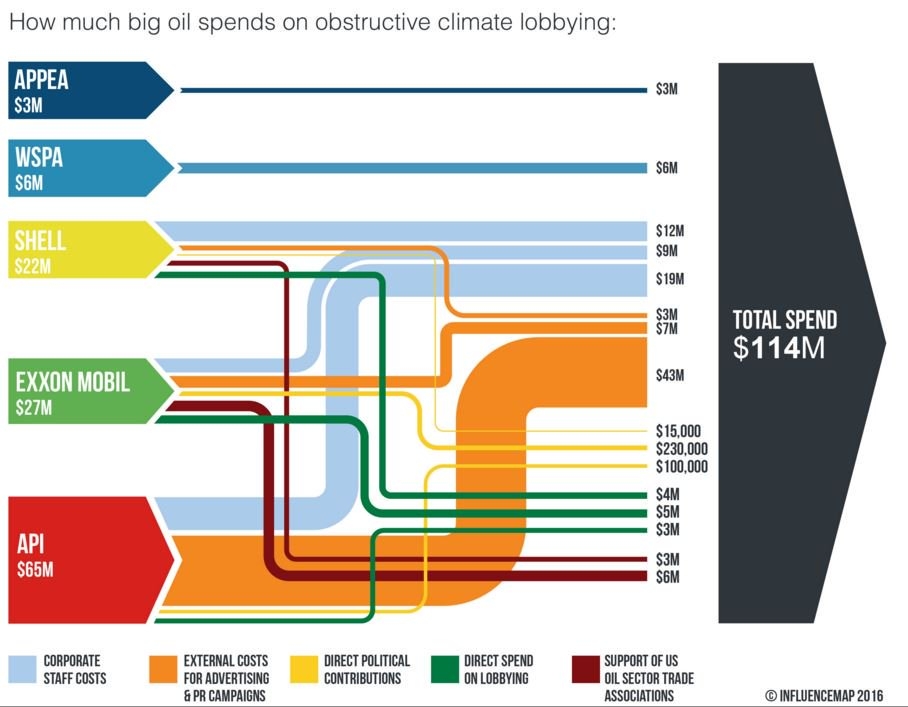
The UK-based non-profit Community Interest Company (CIC) called ‘InfluenceMap’ has produced the below Sankey diagram on obstructive climate lobbying of oil firms and interest groups. These are the spendings in US$ for an unspecified year (possibly 2015).


Source: InfluenceMap, Media Downloads
(via Hypergeometric blog)

Streams are color coded to specify the type of spending (e.g. staff cost, direct lobbying, party donations). Note that the yellow flows (in the range up to 230.000 US$) are not to scale with the others that are on a million US$ range. Some of the elements that represent the sources and the black sum arrow are also overemphasized, showing a height that is larger than the sum of the individual arrow magnitudes. So this is not fully adherent to the principles of a Sankey diagram … but to be fair: they never claimed that it is a Sankey diagram.

This is maybe the first Sankey diagram ever to be featured in the US Senate. Senator [D-RI] Sheldon Whitehouse (yes, that really is his name … you just have to love his “Whitehouse Statement on …” catchphrase) used it in a US Senate testimony in April 2016.

Watch the video how the Whitehouse does quite well explaining the streams of money and to underpin his message with the Sankey diagram. Jump in at 0:25 secs to see Sankey make its Senate appearance…

South China Sea Oil/LNG Transport

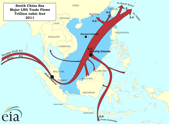
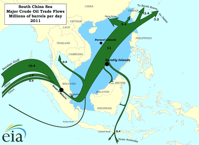
South China Sea has recently garnered increased media attention due to China reclaiming land and building an airfield on Fiery Cross Reef. The territorial dispute regarding Spratly Islands has been simmering since the 1970ies when oil was discovered in the region. South China Sea is also “one of the busiest shipping lanes in the world” with “more than half of the world’s supertanker traffic, by tonnage, pass[ing] through the region’s waters every year” (Wikipedia).

The Department of Energy has two interesting maps on their beta website showing LNG and crude oil transport for 2011.

Transport of liquefied natual gas (LNG) in trillions of cubic feet in the South China Sea:

Transport of petroleum in millions of barrels per day in the South China Sea in 2011:


(both maps from eia.gov website)

These are ‘Sankey-inspired maps’ rather than exact Sankey diagrams. Arrow widths are not maintained where the shipping routes pass through narrow straits. Nevertheless, transport volumes are generally on a correct scale.

Alaska Energy Flows

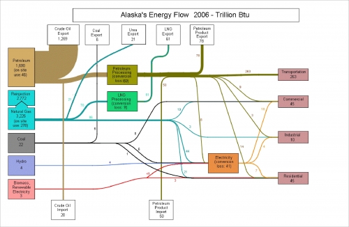
Dug out a folder on the hard disk of my old computer where I had stored many Sankey diagrams. Great stuff there I had saved years ago. Problem is that at the time I didn’t label the diagrams properly, so that I am now trying to trace where I got them from.

Here is one I like quite a bit. It is featured on p. 24 of the Alsaka Energy Plan (available on the Alaska Energy Authority (AEA) website / directly access large PDF)

Alaska Energy Flows for 2006 in trillion BTU. Forget about the other fuels, this state’s energy is almost entirely based on crude. And – despite being an importer of oil – AK is primarily an exporter of oil. All other energy flows really seem to be insignificant because of the dominance of oil. Losses are not shown with streams, but rather are given as text on the node.

Global Oil Flows

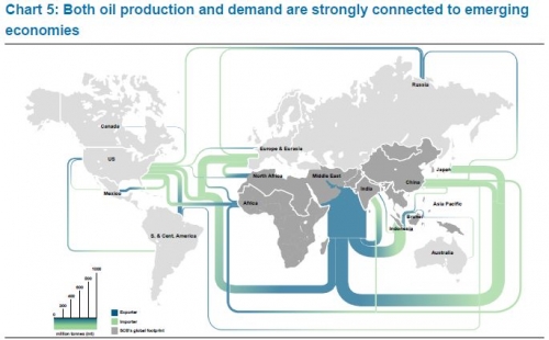
I am back after a few weeks of holiday. To get into posting again, here is a quick one I found at Graphic Design Forum in a discussion thread on software for creating trade flows (in this case oil flows) on a world map.

Flows in million tonnes (per year?). Scale element at the bottom left. No visible arrow direction, but instead a blue to green gradient on each band (blue for export, green for import). Middle East region being the largest exporter remains a problem with a very wide Sankey arrow leaving through the Indian Ocean.

Molly Eagan’s 100 Days Without Oil

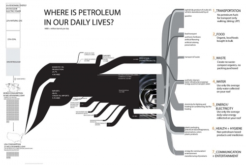
Molly Eagan’s ambitious project ‘100 Days Without Oil’ got some attention in the blogosphere, and even from traditional media. Molly’s dedication to living one hundred days without oil fascinated me, but by putting up the below Sankey diagram on her blog she fully convinced me …

Molly is an Architecture/Sustainable Design graduate student at the University of Minnesota. From August 15 to November 22, 2010 she tried to live a fully-no-oil life style.

By using myself as a research tool I can easily document all aspects of my life and how they might be affected in this not-to-distant world. I’ll be tracking my life in seven categories: Transportation, Food, Waste, Water, Electricity, Health/Hygiene, and Communication/Entertainment.

Her self-set rules were quite strict, and I personally think that the water use part is the hardest constraint. Read more about the criteria of this experiment.

The Sankey diagram is based on data from the Energy Information Administration Annual Energy Review 2008, but has been expanded on the right side with examples for the seven categories she identified for her project.

Inspired by Libya Oil Export Sankey

The recent events in Libya have led to an increased interest in my Libya Oil Export Sankey diagram I created and featured almost three years ago here on the blog.

This post on the Infantile Disorder blog is deep-linking the Sankey diagram, to my disappointment without mentioning the source, and – even worse – without stating that these are 2006 figures.

The idea of presenting oil exports as a Sankey diagram has also been taken up by AFP Infographic Service in Germany. They did their homework and updated the values with data from the International Energy Agency. Instead of simple Sankey arrows, the info graphic shows oil pipes with a diameter representing the percentage values. An oil drop can be seen at the mouth of each pipe… Unfortunately this material is copyrighted, so I won’t feature it here. But you might want to check out the AFP Infographic on Libya Oil Export Sankey on the news portal of N24.