In 2008, the Cartographia blog started a post series called ‘Monday’s with Minard’. Some people consider Charles Joseph Minard the first to use arrow magnitude in his diagrams to represent quantities. (As a consequence, this means that Sankey diagrams would have to be renamed to Minard diagrams!).
What differentiates Minard maps from Sankey diagrams is that Minard’s fine works always have a geographical relation. The most famous one is his Map of Napoleon’s march to Moscow published in 1869. This “carte figurative des pertes successives en hommes de l’Armée Francaise dans la campagne de Russie 1812-13” shows number of men (as width of arrows), geographic movement of the troops on the map both for invasion as well as for retreat, as well as time and temperature on a separate scale.
Cartographia blog has some other nice examples, two of which are shown here:
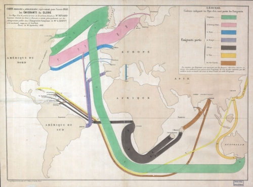
The first shows migration patterns across the globe. Arrows do not have an arrow head but the country of emigration is color coded. The outline of the countries is distorted to accomoadate large flows connected to them. For a detailed description please consider reading the original blog post. This map is similar to the one I showed in this post.
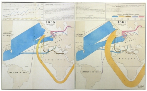
The other is a flow map for wool and cotton for the years 1858 and 1861. “Blue represents cotton and wool from the United States, the orange from British territories in South Asia … One millimeter represents 5,000 tons of cotton or wool.”. As one can see on the 1861 map, cotton imports from Asia have increased dramatically. See the description of the map in the blog post on Cartographia blog.
See all Monday’s with Minard posts here. There has been no activity on the blog since June 2008. I hope to see more of these posts some day.


1 Comment
Comments are closed.