Last weekend I had the possibility to visit a friend in the Netherlands, and we took a tour of Rotterdam Port. Despite the bad weather, I was fascinated by the huge container ships, the cranes, the noises….
Back home I did some research and came up with the cargo data for the year 2005 from the Port of Rotterdam website.
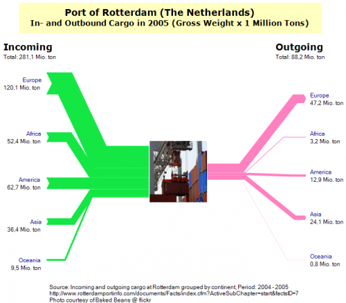
I did the following three Sankey diagrams. The first shows the inbound cargo quantities (in million tons gross weight of cargo) from the left, and the outbound quantities to the right, broken down to world regions. One can clearly see that Rotterdam handles mainly imports, with more than 281 million tons of cargo being unloaded, while only 88,2 million tons of cargo are being loaded onto ships.
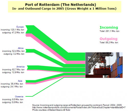
Next I flipped inbound and outbound flows to the same side. However, I think that by this the diagram loses somehow, also because some purple flows (outbound to Africa and Oceania) are too thin.
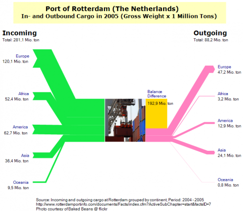
In the third version, I added a shape for the balance difference between inbound and outgoing goods.
Tell me what you think about theses Sankey diagrams. It would be interesting to compare Rotterdam to other ports. Shanghai, for example, might have the opposite picture with much more exports, but I haven’t found any data yet to show this. And, if we are talking cargo traffic: how about doing a passenger Sankey diagram for one of the international airports in the U.S. (by origin/destination continent?, by airline?)


