After showing two variants for visualizing the U.S trade balance in my last post, I got aware of yet another option. The first figure (infographic by Spiegel Online) used the length of the arrows to express the value of imported and exported goods. My remake version used the magitude (width) of the arrows, as is typical for Sankey diagrams.
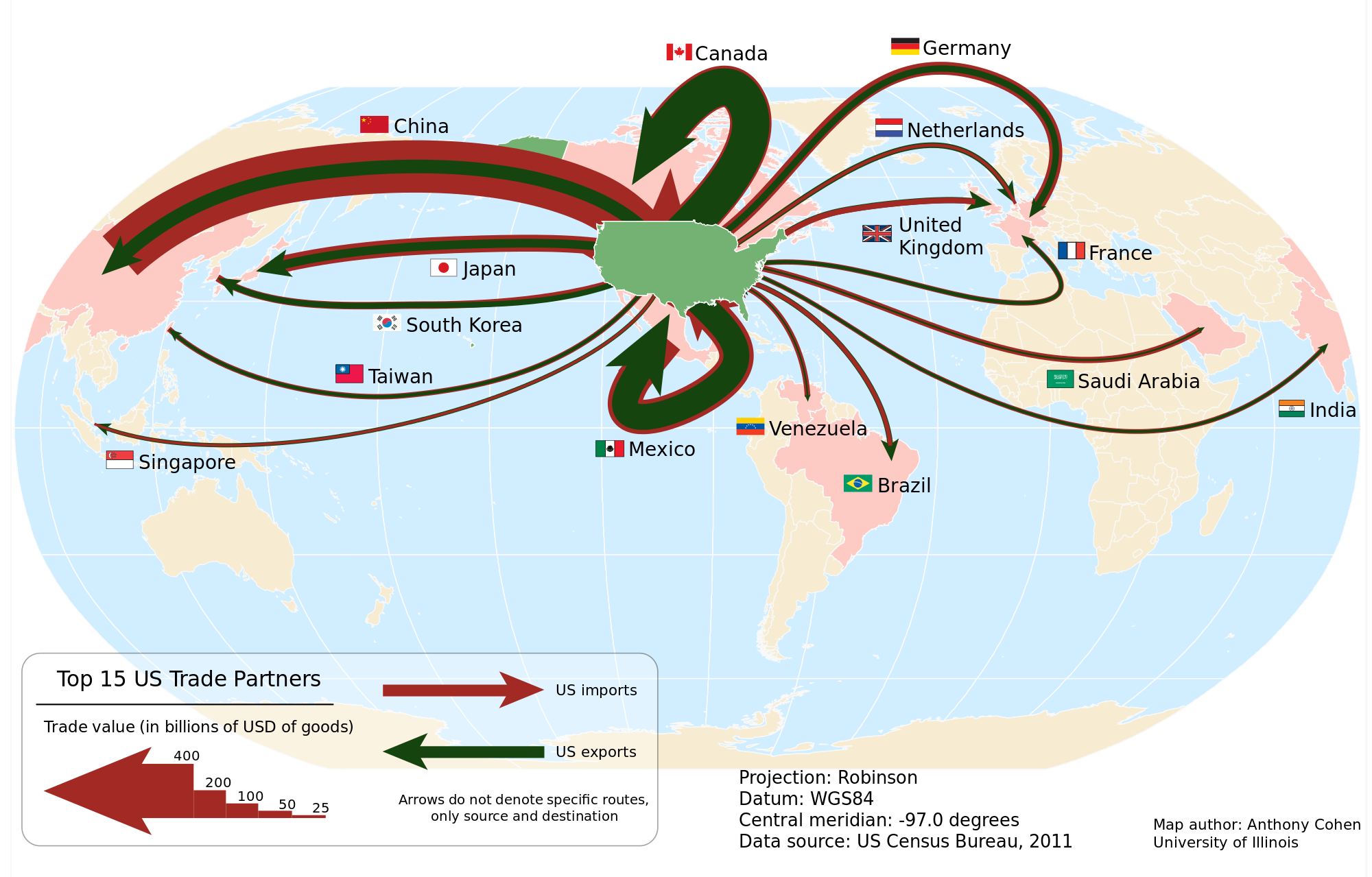
In this figure (by Anthony Cohen, University of Illinois, 2012 / Wikicommons) for US trade in 2011 the arrows for import (red) and export (green) are proportional to the total value of goods, just as we are used to see it in a Sankey diagram. But the arrows are superimposed, with the narrower green export arrow on top of the wider red import arrow. This creates another, somewhat more dramatic impression.
Data shown is for 2011 in billion USD for the 15 most important trade partners. Arrows are not labeled with absolute figures, instead a legend at the bottom indicates the width of five default arrows. The arrow from and to Mexico is a problem (no joke intended!), but the legend clarifies that arrows don’t indicate a specific geographic routing.
