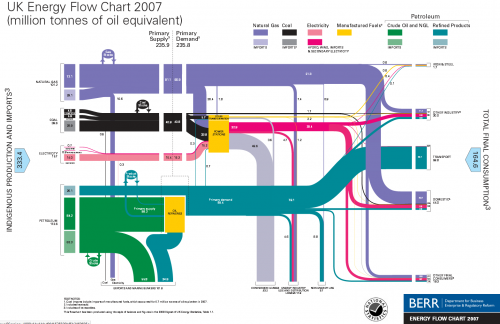
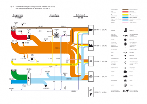
A followup to my last post: This thread on ‘The Oil Drum: Europe’ features similar national energy flow diagrams for UK (2007), The Netherlands (2006) and Switzerland (2007).
For the UK these Sankey diagrams are published by BERR (Department for Business, Enterprise and Regulation). Historic charts back to 1974 can be found on their website.
UK Energy Flows 2007, by BERR, via The Oil Drum: Europe
A commentor to Chris Vernon’s original post added the Swiss version of this Sankey energy flow diagram originally published by Swiss Bundesamt für Energie (BFE):
These Sankey diagrams have some nice details, which a worth a mentioning: The UK diagram shows stock increases and decreases with circles. The size of the circle has no significance, but the magnitude of the in and out flows seem to be to scale, thus allowing to see if the stock has increased or decreased in that year. Losses at transformation steps are shown with “hanging arrows” (the flows branching off to the bottom line of the diagram). The Swiss version also shows exports this way, but visualizes losses with a pin with a big round head.
Even though your run the risk of being overwhelmed by a gloomy feeling when your read through the comments to Chris Vernon’ post, I would like to draw your attention to a comment by “realist” on Sept 5. He writes: “Deceptive graph! Why show losses for electric power generation and not transportation? The heat losses from the internal combustion engine in most transport is 70-80%”. This is true, but I have always understood that losses explicitly shown in these energy flow Sankey diagrams are the losses occuring in the energy generation, conversion and grid, while losses in the energy consumption (such as use for transport) are not shown. This let alone that they are worthwile to discuss.


3 Comments
Hi, really nice diagrams! Do you know which software has been used?
Comments are closed.