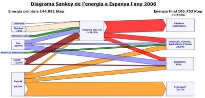
One type of Sankey diagram layout seems to get popular recently. A representation of national energy flows of a country with the energy carriers on the left side (source), and the consumption sectors on the right side (sink). The Sankey flows in between show how energy from these sources are consumed and in which sector. Wasted energy is shown, and the overall energy (in)efficient use of primary energy is made clear with such a Sankey diagram.
I just discovered the energy flow diagram for Spain for 2006 on Joan Vila’s blog.
Unfortunately I don’t speak Catalán (well, I learned that “blog” is “bloc” in Catalán!), and the image quality isn’t very good. You can see nuclear, natural gas, coal (“carbó”) and crude oil (“petroll”), as well as hydro an wind (the two green lines) on the left side. The top box on the right side that takes the big red Sankey arrow for losses from electricity generation (“pérdues”). The others are the use sectors transport, industry, and domestic / services / agriculture. Vila calculates an efficiency of 38,2% for the electric power generation.
Joan advocates Sankey diagrams for visualizing and being able to better understand the issue. He says, that you won’t understand many things about what’s going on, if you don’t study this [kind of] diagram (“No entendrem moltes coses sobre el que passa si no estudiem aquest diagrama.”).
Check out simiular diagrams for Japan, Scotland, Ireland, Canada, United States.

3 Comments
In a thread which discusses this type of diagrams on “The Oil Drum” (http://europe.theoildrum.com/node/4488), a commentor (Realist, on Sep 5, 2008) writes:
“Deceptive graph! Why show losses for electric power generation and not transportation? The heat losses from the internal combustion engine in most transport is 70-80%.”
Comments are closed.