Tag: vertical

Finland Wood Flows, Two Versions

The below Sankey diagrams both show wood biomass flows for Finland for the year 2013.

The first one was published in the report VTT Technology 237 ‘Sustainability of forest energy in Northern Europe’ by researchers from VTT Technical Research Centre of Finland and Natural Resources Institute Finland (Luke).


Authors of this figure are Eija Alakangas and Janne Keränen. The diagram is oriented top-to-bottom and shows how the 104.4 Mm³ of round wood that grew in Finnish woods in 2013 were used. Basically there are two (three) main pathways, with a lot of arrows branching out to depict certain uses. 38.3 Mm³ of round wood was used in pulp industry, 26.2 Mm³ in the mechanical wood industry. Another 9.5 Mm³ of wood is used directly for energy generation.

The second Sankey diagram seems to be a remake of the above. It was published in a VTT Research Report on ‘Cascading use of wood in Finland – with comparison to selected EU countries’ by Laura Sokka, Kati Koponen, Janne T. Keränen.


Here the overall orientation is left-left-to right. The color scheme seems similar. There are some minor differences in the energy use part (orange and dark red arrows).

The first diagram has some images and comes across a little more playful than the second one. Although they depict the same data, I perceive them quite differently.
Is it due to the scaling or the vertical vs. horizontal orientation? Let me know your impression in the comments please.

Sankey GDPR choice

Among the literally hundreds of e-mails that flooded my inbox the last couple of days, urging me to consent to receiving e-mails in the future, one particularly caught my attention, since it used a Sankey diagram pic to convey the message:

My choice made clear in a simple visualization … Did I click the button? Yes I did!

U.S. Plastic Waste Streams

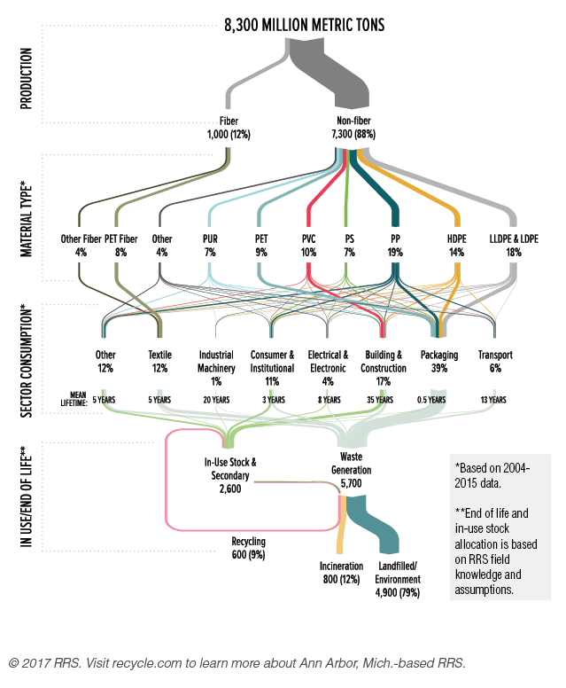
Ann Arbor based consulting firm RRS has published a Sankey diagam visualization of the plastic streams in the United States. This is from their Data Corner blog.

Breakdown is in percentage values only. The amount of 8,300 MMT seems to be an aggregated figure for a 65 year period from 1950 to 2015. And 80% has ended up on landfills.

Original data is from a study ‘Production, Use, and Fate of All Plastics Ever Made’ authored by Roland Geyer of the University of California, Santa Barbara; Jenna Jambeck of the University of Georgia; and Kara Law from the Sea Education Association.

Stuttgart City Energy Flows

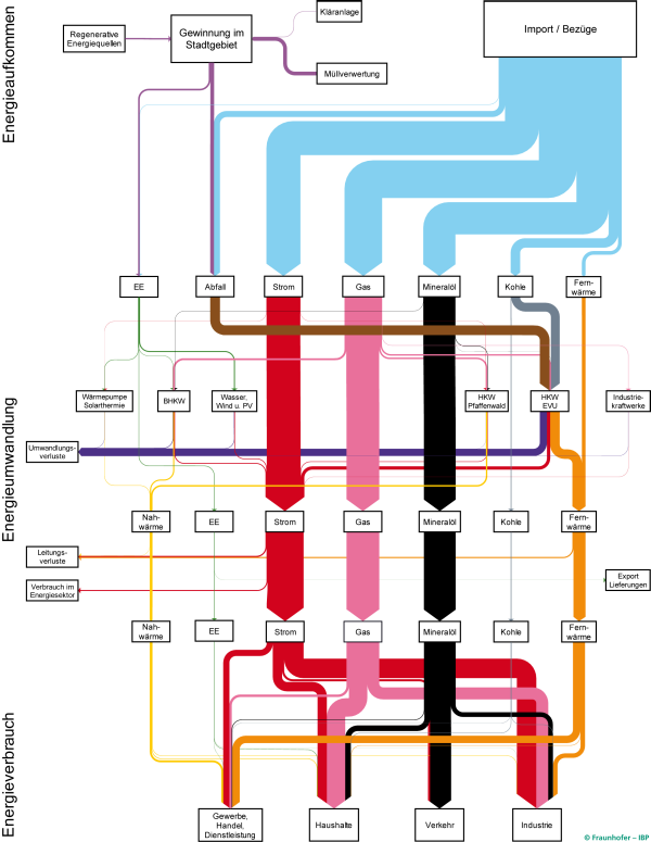
The energy balance of the German city of Stuttgart has been mapped as a Sankey diagram.

This was part of the project ‘SEE Stuttgart’ (City with Energy Efficiency / “Stadt mit Energie-Effizienz”) and has been developed by Fraunhofer IBP research institute.

A vertical layout was chosen. Absolute energy flow quantities are not shown in this version of the diagram, but are available in the underlying study. In 2010 primary energy consumption in Stuttgart was 20.300 GWh.

The diagram is used to promote a better understanding of the consuming sectors in the city, and the types of energy used. The SEE project aims to reduce Stuttgart’s energy consumption by 20% in 10 years and to transition to non-fossil fuels.

Stuttgart has actually won a first prize in a competition for energy efficient cities in 2016. It is thus setting a benchmark for other German cities. The above Sankey diagram is featured in this promotional video (in German) [at 2:36] and also briefly in this video (in German) [at 0:48] by IBP Fraunhofer.

A high resolution version of the Sankey diagram can be found here.