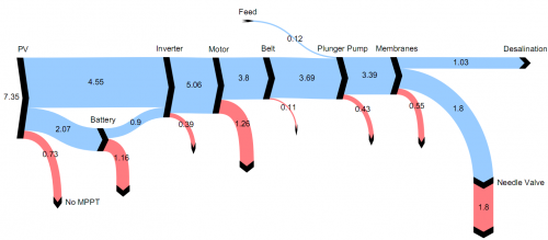
From a 2006 EU-funded research project called ADU-RES, here is a Sankey diagram from one of their reports (p. 24).
It features the energy flows of an autonomous desalination unit based on renewable energy. The plant (ITC’s Dessol) where they gathered the data is on the Spanish Canary Islands. “The system is conceived for small settlements (1-1500 inhabitants), since the scale/cost factor of the required investment/land restricts the capacity of production installed to 100 m³/day”.
The figures represent annual average specific energies in kWh per m³ of desalinated water (or pumped seawater?).

3 Comments
This is a really good one
via Twitter:
@markham tweets on 2 Aug
“Sankey-panky? Am I alone in seeing the aesthetic flaws in this diagram’s design?”
@paulmwatson replies on 2 Aug
“@markham a bit flaccid alright”
@markham: I agree this Sankey diagram definitely has its aesthetic flaws. Paul puts it in one word: “flaccid” 🙂
Why not gather the points for improvement? On the other hand this Sankey diagram has some good points too, which makes it better quality than many others diagrams I have shown here on the blog.
Weaknesses:
– looks “flaccid” due to downward open parabola arrow curves
– unit kWh/m3 not shown (actually my fault, it was given in the figure title below and I cropped the image without)
– dark black nodes at arrow head put unwanted emphasis, especially on thin arrows
Strengths:
– Flows are to scale (this is always the first thing I check, and this basic principle of Sankey diagrams is often violated, see examples here on my blog)
– avoids too many colors, only two colors for energy and losses
– clear structure left-to-right representing sequential processing steps. Losses branch out in the same direction.
Let me know your points…
Comments are closed.