Regular readers of this blog have seen the national energy flow diagrams (energy balances) before. I have featured them from many different countries already.
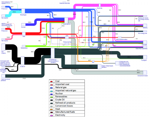
I finally came across a similar Sankey diagram the energy flows of Europe for 2010. It is featured on the European Energy Agency (EEA) website in a report titled ‘Overview of the European energy system (ENER 036) – Assessment published Mar 2013’.
“The figure is a Sankey diagram which shows the composition of the primary energy entering the energy system of the EU-27 in 2010, and where this primary energy was used, either as losses or as consumption by specific sectors of the economy”. It is based on EUROSTAT data for the EU-27 countries.
A legend is available below for the coloured arrows. The diagram is extensively explained and commented on the web page. The content on the source page has been removed, because there is an updated version.
In addition to what we have seen in such diagrams, the primary energy (fuels) is further differentiated with two separate input flows whether the energy carrier was imported or is from domestic European production. This is to visualize dependency on imports.
