Browsing through the blogs on data visualization and infographics (check my blogroll) I often find inspiration in Nels’ MFA diagrams. From time to time I like to beef up the skinny MFA diagram skeletons a bit by converting them into Sankey diagrams. At the same time, by translating the numbers into Sankey arrows one gets a better idea what the main (mass) flows are.
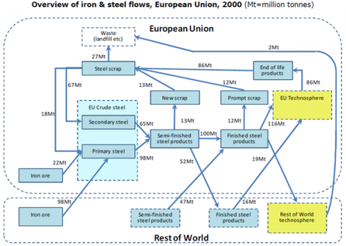
This is a MFA diagram on Iron and Steel Flows in the European Union in 2000 as found in this post. Original data is from a 2008 OECD study, flows in Mt.
The description of the diagram says: “A study of iron and steel flows in 2000 in the European Union showed that an input of about 120 Mt of iron ore (of which 98 Mt was imported) yielded 98 Mt of primary crude steel (i.e. produced directly from iron ore and coke). A further 65 Mt, representing 40% of total crude steel production, were produced as secondary crude steel, produced from scrap steel.”
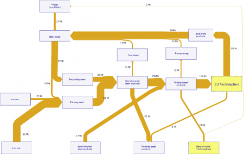
I did a first quick version of the flows as Sankey diagram, trying to stick very much to the layout of the original diagram. All nodes are the same size and more or less located at the position of the master. It already shows that the main steel flows: iron ore imported into the European Union, and steel scrap being recycled within the EU. Export of semi-finished steel products from the EU to the Rest of World (52 Mt) almost balanced with 47 Mt of semi-finished steel products imported into the EU.
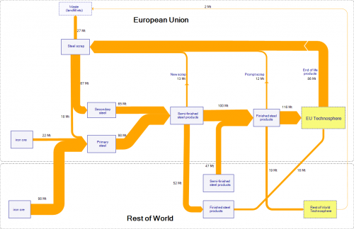
I tried to improve the diagram by removing the three nodes ‘New Scrap’, ‘Prompt Scrap’ and ‘End of Life products’ since there is no transformation of these flows at the nodes (also no change in quantity). Further I reduced the size of some boxes and dragged the ‘Semi-finished Products’ (Rest of World) box closer to the ‘Finished Steel Products’ (European Union) box to avoid crossing streams. Wherever possible I try to avoid diagonal arrows.
The final result also has the Rest of World and European Union grouping. I am not to happy with the colors though.
Your thoughts?
