Tag: Europe

EU28 wood flows Sankey diagram

The European research project CASCADES’ objective was “to define the cascading use of wood and assess the environmental and socio-economic impacts of cascading, to identify and analyse the barriers preventing cascading”. As a central element of the project a wood flow analysis was conducted.

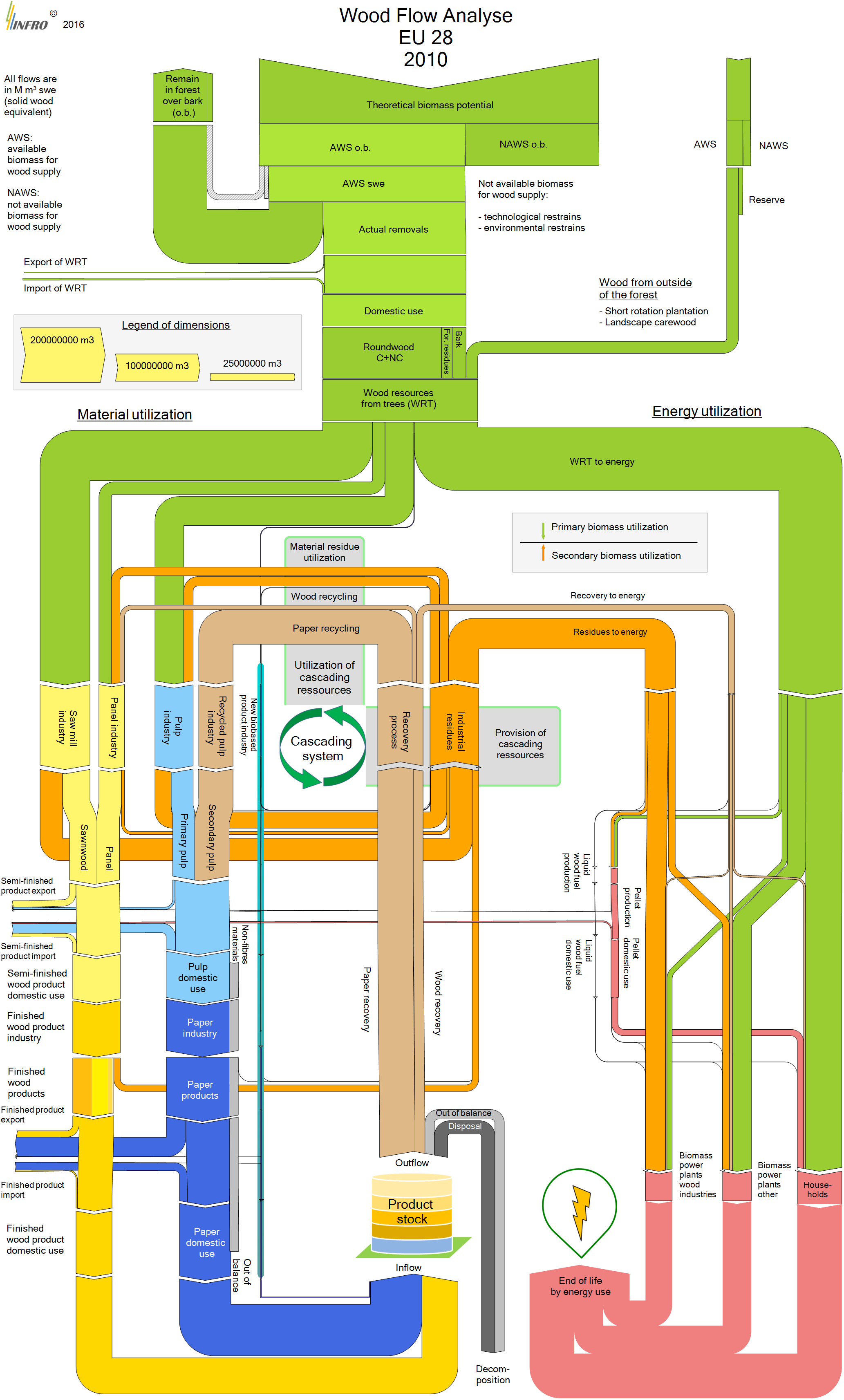
From page 26 the 2016 final report [Vis M., U. Mantau, B. Allen (Eds.) (2016) Study on the optimised cascading use of wood. No 394/PP/ENT/RCH/14/7689. Final report. Brussels 2016. 337 pages)] comes this Sankey diagram depicting wood flows in the European Union (EU-28).

All flows are in Mm³ swe (solid wood equivalent). No absolute numbers are given to quantify the flows, instead three sample arrows serve a reference to the scale (“Legend of dimensions”).

The wood biomass is either used as material (left branches) or as energy (right branch). On the material side wood industry (yellow path) and paper industry (blue path) take up most of the biomass. Residues of both industries along with a good chunk of the post-consumer paper waste are being recovered and led in a cascading loop, until they eventually shift to the energetic side.

A complex and interesting Sankey diagram with much to discover. The CASCADES report describes all the areas of the wood flow system, identifies hotspots and describes measures for optimization.
Europe JRC Critical Materials Report

Europe’s Joint Research Centre (JRC) has published a new report on ‘Critical Raw Materials and the Circular Economy’ in December 2017.

The report also builds on findings from a 2015 study by BIO by Deloitte, where a Raw Material System Analysis (MSA) Framework had been introduced that “investigates the flows and stocks of 28 raw materials from ‘cradle-to-grave’, that is, across the entire material life cycle from resource extraction to materials processing to manufacturing and fabrication to use and then to collection, processing, and disposal/recycling”. I had posted about this here.

Like in the 2015 study the authors present MSAs for a number of critical materials (CRMs) within the EU-28 boundaries and are depicting them as Sankey diagrams. The authors then expand into how scarcity and price may impact certain industrial sectors or products (Automative, Electronics, Batteries, etc.). Best practices are suggested for recovering critical materials.

Here is the MSA Sankey diagram for Germanium (from page 41 of the report):


All flows are in kilograms per the reference year 2012. We can see that roughly 80.000 kg of Germanium entered the EU in the year 2012, and 15.800 kg were made available on the secondary material market within the EU.

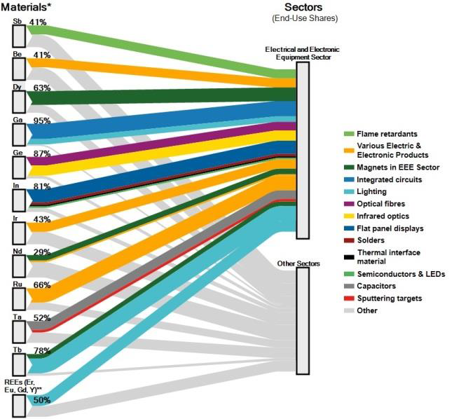
For the individual industrial sectors, another type of figure is presented. This breakdown of how much of the CRMs is used in a specific sector gives a better understanding of the dependency on certain CRMs.

This Sankey diagram (from page 39 of the report) for the Electrical and Electronical Equipment sector shows, for example, that 87% of the Germanium (ge) entering the EU are used in the EEE sector, making it the largest consuming sector of Germanium. The remaining 13% are used in other sectors:

Crossing the information from the MSA Sankey diagams that show availability of a CRM, and the information from the Sankey diagram showing demands per sector gives a good understanding on why some materials are considered critical for industries, and measures for recovering more of them from tailings or waste are meaningful.

Source: Mathieux, F., Ardente, F., Bobba, S., Nuss, P., Blengini, G., Alves Dias, P., Blagoeva, D., Torres De Matos, C., Wittmer, D., Pavel, C., Hamor, T., Saveyn, H., Gawlik, B., Orveillon, G., Huygens, D., Garbarino, E., Tzimas, E., Bouraoui, F. and Solar, S., Critical Raw Materials and the Circular Economy – Background report. JRC Science-for-policy report, EUR 28832 EN, Publications Office of the European Union, Luxembourg, 2017, ISBN 978-92-79-74282-8 doi:10.2760/378123 JRC108710.

Access JRC report here (PDF).

Landscapes of Climate Finance, I4CE

What is landscape of climate finance? A paper published December 2016 by I4CE tells us that “Landscapes of climate finance are comprehensive studies mapping financial flows dedicated to climate change action and the energy transition. Covering both end-investment and supporting financial flows from public and private stakeholders, [they] draw the picture of how the financial value chain links sources, intermediaries, project managers and the end investment.”

The paper by Hadrian Hainaut (I4CE), Andreas Barkman (EEA) and Ian Cochran (I4CE) titled ‘Landscapes of domestic climate finance in Europe: Supporting and improving climate and energy policies for a low-carbon, resilient economy’ features two interesting Sankey diagrams.

This is the ‘Landscape of Climate Finance in France 2014’:


Flows are in billion Euro. Sources and receiving sectors indicated with distinctive black boxes. The authors opted for strictly horizontal/vertical arrow routing. There are no individual quantities at each arrow, so the actual numbers can only be estimated from the arrow proportions.

This is the ‘National Climate Finance in Belgium 2013’:


Flows are in million Euros. Some muddle here at the exit of the top light blue box where the arrows overlap instead of showing the sum of roughly 2000 m€ spending. This coincides with three overemphasized arrow heads for the arrows leading to “Public Investments”, “Policy Incentives” and “Grants”. Arriving arrows at the box “Climate Mitigation” overlap and the Sankey diagram could benefit from clearing up here.

Not sure about the ESDC voting: “France: huit points, La Belgique: dix points” maybe 😉

I had reported on climate finance diagrams back in 2014 when the concept was first presented by Climate Policy Initaitive (CPI) but had since lost sight of them. I am happy to see that the idea is still alive and being taken up in a number of countries in Europe. Also good to see that the diagrams are not yet regulated by a standard and there is some “diversity” among these diagrams.

EU Raw Material System Analysis

A study on key raw materials and their flows “through the EU economy, as raw materials or as parts of basic materials, components or products” has been produced by BIO Intelligence Service for the European Commission, DG GROW (BIO by Deloitte (2015) Study on Data for a Raw Material System Analysis: Roadmap and Test of the Fully Operational MSA for Raw Materials. Prepared for the European Commission, DG GROW).

It contains Sankey diagrams for 28 materials considered critical or important to European economy, such as cobalt, lithium, or tungsten.

The flows of these materials into the EU-28 geographical area (imports) as well as out of the EU-28 (exports) are displayed for all substances in the same way. Recycling of the substance within Europe is represented as a loop, leading to a kind of see-saw-ish diagram. Additions to in-use (e.g. the substance being part of a product in use) and a certain amount of the substance being disposed off (e.g. as waste) are also shown as arrows to the right. Below is the diagram for cobalt. Flows are in tonnes for the year 2012 (t/y).

All Sankey diagrams are color-coded the same-way, providing additional information whether the material (in the case above: cobalt) is imported as raw material or as part of a product, and whether it is exported as processed material, waste, or also as part of a product.

The study can be downloaded from this page or directly here (PDF, 6 MB)

US Trade Balance, two versions

When German Chancellor Angela Merkel meets with POTUS today, one topic that’s most likely going to be addressed is the trade deficit between the United States and the EU, Germany in particular.

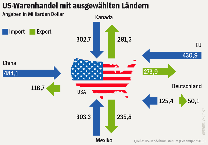
The Spiegel, a major German news outlet, has illustrated recent articles on this subject with the figure below. It shows the volume of trade between the United States and ‘selected countries’ (China, Canada, Mexico and the EU) in 2015. The values indicate the value of goods exported (green arrows) to these countries, and imported (blue) from them into the U.S. in billion US$.


Source: Spiegel Online

The interesting thing in this infographic is that the length of the arrows represents the value of goods traded. For example, the arrow for exports from the US to Europe (274 bnUS$ in 2015) is little over half the length of the blue incoming arrow (431 bnUS$ in 2015). This works fine, with the only exception being the green arrow for exports to Mexico.

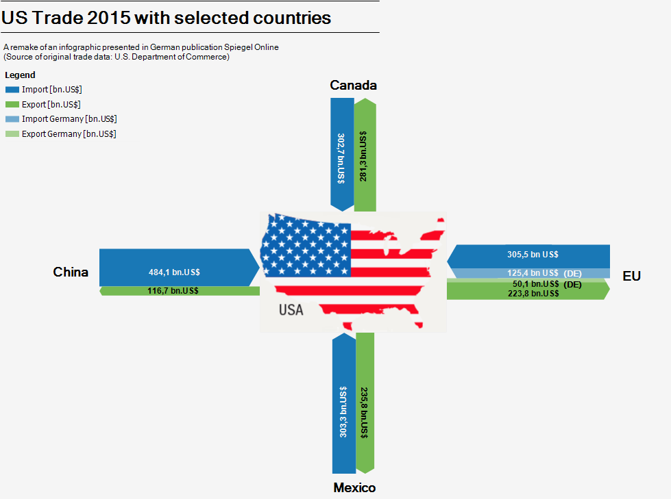
This infographic of course invited a remake as Sankey diagram. As you all know, in Sankey diagrams the widths of the arrows represent the quantity.

I did two or three different versions, all very similar to the original infographic in style and color, even using the lower states map icon (sorry Alaska and Hawaii). I was not sure at first whether the separate arrows for Germany were values already included in the EU trade volume, or if they were meant to be on top of it. A quick look into the original data revealed that indeed they are included in the EU figures already. I therefore decided to highlight the German share in the Sankey diagram with a slightly brighter color, but keep those arrows stacked.

Here is my Sankey diagram version of the Spiegel infographic.

Not sure which version I prefer, but using the length instead the widths of the arrows to represent the flow quantity is definitely a unique approach. Worth sharing with you, I think.

Material Scarcity Visualized

This presentation from 2015 by Alicia Valero of the Spanish Research Centre for Energy Resources and Consumption (CIRCE, Zaragoza) is on critical materials, minerals scarcity, recycling and a “thermodynamic cradle-to-cradle approach”.

It features two Sankey-style diagrams depicting the mineral balance of the European Union (UE).

This first one is a Sankey diagram for the mineral balance without fossil fuels (‘Diagrama de Sankey para el balance mineral de la UE sin combustibles fósiles’).

Data is for the year 2011, Flows are shown in tons. Iron and limestone dominate the picture with 77% of the input. Limestone is produced (extracted) mainly within Europe, while iron is mostly imported.

The second Sankey diagram is a scarcity diagram (‘Diagrama de rareza para el balance mineral de la UE sin combustibles fósiles’) and takes into account thermodynamic exergy to obtain (mine) the minerals. Although it depicts aluminium, gold, ion, nickel and the likes, flows are shown in an en(x)ergy unit (Mtoe).

Iron and limestone which seemed to be the most important mass-wise only constitute some 10% of the input. Aluminium and potash seem to be much more difficult to produce. Rare earth elements (REE) are not included in this diagram.

The author points out that it is important to not only look at materials from a mass perspective. Looking at materials availability taking into account thermodynamic exergy paints a different picture of the real cost and scarcity.

For those interested, please check out the presentation (in Spanish) here.

EUROSTAT Sankey Tool for EU-28

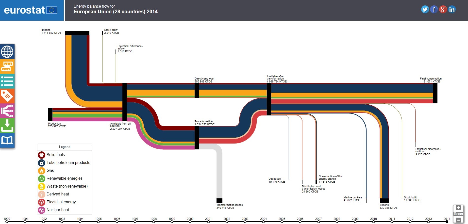
Interested in the energy flows of the Euopean countrues (EU-28)? Check out the Sankey diagram tool on the EUROSTAT webpage (the European Statistics Office).

You can choose to view the energy flows for individual countries, or the total for all EU-28. Switching between the data for the years 1990 up to 2014 lets you compare the changes over the last 25 years. The sidebar offers display options for the Sankey diagram.

Nice visualisation and much more fun to work with than statistics data in tables.

Europe Energy Flows 2013

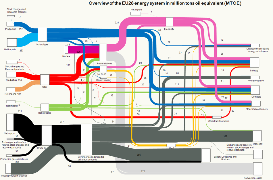
An updated Sankey diagram for the energy flows in Europe (EU-28 countries) is available on the website of the European Environment Agency (EEA).


Copyright holder: European Environment Agency (EEA).

I have reported previously about the energy picture with data for 2012. The Sankey diagram structure is almost identical, just the values have been updated to reflect 2013 data. Minimal changes only, compare for yourself…