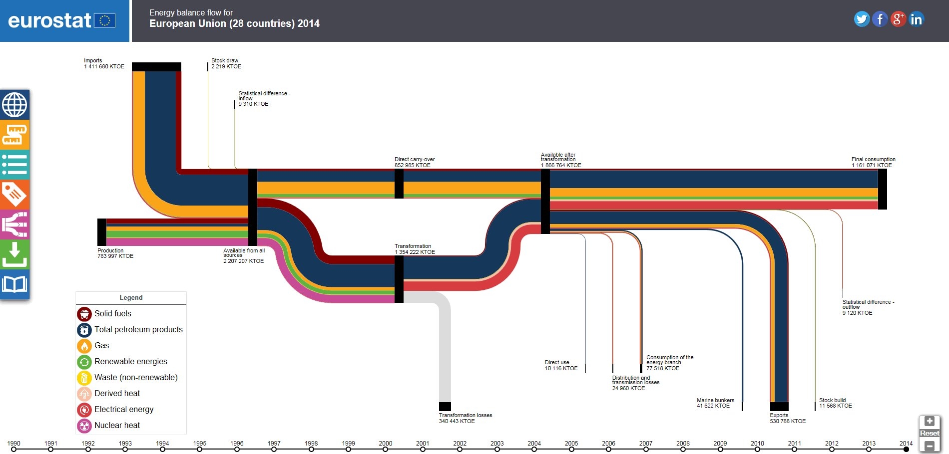
Interested in the energy flows of the Euopean countrues (EU-28)? Check out the Sankey diagram tool on the EUROSTAT webpage (the European Statistics Office).
You can choose to view the energy flows for individual countries, or the total for all EU-28. Switching between the data for the years 1990 up to 2014 lets you compare the changes over the last 25 years. The sidebar offers display options for the Sankey diagram.
Nice visualisation and much more fun to work with than statistics data in tables.
