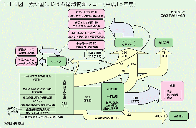
Another wild like-to-be Sankey diagram. Found this on a resources and links list related to ‘material flow’ hosted at Hiroshima University.
The diagram is from a white paper on a ‘Recycling Society’ published 2006 by the Japanese Environment Ministry (HTML version). Data is for the year Heisei 15 (=2003), the book was published in 2006.
The title 平成15年度における我が国の循環資源フロー can be translated as ‘The resource flow cycle in Japan in 2003’ (any other suggestion from a native Japanese speaker out there?).
Flows are in million tons (百万t) per year as indicated in the top right. Values in square brackets relate to the previous year (2002). Flows are not to scale and their width seems to be chosen almost deliberately.
The diagram itself is a very interesting depiction of national material flows. Starting out from the 582 million tons of material (green box lower left), a large portion (220 million tons) is recycled, either directly as rejects from production (96 million tons) or after product use (124 million tons). 3 million tons are reused.
Still trying to figure out some more translations… three more thoughts:
(1) Could this general diagram setup serve as a role model to visualize reuse and recycling in a country. What are the common standards in national MFA accounts for this?
(2) Can I do this more nicely with a modern Sankey diagram software? Would be a nice challenge (mostly for the Kanji characters!)
(3) What would be the picture for Japan in 2015 in comparison to 2003?
