Tag: UK

Combined Heat Power (CHP) Sankey

Have been very busy recently and have neglected the blog. Here’s just a quick one (to get some color on the top post again … 😉 )

UK’s Department for Environment, Food and Rural Affairs (DEFRA) has crowned its new website on combined heat and power generation with a nice Sankey diagram.

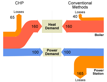
What is CHP? “CHP systems are highly efficient, making use of the heat which would otherwise be wasted when generating electrical or mechanical power (…) and typically has an efficiency of over 80%”, the accompanying text explains.

The diagram is built similarly to this one presented in a previous post: The Sankey diagram doesn’t feature absolute figures, but flows are scaled in relation to the baseline of 100 units energy generation in a power plant and a CHP unit. In a cogeneration unit 160 units of energy would be produced at the same time. Losses are accounted for with 65 units in the CHP. To produce the equivalent energy quanities in a conventional power unit would cause losses 1.65 times higher than the energy output itself. In the boiler 25 % of the energy is lost (40 units).
Overall losses in convential generastion are 205 units compared to 65 units in a CHP.
More National Energy Flow Diagrams

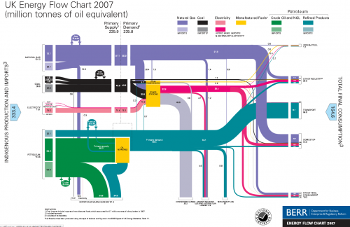
A followup to my last post: This thread on ‘The Oil Drum: Europe’ features similar national energy flow diagrams for UK (2007), The Netherlands (2006) and Switzerland (2007).

For the UK these Sankey diagrams are published by BERR (Department for Business, Enterprise and Regulation). Historic charts back to 1974 can be found on their website.


UK Energy Flows 2007, by BERR, via The Oil Drum: Europe

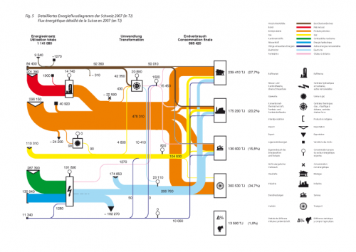
A commentor to Chris Vernon’s original post added the Swiss version of this Sankey energy flow diagram originally published by Swiss Bundesamt für Energie (BFE):

These Sankey diagrams have some nice details, which a worth a mentioning: The UK diagram shows stock increases and decreases with circles. The size of the circle has no significance, but the magnitude of the in and out flows seem to be to scale, thus allowing to see if the stock has increased or decreased in that year. Losses at transformation steps are shown with “hanging arrows” (the flows branching off to the bottom line of the diagram). The Swiss version also shows exports this way, but visualizes losses with a pin with a big round head.

Even though your run the risk of being overwhelmed by a gloomy feeling when your read through the comments to Chris Vernon’ post, I would like to draw your attention to a comment by “realist” on Sept 5. He writes: “Deceptive graph! Why show losses for electric power generation and not transportation? The heat losses from the internal combustion engine in most transport is 70-80%”. This is true, but I have always understood that losses explicitly shown in these energy flow Sankey diagrams are the losses occuring in the energy generation, conversion and grid, while losses in the energy consumption (such as use for transport) are not shown. This let alone that they are worthwile to discuss.

Cardboard and scissors to make Sankey diagrams

The website of Nottingham City Schools offers a variety of materials that can be used by teachers in their courses. One of the key areas in the science field is ‘energy’.

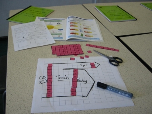
The site has a demonstration of how Sankey diagrams may be used to represent transfer of energy, including a PowerPoint and “stories”, for which pupils can create a Sankey diagram by using tokens cut from cardboard.

I think this is a great idea, as it supports the understanding of the energy topic with a haptic and, very importantly, a visual approach.

Sankey – the movie. Or: moving Sankey diagrams

Mark Barrett, director of a UK-based energy consultancy Senco, has developed several energy models.

The SEEScen model (Society, Energy and Environment Scenario model)…

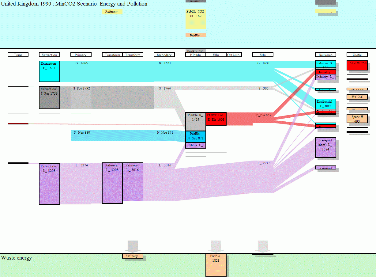
…incorporates 11 energy end uses (motive power, lighting, heating etc.) across 15 sectors. Some of these end uses have physical models; for example, domestic space heating and cooling are estimated with a model of a house which allows the effects of parameters such as insulation and internal temperatures to be examined.

Sankey diagrams for several years have been put together to make a short “film” how energy requirements may change over the years, and what shifts might be expected between different ways of energy generation.

To view this animation click on the image (there are some seconds between the frames, be patient).

To be able to see the details, download the Flash move or the GIF from the SEEScen webpage. Make sure you watch the film in the original size.The website www.senco.co.uk has gone offline (?), go to Mark Barrett’s page instead.

This is a neat idea, and it gives a whole new dimension to Sankey diagrams! On a side note: as far as I am informed, there are only two software tools capable of handling timelines in Sankey diagrams, S.DRAW and SankeyVis.…