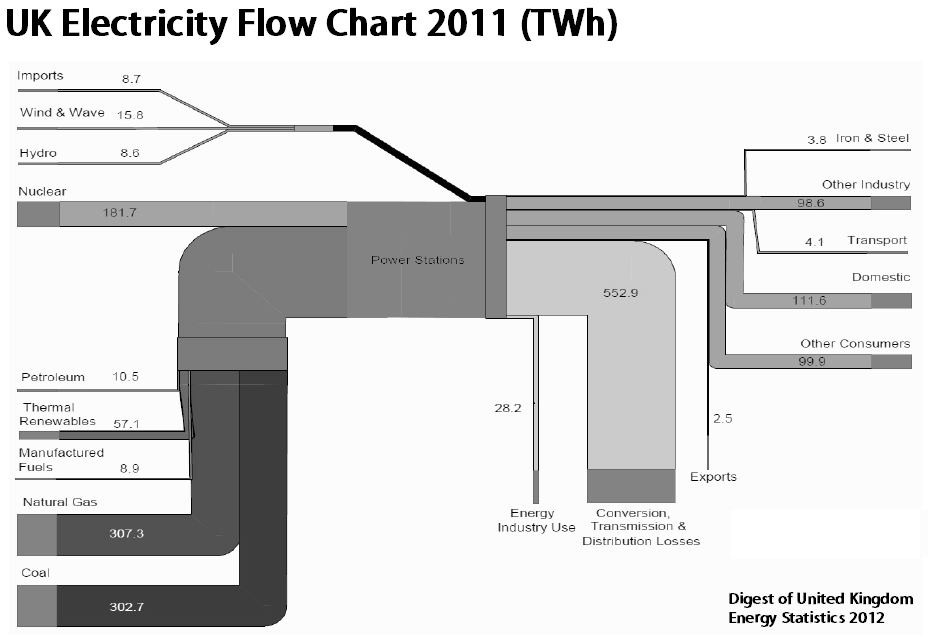
Found this Sankey diagram for UK energy flows in 2011 on reddit. Unit is TWh. Original source: ‘Digest of United Kingdom Energy Statistics 2012’.
While monochrome can be soothing for the eyes at times, this one definitely hurts my aesthetic sense: Too many shades of grey, arrows overlapping, pasted together from rectange it seems.
