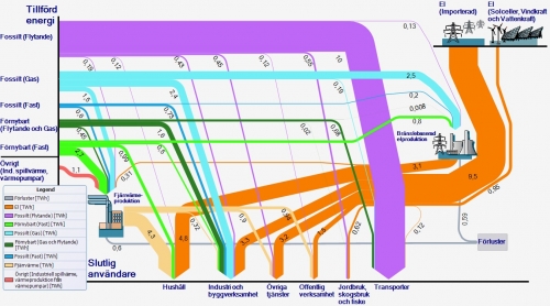
A colorful Sankey diagram for energy flows from Sweden. Found this one on the web page of Länsstyrelsen Skåne (please don’t ask me to read this out loud…) in an article titled ‘Skånska hushåll i fronten för mindre fossilberoende’
Unit of flows is TWh. The orange arrows are imports, the other arrows from the left apparently domestic production, with the majority of energy being from fossil fuels (“Fossilt”). Consuming sectors are at the bottom – in contrast to the typical layout of this kind of energy balance diagrams.
Anyone from Sweden who wishes to comment and explain a little bit?

3 Comments
Most electricity (EI, orange) is imported to this region in the very south of Sweden but some is produced locally (Bränslebaserad=fuel-based). Remarkable are the small losses (Förluster) by power production. This is due to the combined (CHP) production of electricity and district heating (Fjärrvärme). District heating is a means to utilise energy resources that are difficult to use in individual buildings. It here uses mostly domestic renewable solid fuels (Förnybart Fast, largely wood chips and municipal waste) but also industrial waste heat (Ind spillvärme) and imported fossil gas for a CHP plant in Malmö. Fossilt (Flytande) is mostly imported automotive fuel. The consuming sectors are households, industry, private services, public services, agriculture and transport.
CHP is not mentioned in the Sankey diagram but means combined heat and power production.
@Dag:
“Tak” for the additional explanations!
Comments are closed.