Tag: Netherlands

Cool! Cyclifier 3D Sankey Diagram on Food

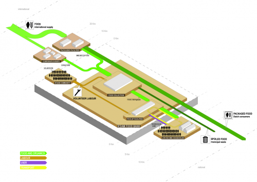
Found on cyclifier.org, a project run by Dutch 2012Architecten: This 3D Sankey diagram by Anna Brambilla visualizes flows of food from producers to the Rotterdam foodbank and onto low income households.


Source: http://www.cyclifier.org/project/foodbank (License: Share-Alike)

The image is explained as follows:

“Processes and actors are identified by labeled platforms with sub-processes shown as stacked platforms. The system boundary is shown as an extruded block indicating that it is one piece within a larger network. Starting from the edges of the cyclifier, distances are marked in intervals to indicate the distances traveled by inputs and outputs. Flows are scaled by mass as in sankey diagrams and are color-coded per flow type. Flows to and from the atmosphere are represented as traveling vertically.”

So, we have ‘Food and Organics’ flows (green), transport (yellow), users (purple) and even volunteer labor (brown) represented in the diagram. No numbers or units given though. Since cyclifier.org is interested in promoting “innovations that contribute to local exchange and production”, distances of producers to the foodbank and to the consumers are indicated on a somewhat logarithmic scale.

I just doubt that roughly a third of the output flows from food production is received by the foodbank. This is probaly to be taken symbolically and not for real…

Very cool Sankey diagram, kudos!
Water Flows – before and after

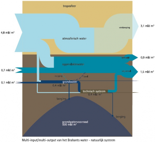
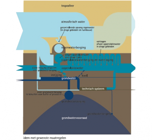
A reader of the blog, submitted the below Sankey diagrams on waterflows in the province of North Brabant in the Netherlands.

Wies writes about these:

The left chart is the actual Multi Input – Multi Output analysis. There are some irregularities and inefficiencies. Therefore we made the chart on the right showing some design proposals. These are not really related to exact quantitative in or output, it’s a bit more freeminded, so no numbers are included here.
We also tried to combine the actual flows of water with the bodies of water (troposphere in the air, the bulk of ground water in the ground)

The report that contains the two diagrams can be found here. Check out p. 22 of the PDF.

Thanks for sharing this!

Pimp my nitrogen Sankey

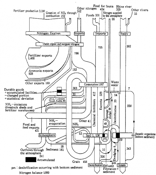
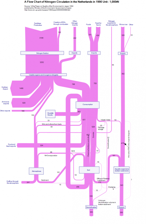
Below is an example of a Sankey diagram showing a nitrogen metabolism. The original diagram is from a Japanese publication (‘White Paper on Quality of the Environment in Japan 1994’), even though the diagram represents nitrogen loads (in 1000 tons N) in the Netherlands in 1990.

A pimped version of this diagram can be found in the e!Sankey download gallery. I don’t like the color very much, but the overall aspect of the diagram is much better than in the b/w version, I think.


They seemed to have struggled with inconsistencies in the original diagram, as an annotation suggests. Also the denitrification due to accumulation in the bottom sediment, or nitrogen ending up in durable goods (shown in black in the original) are not represented in the remake. For the rest it pretty much sticks to the original.

Thinking about a new tag “pimp my Sankey”…

Incoming and outgoing cargo @ Rotterdam Port

Last weekend I had the possibility to visit a friend in the Netherlands, and we took a tour of Rotterdam Port. Despite the bad weather, I was fascinated by the huge container ships, the cranes, the noises….

Back home I did some research and came up with the cargo data for the year 2005 from the Port of Rotterdam website.

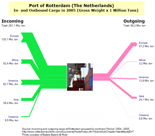
I did the following three Sankey diagrams. The first shows the inbound cargo quantities (in million tons gross weight of cargo) from the left, and the outbound quantities to the right, broken down to world regions. One can clearly see that Rotterdam handles mainly imports, with more than 281 million tons of cargo being unloaded, while only 88,2 million tons of cargo are being loaded onto ships.

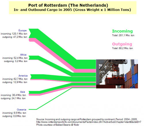
Next I flipped inbound and outbound flows to the same side. However, I think that by this the diagram loses somehow, also because some purple flows (outbound to Africa and Oceania) are too thin.

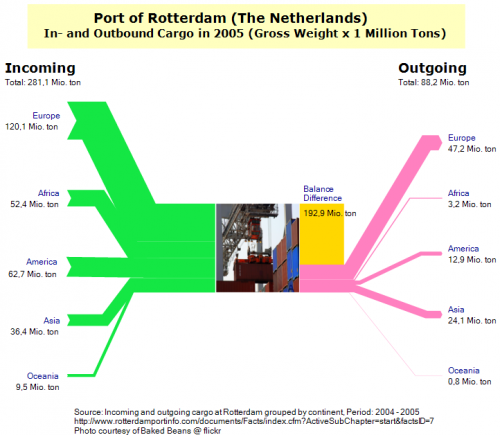
In the third version, I added a shape for the balance difference between inbound and outgoing goods.

Tell me what you think about theses Sankey diagrams. It would be interesting to compare Rotterdam to other ports. Shanghai, for example, might have the opposite picture with much more exports, but I haven’t found any data yet to show this. And, if we are talking cargo traffic: how about doing a passenger Sankey diagram for one of the international airports in the U.S. (by origin/destination continent?, by airline?)