A reader of the blog pointed me to some Sankey diagrams available on the U.S. Department of Transport (DOT) Federal Highway Administration (FHWA) website. Sankey arrows are shown as a U.S. map overlay.
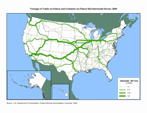
The first transport Sankey diagram shows the net tons of goods being transported on flatcars (either as trailer-on-flatcar, or container-on-flatcar) on the U.S. railway systems. The transport volume quantities are clustered into four groups shown with four different arrow widths. It is nice to see how in the eastern part you still have many railroad tracks, but with significantly less transport on them, while to the west coast you basically have 3 main lines, two of which carry more than 25 mio tons of freight per year.
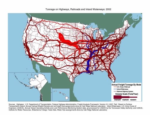
The second one represents freight transport on railroad (bright red), inland waterways (blue) and national highways (dark red). Values also in million tons per year. I am not sure whether flows are to scale, or if transport quantities are also clustered into groups as in the first diagram. I can distinguish at least five different arrow magnitudes, even though only three sizes are given in the legend. A great transport Sankey diagram, as it shows that the East has most of the cargo, and has a much denser transport infrastructure. The reason why railroad transport on this second Sankey diagram differs so much from what is shown the first one, is probably due to the transport of bulk materials not shown in the intermodal transport quantity map.
Flows are not directional in both diagrams, so I assume that quantities for both directions have simply been added.
Can anybody confirm that the massive stream out of Wyoming by rail is coal?


2 Comments
Comments are closed.