Month: May 2007

Sankey Diagrams in Periodic Table of Visualization Methods

Remember having to learn the elements of the periodic table back in chemistry class?

Visual Literacy now presents a ‘Periodic Table of Visualization Methods’ that has been published by two scientists from the University of Lugano in Switzerland.

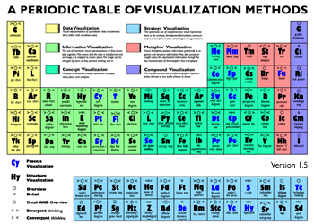
Each elements represents a visualization method, from ‘C’ like ‘continuum’ to ‘Sd’ like ‘spray diagram’. The Sankey diagram can be found as element ‘Sa’ in the periodic table. It is colored in green for being in the ‘Information Visualization’ category. Furthermore its characteristics are ‘Overview’ and ‘convergent thinking’.

You can see the full periodic table at visual-literacy.org and hover the mouse over to see an example for each visualization method. The original article (Lengler R., Eppler M. (2007). Towards A Periodic Table of Visualization Methods for Management. In: IASTED Proceedings of the Conference on Graphics and Visualization in Engineering 2007, Clearwater, FL, USA) and the table separately are available as PDF files.

Sankey Diagrams in Material Flow Accounting

Another field where Sankey diagrams are used widely is Material Flow Accounting, the analysis of material flows on a national or regional level. MFA focuses on bulk materials or individual substances (e.g. zinc, copper, cadmium) and the quantities in which they enter, leave or accumulate in a national economy.

The diagram below is from a peer-reviewed paper presented at the 4th LCA conference in Australia (van Beers, van Berkel, Graedel: The Application of Material Flow Analysis for the Evaluation of the Recovery Potential of Secondary Metals in Australia, 2005). It shows the copper flows within the system boundary of Australia, the unit is Gg/year (= 1000 metric tons per year).

This “clustered” Sankey has six different flow widths, grouping together flow quantities within a specific range (e.g. <10, 10 < 30,9, …). Flows larger than 999 Gg/year are not shown any wider. This avoids that very large quantities “spoil” the whole diagram, as smaller flows become less significant in Sankey diagrams to scale.

An alternative way to overcome the problem or very wide flows in a Sankey diagram spoiling the chart would be to define a cut-off quantity. Flows that are large than the cut-off quantity are excluded from the scale, and are shown with a hatch or moirée pattern. The two Sankey diagrams below were made based on the data from the above publication. The first one shows the large “Ore” flow with a cut-off level at 300 Gg/year (an additional note warns the reader that this flow is not to scale”, while the second diagram is fully to scale.


Very thin arrows additionally get explicit arrow heads to be able to identify their flow direction.

Feel free to comment

U.S. Freshwater Withdrawals in 2000

I had bookmarked a number of Sankey diagrams a while ago when visiting the website of Lawrence Livermore National Laboratory. These diagrams on energy, CO2 and freshwater are a great source of information. You can, for example, find the typical energy Sankey diagrams (like the one in my previous post) for the U.S. all the way back to 1950, 1960 and 1970 and then from 1973 to today.

Summer is coming closer, and we can again expect water shortage in some states. So the Sankey diagram I have selected for presentation today (original PDF), is for freshwater withdrawals in the year 2000.

The overall extraction was 345.000 Mgal/day (roughly 1.3 bio litres per day) with approximately 75 % from surface water and 25 % from ground water. Another 62.300 Mgal/day of saline water is withdrawn for thermoelectric use.

The largest portion of the water is for irrigation, livestock and aquaculture, closely followed by the water used in thermoelectric power generation. Domestic self-supply is a comparatively marginal 3,590 Mgal/day (1,04 %), which makes my Mom’s call to “close the tap” sound somewhat ridiculous.

A Sankey for Energy Generation in the U.S.

Joshua Rosenau over at scienceblogs took up on the energy topic in his ‘Thoughts from Kansas‘ and presents a Sankey diagram for the U.S. energy distribution (The Problem of Energy Generation) from an article in Science (Whitesides and Crabtree: Don’t Forget Long-Term Fundamental Research in Energy, Science 9 February 2007:Vol. 315. no. 5813, 796-798). It shows that more than 55% of the energy produced is lost, mainly in transmission and distribution on the grid (approx 25%) and another 30% in transport-related combustion of petrol [Note to self: do a Sankey diagram comparison for 1911 race car and modern light vehicle].

“…over half of the energy produced for our domestic market goes to waste. Fully two thirds of the energy produced by electrical generation and distribution goes to waste.”

This Sankey diagram shows the energy carriers on the left side, the sectors where energy is consumed (noteworthy: traffic has a larger share than industry) as midpoint groups, and a breakdown to useful and lost energy on the right.

Next stop … Sweden!

My Sankey diagram tour around the Baltic Sea continues. After stops in Estonia and Poland, today it is Sweden.

The diagram below is from the website of the energy provider of the Swedish city Lund.

This diagram is in GWh. It shows the different energy sources used in Lund on the left side, like wind energy (“Vindkraft”, 4 GWh) or geothermal energy (“Geotermisk värme”, 183 GWh). The largest portion (1960 GWh) is electrical energy purchased. The arrows on the right hand side show as what type the energy is being consumed: electricity, heat, cold and gas.

I like this diagram for its ‘blockish style” and the very strict horizontal orientation. The fact that certain flow quantities are branching off to join other arrows is indeed rather difficult to depict. You can see – especially on a b/w printout of the PDF file (on their old website) – that they were struggling with this, but they smoothed it nicely with color gradient effects.

If you take out your pocket calculator (and that’s what I always do!), you will come up with a difference of 244 GWh (“inputs” on the left 3361 GWh, “outputs” on the right 3117 GWh). Might this be attributed to transformation losses?